As the name implies Chrome Developer Tools is a tool that allows web developers to interfere and manipulate applications via the browser. With this tool you can:
- Manage interface problems
- Debug Javascript Code with using breakpoints
- Optimize your code
To open DevTools, you can right-click anywhere on the page and select inspect element or you can choose the “tools > developer tools” option from the top right menu.
The following examples are using the Canary version of Google Chrome.
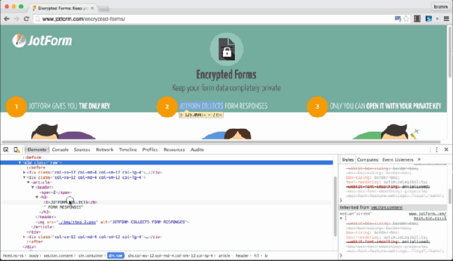
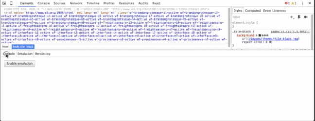
1. Quick-edit a HTML Element

To try it:
- Select the “Elements” panel.
- Choose a DOM element within the Elements Panel editor.
- Double click on the opening tag and edit it.
When you are finished, the closing tag is automatically updated.
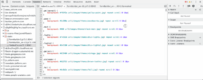
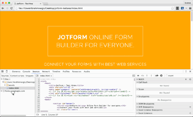
2. Go to a Line Number
You can use this feature in the “:linenumber:columnnumber” format from the Sources panel.
To try it:
- CMD + O
3. Expand All Child Nodes
To try it:
- Select the “Elements” panel.
- Choose a DOM element and Alt + Click the arrow within the Elements Panel editor to expand all child nodes.
4. Change DevTools Positions
To try it:
- CMD + Shift + D
Dock options:
- Undock DevTools
- Dock to bottom
- Dock to right
5. DOM Search by CSS Selectors
To try it:
- CMD + F / CTRL + F and enter your class name or id name base search selector.
6. Material and Custom Color Palettes
You can click on the little switcher icon in front of hex code. you can choose from the following:
- Page Colors: This palette is auto generated from your web site (in your CSS).
- Material Design: This palette automatically generates primary colors from The Material Design palette.
7. Multiple Cursor
Move the cursor with the CMD + Click to add multiple cursors. You can alsoundo your last selection with CMD + U.
8. Copy Image as Data URI
To try it:
- Select “Network” panel.
- Choose your image within the Resources Panel
- Right click and copy it as a Data URI (base 64 encoded)
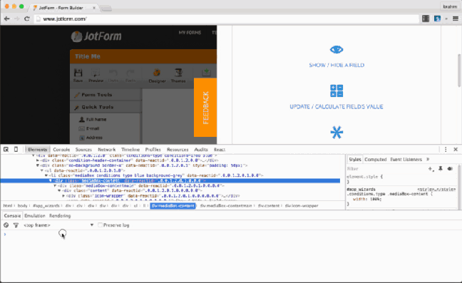
9. Triggering of Pseudo Classes

To try it:
- Right click in the left panel and select “Force Element State”.
- Alternatively, the toggle element state icon can be clicked in the right panel.
10. Column Selection by Dragging
To try it:
- Select “Sources” panel.
- Choose your file within the Sources Panel editor.
- Hold Alt and dragging the mouse.
11. Get the current element with “$0”
To try it:
- Select “Elements” panel.
- Choose a DOM element within the Elements Panel editor.
- Click Console and write $0 to access it.
12. Reveal in Elements

To try it, if you choose an a DOM node:
- Right click on it within the Console panel.
- Select “Reveal in Elements Panel”.
13. View Event Listeners

To try it:
- Select the “Elements” panel.
- Navigate to the Event Listeners and choose an event.
- You can also view source by right click and choose “Show Function Definition” in context menu.
14. Easing Previews

To try it:
- Click the easing icon (purple icon) and see a preview.
- You can view it via choose other previews or you can set new easing format.
15. Media Query

To try this:
- In Device Mode, click the icon (‘bars’) in the upper left corner of the page.
- Click the breakpoint (‘blue’, ‘green’, ‘orange’) bars and change.
If you right click on a bar, you can reveal its position within the source code.
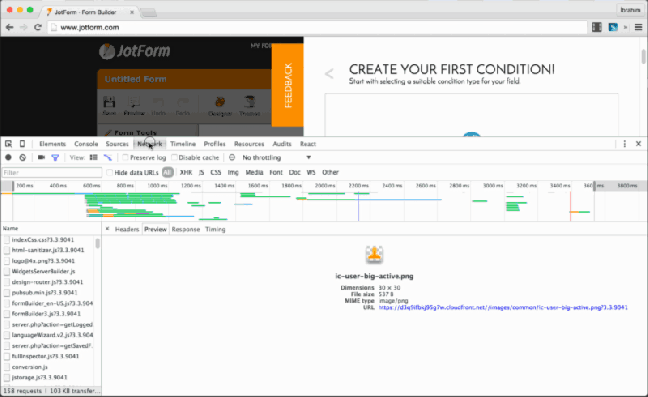
16. Network Filmstrip
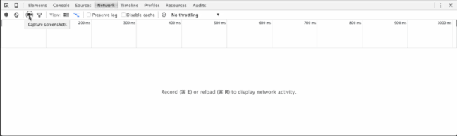
“Film Strip” shows page rendering screenshots and times from start to finish. You can click a screenshot and view in the timeline-style view.
To try this:
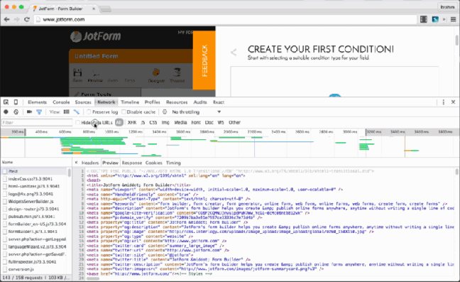
- Select “Network” panel.
- Click “Camera Icon”.
- Reload page.
17. Copy Response
You can copy the response/request headers of a network resource.
To try it:
- Select “Network” panel.
- Choose your file within the Resources Panel.
- Right click and click “Copy Response”.
18. Run Predefined Snippets
To try it:
- In the left sidebar: Sources > Snippets
- Right click > Select New
- Enter a file name and write your snippets in the right panel
- Right click on the snippet and select Run
19. Device Emulation Sensors
You can also simulate mobile devices sensors like:
- Touch Screen
- Geolocation Coordinates
- Accelerometer
To try this:
- Select “Elements” panel.
- Click “Esc” and choose “Emulation > Sensors”
20. Workspaces
To try this:
- Select “Sources” panel.
- Right click within sources pane and choose “Add Folder to Workspace”
- Choose your file and right click > Map to Network Resources
- Change your file code and view it.
References:
Fonte: How to use Chrome DevTools like a Pro — JotForm — Form Builder — Medium

 Hom Digitalis