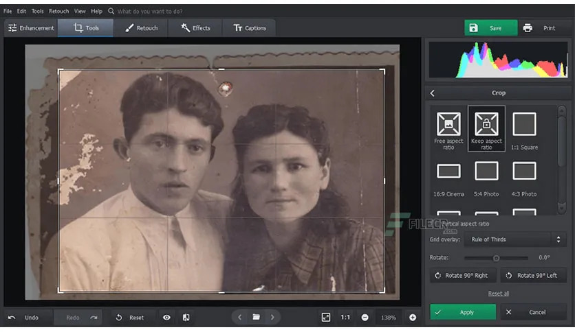
Os melhores editores de fotos e imagens para Windows 11 em 2022

1. PhotoWorks

Começamos com o PhotoWorks, aquele que é considerado como um dos mais inteligentes editores de fotografia para PC.

Não obstante, a aplicação vem equipada com todas as ferramentas essenciais para a edição de imagens, mas tem também uma série de funções avançadas.

Inicialmente, o PhotoWorks permite aos utilizadores melhorar automaticamente as suas imagens – as edições são baseadas no género da imagem e oferecem o melhor aspecto possível.

Em segundo, existe um módulo de retoque de retratos alimentado por Inteligência Artificial (AI) e, importante, não envolve selecção manual ou aplicações de máscaras. Neste caso, apresenta um conjunto de pré-configurações com um clique e arrastamentos convenientes que proporcionam resultados surpreendentemente naturais.

Certamente que o  kit de ferramentas do software também oferece:

  • Alteração semi-automática do fundo,
  • Processamento em grupo,
  • Mais de 200 efeitos,
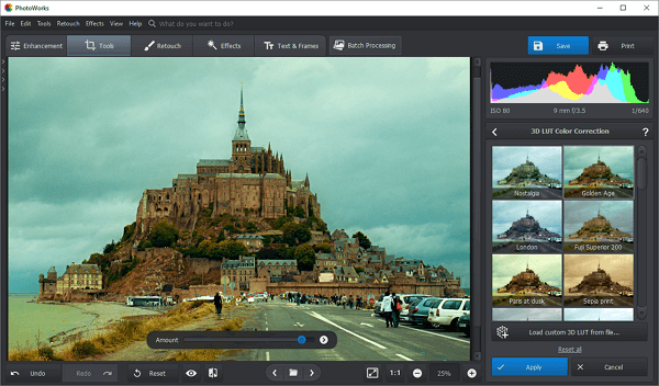
  • Filtros HDR, e LUTs 3D,
  • instrumentos para remoção de objectos estranhos,
  • Entre outras funções.

Resumidamente, o PhotoWorks é um programa fácil de usar que pode ser utilizador por vários tipos de utilizadores com vários níveis de conhecimentos. Mesmo ao nível de requisitos o software em si não requer muita potência RAM.

Apesar de ser bastante rico em funcionalidades, PhotoWorks oferece apenas edição em camadas muito básicas, estando no top melhores editores de fotos e imagens para o Windows 11 em 2022.

Principais características do PhotoWorks: 

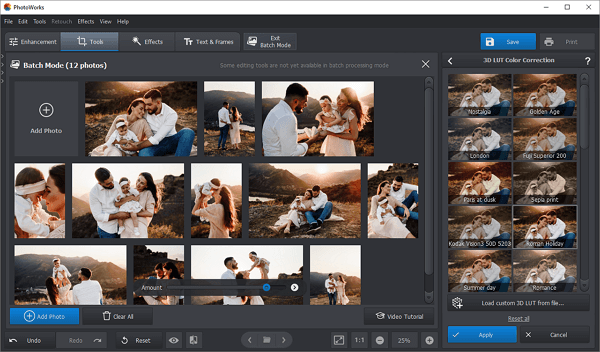
Em poucos pontos, vamos mostrar o quão útil se pode considerar esta ferramenta. Então, vejamos as principais carcaterísticas:

  • Auto-correcção consciente do conteúdo,
  • Recurso de processamento em grupo,
  • Retoque de retrato com apenas um clique,
  • Ferramentas Pro para correcção de cor: Curvas, HSL,
  • 200+ efeitos e filtros incorporados
  • Ferramentas de escultura facial e corporal
  • Suporte de mais de 450 formatos RAW

Sem dúvida, de todas as opçoes que aqui estamos a apresentar este software mostra uma grande diferença, quando comparado com os demais.

2. Luminar AI

Desde já, começamos por definir o Luminar AI como sendo outro editor de fotografia inteligente para Windows 11.

Sabe aquela situação em que necessita de uma pós edição rápida? Então este software é sua cara, pois apresenta uma solução elegante de Templates.

No fundo, os Templates são nada menos que conjuntos de perfis diferentes que transformam as nossas imagens num ápice, como por exemplo:

  •  Alterar a imagem em termos de cor,
  • Gama dinâmica e exposição,
  • Ferramentas manuais de seleção de equilíbrio de cor,
  • Instrumentos de corte e perspectiva, etc.

Na verdade, podemos encontrar características específicas, alimentadas por Inteligência Artificial, que podem ser bastante impressionantes, entre elas a substituição automática do céu e efeitos de nevoeiro ou névoa, etc.

De antemão, o Luminar AI apresenta-se com com ferramentas de retoque de retrato relativamente, digamos, decentes. Tem alguns sliders que lhe permitirãoaliviar e suavizar a pele, eliminar imperfeições, realçar os olhos, sobrancelhas, e lábios, e emagrecer o rosto do modelo, caso o deseje.

Contudo, importante, caso escolha este software como ferramenta certifique-se de um detalhe importante: o seu hardware tem de ser de primeira qualidade pois caso contrário, o programa não funcionará da forma desejada ou mesmo correctamente.

Principais características do Luminar AI:

  • Modelos, Templates, para edição rápida e estilização,
  • Efeitos da natureza realistas como nevoeiro, raios de sol, etc.
  • Retoque de retratos com base em deslizadores,
  • Fundo artístico com efeitos acima da média 

3. ON1 Photo RAW

ON1 Photo RAW apesar do nome, não se assuste, pelo menos já!

Ao mesmo tempo que o programa pode servir como sendo um software de edição de imagem autónomo como também pode servir como um plugin do Photoshop.

Resumidamente, esta app foi pensada para se dedicar principalmente à manipulação do formato de imagem RAW, o que inclui a edição de imagem com ferramentas de topo para uma melhoria rápida e eficiente.

Por outro lado, para além de instrumentos básicos, o ON1 Photo RAW oferece características de nicho como:

  • Junção panorâmica,
  • Correcção de lentes,
  • Retoque facial inteligente.

Logo depois, existem também ferramentas de edição de camadas e um conjunto respeitável de filtros.

Apesar de possuir um fluxo de trabalho relativamente fácil, o ON1 Photo RAW pode requer algum tempo para nos habituarmos, especialmente devido à sua interface mais complexa e por vezes confusa.

Mas, sem dúvida, a maior desvantagem deste programa que, de resto, merece toda a nossa atenção é que tem uma tendência para se arrastar um pouco.

Principais características do ON1 Photo RAW:

  • Fusão do HDR e colagem (junção) panorâmica,
  • Colecções de filtros, texturas, & bordos,
  • Correcção da desajustes cromáticos,
  • Edição de metadados,
  • Pincéis personalizados 

4. CyberLink PhotoDirector

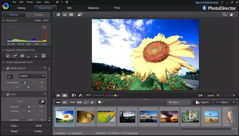
Igualmente a outros grandes nomes do mercado, o CyberLink PhotoDirector é uma aplicação fotográfica multifuncional para Windows 11 que inclui funcionalidades de catalogação e edição.

tanto quanto podemos apontar, entre as suas características mais proeminentes estão:

  • A substituição via IA pelo céu,
  • A remoção de objectos sensíveis ao conteúdo,
  • A criação de GIF,
  • Ferramenta de emagrecimento do corpo – sim, leu mesmo bem!

Embora PhotoDirector não tenha tantas ferramentas poderosas como, digamos, o Lightroom, certamente ultrapassa o produto Adobe em termos de pincéis disponíveis e outras ferramentas de pintura.

Não obstante, outra vantagem deste editor de fotografia para PC é o seu fluxo de trabalho relativamente fácil. O PhotoDirector não está, contudo, isento de certos inconvenientes. A maior delas é a exigência do software em termos de hardware. 

Principais características do CyberLink PhotoDirector:

  • Colagem (junção) Panorâmica,
  • Apoio de tiro com fio
  • Fornece acesso a imagens de stock
  • Suporte à edição de/por camadas (layers)

5. ACDSee Gemstone Photo Editor 

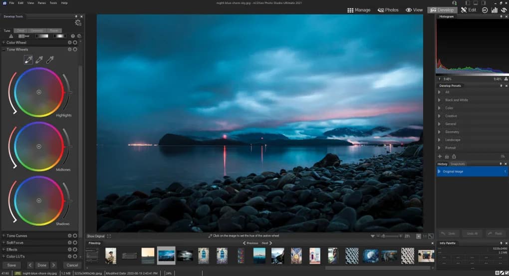
ACDSee Gemstone Photo Editor é o o topo dos topos do famoso criador de software ACDSee.

Basicamente, este software vai funcionar exclusivamente com imagens RAW, oferecendo para tal uma série de características de edição.

Logo, o seu kit de ferramentas inclui (mas não está limitado a isso) a:

  • Correcção de cor e tom,
  • LUTs e efeitos de cor,
  • Instrumentos inteligentes de remoção de objectos,
  • Funções de retoque de retratos.

No fundo, o Gemstone Photo Editor é relativamente fácil de usar e o que ajuda, e muito, é a sua própria uma interface simples. Infelizmente, este software para Windows 11 não tem um navegador de imagens para que possa folhear as suas imagens RAW.

Principais características do Gemstone Photo Editor:

  • Conjunto de ferramentas de desenho gráfico,
  • Edição em camadas (layers),
  • Efeitos HDR e LUT pré-definidos
  • Modelos pré-definidos para publicações nas redes sociais

6. Paint.NET

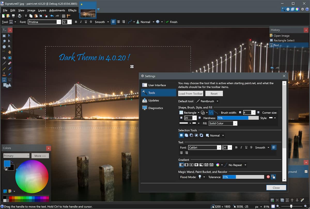
Primordialmente, não confundir o Paint do Windows 11 com o Paint.NET que é um software completamente diferente de edição de fotos.

Logo, podemos chamar a este software de edição de imagem uma versão simplificada do GIMP e Photoshop, não é brincadeira.

Para tal, a consideração pode ser apresentada graças à partilha uma série de ferramentas essenciais com os dois gigantes referidos, ficando apenas de fora todas aquelas funções mais complexas e confusos.

Ora, o Paint.NET permite a melhoria básica da fotografia, edição de camadas (layers) e também aplicação de efeitos. O conjunto de ferramentas pode ser facilmente expandido através de plug-ins gratuitos.

Ao nível da interface e acesso ao utilizador, o programa chega bastante simplificado e, em pouco tempo, é fácil de dominar.

Mas, importante, não nos devemos iludir, pois daqui não vamos encontrar uma ferramenta topo de gama. O principal objectivo do Pain.NET é a simplicidade com todos os instrumentos avançados e níveis pró propositadamente omitidos. Outra app que pode figurar nos melhores editores de fotos ou imagens para o Windows 11 em 2022.

Principais características do Paint.NET: 

  • Interface personalizável,
  • Ferramentas baseadas em camadas e níveis,
  • Kit de ferramentas expansível através de plug-ins
  • Coleção decente de pincéis

7. Corel PaintShop Pro 

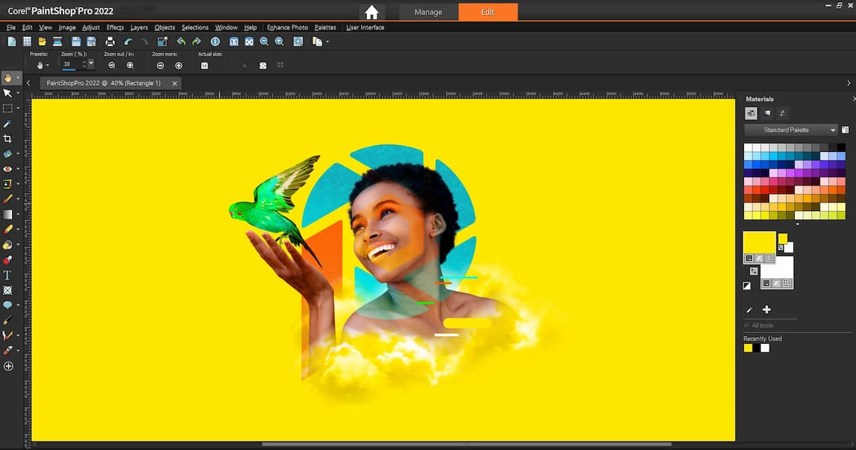
Não conhece este software? Então o melhor é mesmo desistir de ler o restante artigo uma vez que este software é dos mais antigos e famosos que persistem no mercado da edição de imagens

Assim, o Corel PaintShop Pro é um programa de fotografia para Windows 11 que pode ser utilizado como ferramenta de catalogação e como um editor de fotografia capaz.

Na verdade, a evolução do PaintShop Pro conta com a sua IA em todos os aspectos de edição:

  • Desde a correcção de cor até ao retoque de retratos
  • Suporta ficheiros RAW
  • Permite aos utilizadores processar imagens em grupos em termos de gama dinâmica e correcção de cor.

Importante, este editor não seria um verdadeiro produto da Corel se não dispusesse também de uma vasta gama de ferramentas de desenho vectorial. Além disso, o PaintShop Pro também traz modelos incorporados para colagens e folhetos.

Sem dúvida, este é um poderoso editor de fotografia para PC que pode rivalizar com os gigantes da indústria. Contudo, esta proeza traz um preço, uma vez que o PaintShop Pro é um programa faminto de RAM e sem um bom PC, vai ser mais complicado trabalhar com ele.

Principais características do Corel Paintshop Pro: 

  • Ferramentas de desenho gráfico,
  • Edição raster e vectorial,
  • Coleção de modelos de colagem,
  • Integração das redes sociais,
  • Biblioteca de pré-definições de melhoria.

8. Canva

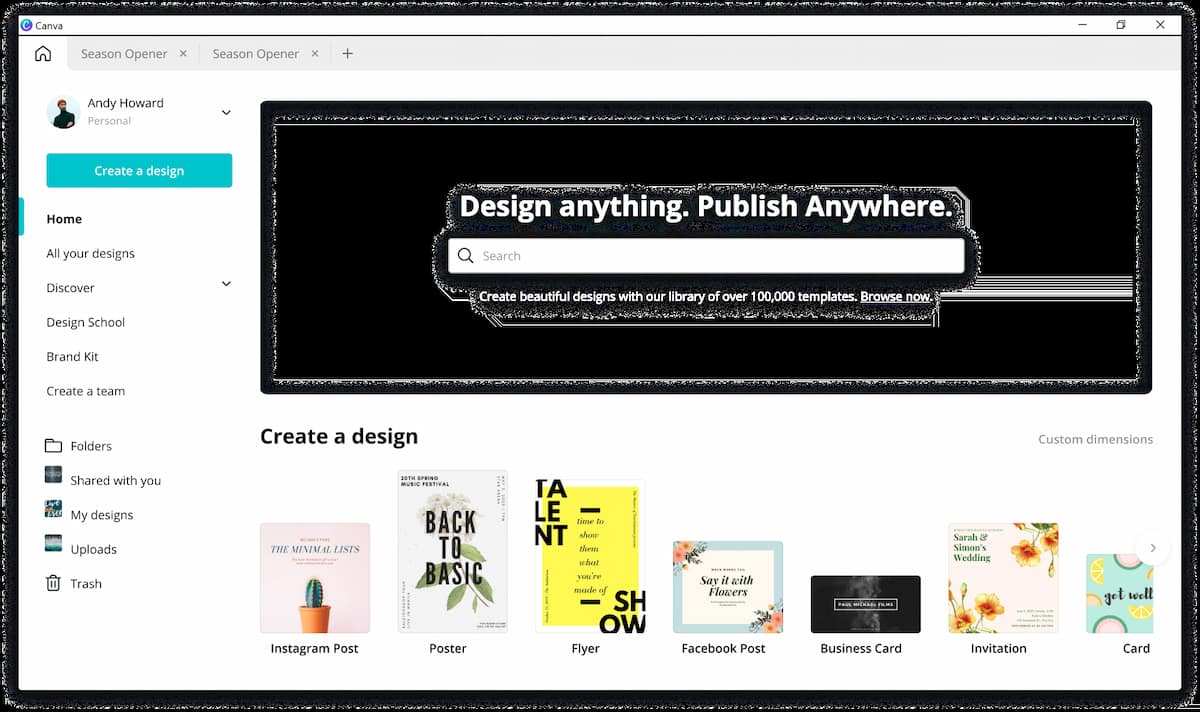
Em resumidas palavras, o Canva é mais uma ferramenta de desenho gráfico do que um editor de fotografia adequado, embora possua algumas ferramentas para a fixação de questões fotográficas comuns.

Logo, o principal objectivo desta aplicação baseada na web é a criação de todo o tipo de materiais visuais. O Canva oferece um tremendo conjunto de modelos para anúncios, cartazes, panfletos, posts nas redes sociais, currículos, etc.

Em segundo, no que a ferramentas de edição de fotos diz respeito, estas estão na sua maioria limitadas a modificações simples e a um conjunto de filtros. O Canva é uma aplicação freemium, o que significa que, embora possa definitivamente utilizá-lo gratuitamente, as suas opções de modelos serão severamente limitadas.

Principais características do Canva: 

  • Milhares de modelos para materiais visuais,
  • Elementos gráficos personalizáveis,
  • Modo de colaboração,
  • Biblioteca de imagens de stock

9. PicMonkey

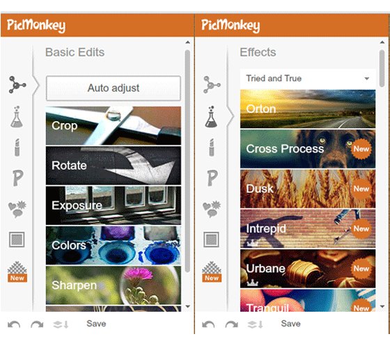
Desde já, define-se o PicMonkey como um editor de fotografia online extremamente fácil de usar.

Sobretudo, foi pensado para se destinar a utilizadores casuais que necessitam de corrigir as suas imagens para os seus blogs e posts Instagram, por isso não é de esperar quaisquer ferramentas de pós-processamento hardcore.

Ainda assim, com PicMonkey, pode:

  • Facilmente realizar quaisquer melhorias básicas,
  • Aplicar filtros,
  • Retocar retratos,
  • Decorar as suas fotos com texto, clipart, e molduras.

Este software de edição de imagens infelizmente não tem qualquer recurso de processamento em grupo e requer uma ligação estável à Internet para um desempenho sem bugs.

Principais características do PicMonkey: 

  • Grande coleção de filtros e efeitos,
  • Ferramentas de edição com base em corrediças,
  • Layouts e modelos de colagens,
  • Retoque eficiente de retratos.

10. Inpaint

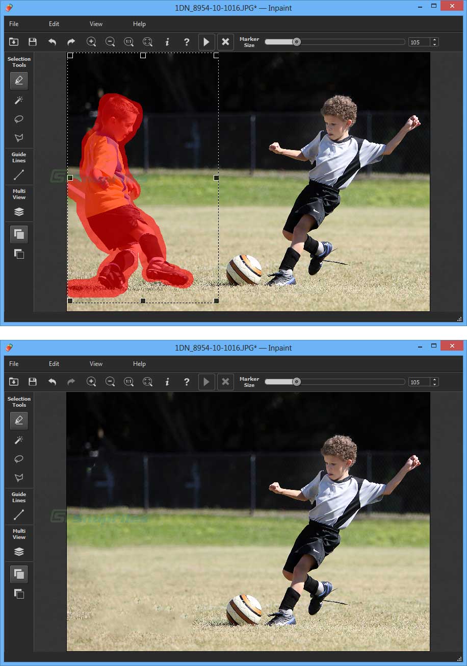
Para começar, o nome Inpaint  não será do conhecimento de muitos dos leitores deste artigo.

Então, a definição melhor que podemos atribuir é tratar-se de um programa de edição de fotos para Windows 11 com um conjunto de ferramentas severamente limitado.

Ainda mais, os programadores escolheram armazenar o programa com as características mais usadas e procuradas e torná-las tão boas quanto possível (ao invés de terem um kit de ferramentas alargado onde o desempenho de cada ferramenta seria subparcial).

Seja como for, é para isto que o Inpaint é bom: remover objectos estranhos, apagar marcas de água e selos de data, e consertar “arranhões”, bolhas e vincos de fotografias antigas. Basicamente, não há características adicionais.

Principais características do Inpaint: 

  • Remoção de objectos sem pares,
  • Resultados rápidos,
  • Ferramenta para restaurar espaços em branco em panorâmicas.

11. PhotoScape

Antecipadamente, o PhotoScape  é um software para PC que combina um editor fotográfico robusto, um programa de colagem fácil, e um programa de catalogação conveniente, um verdadeiro 3 em um.

Ou seja, possui todas as ferramentas de pós-processamento necessárias, juntamente com alguns instrumentos avançados de restauração de fotografias.

Ao mesmo tempo, o PhotoScape suporta ficheiros RAW e permite a edição em grupos de imagem. Existem, também, bastantes filtros e uma funcionalidade de criação de GIF. Ainda assim, o editor de imagens tem tendência para diminuir a qualidade das suas fotografias após a edição – este é um ponto absolutamente importante para todos os utilizadores.

Principais características do PhotoScape: 

  • Correcção fotográfica com um clique,
  • Conveniente ferramenta de gestão de fotos,
  • Milhares de modelos de colagem.

12. PhotoDiva

De acordo com outros software já aqui apresentados, o PhotoDiva é um software gratuito de edição de fotos para Windows 11 que se concentra principalmente no retoque de retratos.

De maneira idêntica, existem milhares de predefinições alimentadas por IA que podem retocar o rosto do modelo com apenas um clique no rato:

  • Suavizar a pele,
  • Branquear os dentes,
  • Remover olheiras, etc.

Igualmente, estão também presentes instrumentos manuais à base de lâminas deslizantes. O PhotoDiva oferece uma ferramenta de maquilhagem virtual sofisticada, instrumentos para remoção de objectos, uma característica de escultura facial e corporal e mais de uma centena de filtros artísticos.

Por outro lado, o software está também equipado com instrumentos essenciais para melhoramento de imagem, recorte, afinação, etc.

Por último, podemos afirmar que o PhotoDiva tem uma interface simplificada e é fácil de navegar. Ainda assim, o software apresenta alguns problemas no processamento de imagens com maior dimensão, contudo para uma grande maioria dos utilizadores é perfeitamente viável.

Principais características do PhotoDiva: 

  • Pré-configuração automática de embelezamento,
  • Ferramentas de escultura facial e corporal,
  • Característica de maquilhagem virtual,
  • Ferramenta de mudança fácil de fundo,
  • Suporte de ficheiros RAW  

13. PortraitPro

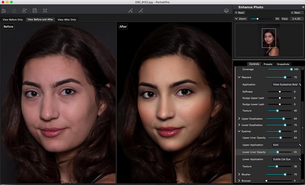
Em contrapartida ao software anterior, encontramos o PortraitPro outro software de edição de retratos que é considerado como de topo, na sua gama.

Em contrapartida, está equipado com uma IA avançada e oferece tanto ferramentas de embelezamento manual como automático.

Por outro lado, existem funcionalidades de processamento em grupo de imagens, instrumentos de remoção de objectos, e escovas de iluminação.

De maneira idêntica, o PortraitPro oferece opções como a substituição do céu alimentada por IA para tornar as suas fotografias ainda mais merecedoras de Instagram. O software é perfeito parautilizadores com poucos conhecimentos ou iniciantes, devido ao seu fluxo de trabalho intuitivo. Contudo, aconselha-se o uso dos efeitos de embelezamento com moderação, uma vez que têm a tendência de trazer resultados com um pouco de aspecto demasiado plástico.

Principais características do PortraitPro

  • Suporte de formatos RAW,
  • Capacidade de embelezar, mesmo fotos de perfil,
  • Detecção de características faciais sem par,
  • Remoção rápida do fundo

14. PhotoGlory 

Enquanto existem editores básicos, depois, há o PhotoGlory  que se define como um editor de fotografia para Windows 11 que tem um conjunto de ferramentas estritamente limitado, mas, neste caso, é por uma boa causa.

No fundo, esta aplicação foi desenvolvido especificamente para o restauro de fotos antigas. Devidamente equipado com uma IA bem pensada, o software permite o restauro automático e coloração de imagens antigas.

Segudamente, existem também ferramentas manuais para remoção de defeitos, bem como uma série de instrumentos de correcção de cor que o ajudarão a aumentar as cores desbotadas.

Ao mesmo tempo, e apesar de ser avançado nas suas características, o PhotoGlory é bastante fácil de usar e faz bem o seu trabalho, mesmo que ocasionalmente possa deixar o utilizador pendurado, também conhecido como crashado.

Principais características do PhotoGlory

  • Coloração automática e manual,
  • Restauro de imagens antigas com um clique,
  • Coloração de imagens em conjuntos de imagens,
  • Curvas e LUTs 3D para correcção de cor,
  • Mais de 150 efeitos de estilo: vintage, tonificação, etc.

15. AKVIS Retoucher

Restauro de fotografias antigas? Então o AKVIS Retoucher é outro editor de imagens que oferece das melhores ferramentas para o efeito sobre a recuperação de fotografias antigas.

Assim, todas as correcções são executadas automaticamente – basta escolher o modo de processamento correcto. Por outro lado, o software também permite melhorar as imagens ditas «normais» – modernas – corrigindo-as por cor, eliminando objectos aleatórios, e melhorando a sua composição.

Sob o mesmo ponto de vista, na verdade, não há muito mais que o AKVIS Retoucher possa fazer, pelo que a sua relação custo-benefício é questionável.

Principais características do AKVIS Retoucher

  • Remoção automática de defeitos,
  • Fácil ocultação de objectos estranhos,
  • Ferramentas de correcção de cor .

How Envato’s agile UX team works – InVision Blog

Agile delivery teams work in sprints with cross-functional teams to create small iterative or incremental improvements to a product.

UX designers prefer to work on the big picture alongside other designers

The trick is finding the balance between these 2 ways of working. UX designers on an agile delivery team need to be in several places at once while maintaining laser focus on the task at hand.

At Envato, we adapted a typical agile UX process to enable our UX designers to get this balance just right. Below I’ll explain how we started, the problems we encountered, and how we found the right balance with 3 modes of working.

Starting off with agile UX

We embed our UX designers within cross-functional feature teams made up of about 8 people, including a product manager and front- and back-end developers.

Each team specializes in a single part of our product—either a specific feature like our author upload tool, or a single customer journey such as the purchase process.

Every sprint (a repeatable 2-week process), the team ships a new iteration to the customer and measures the results.

It’s not easy to wedge the UX process—research, ideation, prototyping, user testing, and iteration—into a 2-week timeframe. So an agile UX designer typically works at least one sprint ahead of their team to ensure they can have designs ready for the developers and avoid becoming a blocker for the team.

The problem with working one sprint ahead

We discovered that working too far ahead created an environment of “us and them” where thedevelopers wanted designs delivered in a finished state, and UX designers felt pressured to keep delivering. It felt like design’s only purpose was to feed the development team with designs.

We spent most of the sprint fighting the little fires that occur when design and development aren’t aligned. Designers were more focused on trying to make the design work within the constraints that emerge during development. So the strategic work of defining the product of the future or the research into the customer’s needs rarely happened.

“Design’s only purpose should not be feeding the dev team with designs.”

We wanted to be measured by successful software in the hands of our customer—and not on the successful delivery of designs to the developers. So we made the switch to working half a sprint ahead.

This meant we needed to adjust the way we worked to fit 3 different modes of work. From collaborating with the developers and sharing their goal for the sprint, to working with the product manager on preparing just enough for the sprints ahead. We also made customer research an ongoing process and ensured we gave time for investigating the future product direction.

Working closely with front-end developers at Envato.

Working closely with front-end developers at Envato.

1. The current sprint

Our biggest priority: working with our team to focus on delivering the goal of that sprint. We need to make sure the developers have everything they need. As we gain knowledge during the sprint, we respond to the changes and compromises that need to be made. We find ourselves:

  • Doing just enough design—sketching and talking more than wireframing and creating mockups
  • Creating small iterations of the feature, not the full picture
  • Guerrilla user testing
  • Collaborating with front-end developers
  • Working with other designers to ensure a cohesive experience
  • Leaping in to help when problems pop up
Sketching flows and screens on a whiteboard.

Sketching flows and screens on a whiteboard.

2. Future sprints

UX takes longer than the 2 weeks you have for each sprint once you’ve considered the research, idea generation, testing, and feedback. So we need to be ready for the sprints ahead. Balancing preparing for the iterations ahead against not doing too much in advance or without the collaboration of the development team.

In our second mode, we focus on discovering what the right thing to build is so we can build it right. This includes:

  • Researching customer needs and pain points
  • Running an idea workshop—we like the Design Studio format
  • Sketching flows and screens
  • Building and testing prototypes with InVision
  • Gathering feedback from everyone, including the customer
  • Measuring outcomes from previous sprints to form new hypotheses
Discussing opportunities in the customer journey.

Discussing opportunities in the customer journey.

3. The roadmap

A product roadmap gives you a bird’s-eye view of where your product is going. And in order for the modes above to work, a product roadmap is key.

To create the roadmap, we collaborate with product managers. This is where we do most of our research. The teams are split between different customer types. Building a detailed picture of your customer is vital for creating a successful roadmap. We work on:

  • Jobs-to-be-done customer interviews
  • Service Design to map out the entire customer journey
  • Running workshops to gain a shared understanding of the future
  • Creating high-level concepts, a 10,000-foot view of the product in the future
  • Gathering feedback from business stakeholders
Collaborating with other designers.

Collaborating with other designers.

Design facilitation

We rarely sit at our desks. Design facilitation is our new role. We collaborate in the open to facilitate the design of the product. The results can only be realized once the design is part of the product and in the hands of the customer—we can’t do this alone.

“Design facilitation is our new role.”

So in addition to these 3 modes, we need to be great with people. We build really strong relationships and collaborate closely with several different people. We build empathy with them and their world to understand their goals and constraints. People like:

  • Developers
  • Business stakeholders
  • Other designers and researchers
  • The end user of the product
Organizing the work in-hand.

Organizing the work in-hand.

Making it work

All this seems very hard, and it is. The secret to making agile UX work: always know the most valuable thing you can do. We give each task 100%—as multi-tasking is not allowed. But we never forget to make time for the other work.

If you don’t develop a roadmap, your product won’t move forward. Without preparing for the work ahead, the whole team will slow down. And without working closely with developers those results won’t get realized.

“If you don’t develop a roadmap, your product won’t move forward.”

Things to try with your team

Nothing’s ever perfect. Every piece of design work is an iteration towards perfection and the search for more knowledge about the customer and their needs.

To be successful and happy working like this—as the UX designer in a fast-moving cross-functional team—you could say you need to be superhuman. But I think it’s more about being a super human being.

Fonte: How Envato’s agile UX team works – InVision Blog

Twitter’s Heart Animation in Full CSS

A few weeks ago, as everybody, I saw the Twitter Star turned into a Heart. The favorite into a like.

That was a huge source for debates for sure … but the only thing that I had in mind was … is it possible to make it with only CSS (not a single picture or SVG) ?

I know it’s not a matter of life and death but when something like that gets in my head it’s too late, I can’t sleep until I have a viable answer.

After a few trials on this challenge I finally have my answer. The result is not perfect (and it’s a lot of SCSS / CSS — almost 400 lines) but it’s satisfying (based on my expectations at least).

Image (gif) from the animation

I will now describe the steps I went through to find it.

First I divided it in 3 layers : the Heart (.heart), the Ring (.ring) and the Circles (.circles), and grouped them in a wrapper (.heart-wrapper). After this, I made the drawing for each layer, then the animation of each layer and finally mixed them all together.


Drawing

Heart

First part was the Heart.

I separated the full area in 4 rectangles :

  • Top / Left and Top / Right : 25% high / 50% wide
  • Bottom / Left and Bottom / Right : 75% high / 50% wide

And I used a pseudo element (:after) inside every rectangle and played withborder-radius property to be as close as possible to the original shape for each part.

Then I applied the color and overflow:hidden

Ring

The second part was the Ring.

This one is a simple rounded element with different border-size values andwidth / height values.

Circles

The third part was the Circles.

I built this one using a transparent rounded element in the middle and adding shadow boxes on it.

A shadow-box value for each circle, comma separated. The position x / y is computed based on the angle with sin / cos using Compass

Animation

Heart

Nothing too complex.

Increasing / decreasing the width / height of the main element (and setting the position left / top accordingly). The only thing is to make sure everything inside is relative to this element to adjust.

Ring

Adjusting the size of the border and the circle inside and the positionaccordingly as well as the color.

Circles

This one is a bit more tricky because all the border-shadow values have to be udpated all at the same time (position x / y, size, color) as it’s only one property with several comma separated values.

For instance :

And this is only for one step…

To make it easier to read and adjust, I created a SASS function to handle this :

This function loops through all the Circles (stored in a SASS Map) and set 2 by 2 (the big and the small Circles) the box-shadow values accordingly, based on the distances, the sizes, the angle of shift between them and the progression in the color, all passed as arguments.

Completion

Then I adjusted the timings / percentages of the animations according to what is explained in this post https://medium.com/@chrismabry/how-did-they-do-that-the-twitter-like-animation-2a473b658e43 by @chrismabry

Therefore I separated in 28 steps

$animStep: 100% / 27;

that run in 0.8s

$animDuration: 0.8s;

using a function to generate the percentages of the various steps :

@function setStep($n) { @return ($n — 1) * $animStep }

For instance :

#{setStep(6)}

will output :

18.51852%

And make the three layers superimpose with the good timing.

A picture will be better than a long explanation :

The animation will be active / inactive just by adding / removing the class(.active) on the container (.heart-wrapper). In my example this class toggles on click.


Conclusion

I achieved my goal but as you can imagine for me it was more a question of winning this personal challenge, nothing more.

Browser support is the same as the current version (IE10+) because the most advanced requirement is CSS3 Animation (http://caniuse.com/#feat=css-animation).

This is what it looks like :

I tried to keep the code as clean and structured as possible, and I used SASS variables for settings at the top to let people easily make some tests and changes. Feel free to let me know what you think and if you find something that can be improved (by setting the debug to true in the JS you’ll be able to see the animation step by step, with 1 click for each step).

Thanks for reading

Fonte: Twitter’s Heart Animation in Full CSS — Medium

Tips for Creating and Exporting Better SVGs for the Web

Working with SVG in a RWD workflow usually involves a design phase and a development phase. The design phase is usually handled by designers who may or may not know how to code. And because of the nature of SVG as both an image format and a document format, every step taken in the graphics editor in the process of creating the SVG directly affects the resulting code and hence the work of the developer in charge of embedding, scripting or animating the SVG. In my day-to-day work, I am usually the developer whom designers hand the design assets over to, and SVG images are part of those assets.

Most of the assets I’ve been handed in my past projects needed a do-over and/or a second round of editing in the graphics editor before I could script them, because the resulting SVG code was not optimized enough for the kind of work—especially animation—that I was hired to do. The reason for that is that many of the designers I’ve worked with knew very little—if anything—about SVG code. They create vector graphics and UI assets all the time, but, for them, SVG is no more than an image format and they don’t know much about the code generated when their assets are exported as SVG documents.

There are some steps that designers can take or avoid—a set of “dos and don’ts”—that can help make the generated code cleaner. In this article, I want to share some of these. If you know any more, please do share them in the comments at the end of the article.

The tips we’re going to go over are applicable in Adobe Illustrator (Ai)—my graphics editor of choice—as well as other graphics editors. But since I personally use Ai, it is what I will be focusing on throughout this article.

We’re also going to go over the current SVG export options available in Ai and which ones to choose and why. But note that these options will change in the future, and this article will then be updated to reflect those changes.

Note that this article is based on my talk “SVG For Web Designers (and Developers)”—a talk I gave at CSSDevConf 2015 last month.

So, let’s start.

There is a reason we have different basic shapes in SVG for creating, well, basic shapes. One could create practically any shape using a <path> element, right?

Simple shape elements (<line>, <circle>, <rect>, <ellipse>, <polygon> and<polyline>) are there for many reasons, and one of these reasons is that they are more readable and more maintainable and editable by hand than their <path>alternatives.

Basic shapes come with a set of attributes that allow you to control the shape features, such as position (x, y, cx, cy) and dimensions (width & height), while paths don’t come with these attributes.

For example, the following snippet shows the difference between a circle created and exported as a simple shape, versus one created and exported as a path:

<circle fill="#FFFFFF"
        stroke="#000"
        cx="28.1"
        cy="28.1"
        r="27.6"/>
<!-- versus -->
<path fill="#FFFFFF"
      stroke="#000"
      d="M55.7,28.1
         c0,15.2-12.4,27.6-27.6,27.6
         S0.5,43.3,0.5,28.1
         S12.9,0.5,28.1,0.5
         S55.7,12.9,55.7,28.1z"/>

If you want to animate your shape by, say, moving the position of the circle or making it bigger, you can do that by animating the position of the center via the x and y coordinates (cx & cy) and the radius of the circle (r). Whereas if you are working with a circle generated as a path, you will have to resort to CSS/SVG transformations (translation and scaling) to do that. And then suppose you want to animate that path and the animation requires you to apply further transformations to it? It can easily become a transformation mess.

Another advantage to using simple shapes is that, in the majority of cases, the code required to create a shape using simple shape elements is less than that required to create the same shape using a <path> element (see above snippet for a comparison), so using simple shapes will also result in a smaller file size, which is always better.

To convert text to outlines:

  1. Select the text you want to convert.
  2. Choose Type → Create Outlines

Pros:
  • Text converted to outlines will preserve the font face used, without having to use a web font to display it. This means you save a few extra HTTP requests and don’t risk displaying your text with a fallback font that generally doesn’t look good enough to substitute the beautiful font of your choice.Outlining the text and preserving the font face used is good for preserving a brand’s identity when the latter is defined by the font face used, for example: in a logo. I almost always turn logo text to outlines. Outlining is also good for preserving the font face of certain scripts when used for headlines.
Cons:
    • Text converted to outlines is not real text: it is a set of paths that form the outline (shape) of the text. Consequently, the text becomes unreal and inaccessible, not searchable and not selectable.In the case of a script headline or even a logo where the text is outlined, using analt text (if the logo is embedded as an image) or SVG’s accessibility elements (<title> & &>) is a good idea for providing alternative text for screen readers.I highly recommend reading all about making SVGs accessible in these two articles by Léonie Watson:
    • Converting text to outlines can significantly increase your SVG file size, depending on the complexity of the font face used. The image below shows the difference in the size (and readability) of an SVG with text converted to outlines (left) and text exported as SVG <text> (right).
  • Paths are not easily controlled and animated as <text> elements (including<tspan>s) are. The latter have a set of attributes that give you more control over your animations, while path data is limited in that sense.

A path is defined by a set of points which in turn are defined by a couple of coordinates each.

The less the number of points, the less the path data (d attribute), and, consequently, the less the overall SVG file size. This is always a good step to take because a smaller file size is better for performance.

To simplify a path:

  1. Select the path
  2. Go to Object → Path → Simplify
  3. Tweak the number of points. Make sure you have the Preview checked so can see how the path changes as you change the number of points. Tweak the number to get to the minimum number of points while preserving (or sacrificing) as much of the path’s visual appearance as you need.

There is a video tutorial created by Adobe to explain the process; so if you are more into videos, you can check it out here.

You can also simplify paths using the Warp Tool. I’m not a designer and I usually use Ai’s Simplify algorithm to simplify my paths, so, if you’re a seasonded designer, you probably alreay know much more about the Warp tool than I do. There is an article over at Smashing Magazine all about this tool, in case you want to check it out.

Many designers tend to combine or merge paths whenever possible. To merge paths:

  1. Select the paths you want to merge.
  2. Go to Window → Pathfinder
  3. Click the Merge option among the list of options at the bottom of the panel (third icon from the left, shown in the screenshot below).

Combining paths may have its benefits, but avoid it when you or the developer needs to control and/or animate paths separately. Some animations are designed so that multiple elements are animated seperately, or sometimes you just want to style the paths using different fill colors. If you combine the paths, that will no longer be possible.

You need to make sure you know what the developer (or yourself, if you’ll be handling the development phase as well) needs and wants to do with the shapes you’re working on, and make the decision to merge or not to merge accordingly. This will save both of you a lot of time and friction.

If you use the filters in the Photoshop Effects section under the Effect option, Illustrator is going to export the effects you create as raster images. For example, if you create a drop shadow using the Blur Photoshop effect, the drop shadow generated will be a raster image embedded inside the SVG either inline or externally, using <image>. You definitely don’t want that when you work with SVG.

To generate your effects as SVG code, you need to use the SVG Filters available:

  1. Go to Effect → SVG Filters
  2. Choose and use one of the filters available in that panel.

Have you ever embedded an SVG on a page, gave it a specific height and width and then found that it was being displayed at a size smaller than what you specified?

In most cases, this is caused by an amount of white space inside the SVG viewport. The viewport is displayed at the size you are specifying in your style sheet, but the extra space inside of it—around the graphic—causes your image to “shrink”, because that white space is taking an amount of, well, space, inside the viewport.

To avoid this, you need to make sure your artboard is just big enough to fit the drawing inside of it, but not any bigger.

The artboard dimensions are the dimensions of the exported SVG viewport, and any white space in the artboard will be generated as white space inside the viewport.

To fit your artboard to your drawing:

  1. Select the entire graphic. (I use cmd/ctrl + A.)
  2. Go to Object → Artboards and choose the Fit to Artwork Bounds option.

I know this sounds like a no-brainer, but it needs to be emphasized for a few reasons:

  • The IDs and class names you use in the graphics editor are going to be translated to IDs and class names in the generated code. The more these names make sense and the clearer they label their respective elements, the less friction there will be when the developer works with the code.Now, I’m not saying you have to think up the perfect names—I’m sure we all have different ways of naming things and naming can be one of the hardest tasks, but labelling groups appropriately goes a long way. For example, if you are drawing a car, then using an ID of wheel to name the layer or group wrapping the shapes making up the wheel would be appropriate. If you are grouping all wheels in one group, you might give it an ID wheels. Simple names to tell elements and groups apart go a long way and save a lot of time, especially if the developer will be editing and manipulating the code by hand.Illustrator does not do the best job at naming things, so specifying names helps reduce the amount of junk it produces. Granted, there will be some extra editing required to get rid of the annoying underscores that Ai insists on generating, but using proper names helps make this process a bit easier.

    As mentioned before, the next verison of Illustrator will show a big improvement in the way SVGs are generated, including generated IDs.

  • Use layers to group related elements. Layers are translated into groups in code, so name these well too. Create layers/groups to wrap related elements together, especially those that might be animated as a whole. A lot of time could be spent reordering and grouping elements by hand by the developer if this is not already done in the design phase. To save time, make sure you group appropriately. Talking to the developer in the design phase and designing how the animation will be executed together is a big time saver.
  • If the images you’re creating are going to be used to create an SVG sprite, the names you use can and will be used by most automation tools to generate new files. So using clear and proper names will result in cleaner file names.

At the time of writing of this article, Illustrator comes with a bunch of export options that allow you to generate a generally better SVG code.

To export your SVG:

  1. Choose File → Save As
  2. Choose SVG from the dropdown menu
  3. Click Save.

Once you click save, a dialog will show up that contains a set of options that you can customize, and that will affect the generated SVG code:

The options shown in the image above are the ones recommended for generating SVG for the web.

Of course, you can choose to Outline text if you don’t want to use a web font; Illustrator provides you with an option to do it upon export, as you can see, as well.

The Image Location option specifies whether any raster images will be embedded inline in your SVG or will be external with a link inside the SVG. This, again, depends on what you need. Inlining images inside the SVG can increase its file size dramatically. Last time a designer sent me an SVG with an image inlined in it, the file size was more than 1MB! After removing that image (which was caused by the Photoshop Effects used, that we mentioned earlier), the file size dropped to less than 100KB! So, choose wisely.

The CSS Properties option gives you the option to choose how you want the styles inside the SVG to be created: using presentation attributes, inline styles, or in a<style> tag. This is also a matter of preference and depends on how you intend to manipulate the SVG once you’ve embedded it. If you’re not the one who’s going to do that, make sure you consult with the developer to choose the option that suits their needs best.

The less the number of Decimal Places, the less the file size of the SVG. One decimal place should generally be enough, so I’d go with that.

Note that if you choose 3 or 4 decimal places, for example, and then use an optimization tool to optimize the SVG and bring that number down back to 1, the SVG might end up visually broken; so it is best to choose this option early on.

There is more to the options panel than what I have covered. Adobe’s Michaël Chaize has written an excellent article about the export panel that explains what each option does exactly. I highly recommend checking his article out:

Now, at the time of writing of this article, Illustrator will still generate unnecessary code such as editor metadata, empty groups, among others, so you will need to optimize the SVG further after you’ve exported it, be it by hand, or using a standalone SVG optimization tool.

But before we jump into the Optimization section, I want to note that you may or may not want to check an extra option as you save the SVG: the “Use Artboards” option, in the Save panel:

This option is useful for when you are working with multiple SVG images (for example: icons) and you are using an artboard for every icon.

Exporting multiple artboards will generate multiple .svg files, one for each artboard (one for each icon).

If you are working with only one artboard, this option will be disabled by default.

Choosing to export one or multiple SVG files depends on how the SVG is going to be embedded.

For example, if you are going to create an SVG sprite for an SVG icon system, there are several ways you can create and use the sprite, and each one would require a different approach: one technique requires the icons to be separate at first, and another requires them to be part of one image.

I will be writing a separate post about spriting SVGs and the artboard options, but until then, you can get an overview of the different spriting techniques in the following article I wrote for 24Ways.org:

It is usually recommended to optimize the SVG after exporting it from a graphics editor using a standalone optimization tool. The current most popular optimization tool is the NodeJS-based tool called SVGO. But it may not always be a good idea to optimize your SVG, especially if you intend to animate it.

If you intend to script and/or animate the SVG, you’re likely to set up a certain document structure—wrapper groups, ID names that you are not using/referencing inside the SVG but intend to use in your JavaScript, etc. This structure is going to change if you optimize your SVG using SVGO (or any other optimization tool).

Optimization tools usually remove any unused groupd and IDs, as well as apply many changes to the SVG to make sure it is optimized well.

I’ve once optimized an SVG after applying an animation to it using <animate>. The SVG was broken and so was the animation inside of it, because the entire structure was changed. So that is something to keep in mind before optimizing SVGs.

If you’ve manually edited and/or generated an SVG with a certain structure that you need, avoid optimizing using an optimization tool, and optimize by hand as much as possible. Some editor junk at the beginning and end of the SVG can be easily removed by hand. Other junk, such as metadata and classes generated by editors like Sketch—which has no SVG optmization options, can be harder to optimize by hand.

I generally never use Sketch to generate complex SVGs. I use Illustrator or Inkscape; the latter comes with a default export panel which gives you a lot of options to optimize your SVG before exporting it (see image below). Inkscape generates the cleanest SVG code at the time of writing of this article—that is, if you choose theOptimized SVG option, but the blurriness of the UI on a retina screen as well as its dependency on X11 on OS X make it a pain to use, so I am currently sticking with Illustrator.

If you do need/want to optimize your SVG, SVGO is the tool I would recommend.

SVGO comes with a bunch of plugins that you can fit into practically any kind of workflow. You can find more information about those tools in the following article I wrote a few months ago:

Possibly the most important tip I can give is to communicate, and to do it early in the design process.

I’m now assuming that you—the designer creating the SVG—are not the same person responsible for developing the SVG (scripting, animating, embedding, etc.).

Almost every one of the above tips requires knowledge of the development phase and what the developer intends to do with the SVG—how they intend to embed, script, style and animate it. So, unless you’re the same person making decisions for both phases, and unless you want to waste a lot of time reiterating and editing the SVGs, you need to make sure you know what the developer needs to do with the SVG and what approach(es) they will be taking. If you’re working on a project that has a tight deadline, you probably can’t afford to waste a big amount of time making changes and revisions to image assets, when you can avoid that by communicating early.

Designers and developers can be each other’s best friends. The very nature of SVG requires both design and development phases to be open to one another, and this, in turn, requires the designer(s) and developer(s) to talk, before the design process begins, and throughout the process as well.


I hope this article helps save you some time in the future. I’m not a designer so I might have missed a few clever design tips. If you know any that would help generate better SVGs, please feel free to share them in the comments below.

Thank you for reading.

Freelance Front-End Web Developer – Lebanon

Fonte: Tips for Creating and Exporting Better SVGs for the Web

Creating a hand-lettered logo design

Dina Rodriguez’s step-by-step process for creating a hand-lettered logo design that tells a vivid brand story.

Step 1: Discover the meaning of the brand

Before you begin sketching concepts, you need to reveal the purpose behind what you’re creating. You need to understand what typography means and how to use it to evoke an emotional reaction in your audience.

The most powerful tool a graphic designer has in creating logo design is typography. The typestyle you choose can have a strong effect on how your logo is perceived. You first need to understand the meaning of certain types of letters and how they can uniquely represent your company. This will help you decide which typography is best suited for your logo design.

Serif
A serif is a small line, flourish or embellishment trailing from the main stroke of a letter. Aside from the decorative element, serifs were created to increase the legibility of letters.

Font psychology: Traditional, Professional, Elegant, Strong, and Universal.

Sans Serif
Sans-serif fonts do not have the small projecting features called “serifs” at the end of strokes. The term comes from the French word sans (without).

Font psychology: Balanced, Modern, Clean, Simple, and Corporate.

Slab Serif
Slab Serif or Egyptian fonts resemble sans serifs in their simplicity but include boxy serifs on the end of each letter.

Font psychology: Authority, Heavy, Antiquity, Friendly, and American.

Script
Script lettering, which is similar to cursive or calligraphy, is often created with fluid strokes using a brush or nib.

Font psychology: Classic, Romantic, Welcoming, Warm, and Soft.

Blackletter
Blackletter script features elaborate thick-to-thin strokes and serifs and is seen with long swirls ascending from diagonal serifs.

Font psychology: Masculet, Hard, Historic, Dramatic, and Cold.

seth-rexilius-sketch-shotSign Painter
Sign painting is similar to Script, but the look needs to appear like it was made with a paint brush or brush pen for the desired hand-painted effect.

Font psychology: Vintage, Craftsmanship, Artistic, Playful, and Affordable.

Reveal the symbolism behind the company

Your logo is a visual representation of everything your company stands for. Far beyond a simple, pretty picture, a strong logo is filled with symbolism, both obvious and hidden. To help figure the symbolism behind the brand, focus on your message by writing ten words that illustrate a business’s key benefits. These words can be feelings, adjectives, objects or time periods.

Here are my 10 words: 1. Artistic 2. Valuable 3. Bold 4. Natural 5. Warm 6. Classic 7. Simple 8. Confident 9 Handmade 10. Welcoming.

Then, as a fun exercise, I want you to draw out your favorite word and illustrate its meaning through typography, decorations, and illustrations.

lettering-bold

For example, I drew “bold” in a tall serif font with a stroke sunburst coming towards you. In my mind, this is what I envision when I think of the word “bold” as it pertains to my brand. Thanks to this exercise, I now know that this vintage serif style will be perfect for the supporting text in my logo design.

Inspiration and visual research

At this point in my process, I like to create a mood board so I can visualize the style I have in my head. By creating my Pinterest board for Letter Shoppe, you can tell that I’m gearing towards a vintage script style. I encourage you to develop a mood board of your own that consists of at least 20 images to help mold your style for the brand.

letter-pinterest

Hint: be careful when pursuing popular trends because usually that design can become stale very quickly once that trend fades from popularity. So no matter what style you’re thinking of, make sure it remains timeless and unique.

Break time!

Now it’s time to take a 1-day breather to really get your ideas to steep. Breaks allow your brain to gather outside information so you can build a larger set of references that will be at your mental disposal when you start the sketching process.

Step 2: Experiment through sketching

Whether you’re a seasoned hand-letterer or a graphic designer who usually sticks to a digital canvas, I encourage you to start sketching your logo concepts with an old-fashioned pencil and paper. Without looking at any of your references, start to develop various thumbnails so you can explore some ideas.

This is your opportunity to experiment and really go wild with as many concepts as you can imagine. I usually rough out anywhere from 10 to 20 thumbnails for a complete look at all the possible design solutions.

Hint: A good way to get started is to build the skeleton of your letters first by simply writing out the words. Then, as you continue to experiment, make your drawings more and more refined by adding thickness and decorations.

letter-thumbs

As you get more comfortable drawing, allow yourself to break the rules and stir away from the most rigid forms of typography. Mix up upper- and lower-case letters, connect your marks, play with different sizes, and most importantly HAVE FUN!

Break time!

Alright, time for another break. Take anywhere from an hour to a day to go back to your sketches with fresh eyes.

letter-sketch

Revisit your thumbs and choose a few of your favorites to experiment further. Enlarge each of your drawings by filling up an 8.5 x 11 piece of paper so you have room to play. Remember to start off using a light pencil. You can go darker and darker as you build out the details.

At this point don’t be afraid to redraw your logo several times. Even the most talented hand lettering artists don’t get it on the first try. Spend the time to trace over your lettering and play with the spacing, perfect your balance or try out various styles and details.

“Even the most talented hand lettering artists don’t get it on the first try.”

Once your outline is complete, you can ink your piece using thin and thick Sharpies or Micron pens. This will help you see the weight of your letters so you can make sure each of your letters are consistent.

Hint: Use a thin marker for the outline of your drawing first, and then color it in with a thicker marker to fill in. Whether you feel more comfortable going to the computer at this point or perfecting your hand-lettered solution is up to you. Keep in mind when you’re building a logo from scratch, the more work you do in the drawing process, the less effort it’ll take to digitalize your work.

Step 3: Digitalize your final concept

Whether you want a rough or clean look for your logo will determine your digital process. This next part is going to go over some design techniques for digitizing your logo and requires an intermediate knowledge of Photoshop and Illustrator.

Cleaning up in Photoshop

1. Scan your image at 600 DPI—and please don’t just use your iPhone

2. Open up your scanned image of your sketch in Photoshop

3. Go to Image > Adjustments > Levels and pull in your whites and blacks so you can really see your lettering

letter-levels

Hit Command-R to pull up your rulers. Pull down some guides for your sketch to ensure all your letters rest on the same axis. You’ll want to place your guides on the base, descender, body, ascender and t line

letter-guides

Hint: Letters like C, S, O, capital Q and G rest slightly above and below your guides. This allows your letters to appear to be resting on the same plain.

o

5. Feel free to use your Lasso Tool to Select > Right Click > Cut out your letters to fix any alignment issues.

lasso

6. Now it’s time for a serious clean up. Zoom in close to add or remove anything else that may help to perfect your drawing.

Break time!

Hit Save. Now, step away from your drawing to take a break. Try not to go from screen to screen so you can give your eyes a proper rest.

7. After about an hour, go back to Photoshop and turn your drawing upside down. See any more imperfections? Maybe only some of your letters are straight while others are tilted, or your S’s and O’s look more oblong than round. Looking at your work from this perspective really helps in finalizing the details.

8. Turn your art board right-side up, hit Save, and you’re ready to vector!

Using Live Trace to vectorize your work

If you want a more natural look to your lettering, I recommend using Live Trace to vectorize your work. This will give your artwork a more organic, rough feel that looks more hand-drawn with tiny imperfections.

1. Open up Illustrator and place your PSD into your art board.

2. Select your piece and go to Object > Live Trace > Tracing Options. Once your dialog box shows up, hit Preview and play with your settings until you get your desired result. I usually start off with the Black and White Logo preset and go from there.

Here’s a look at my settings for my Letter Shoppe logo. The reason we placed a .psd file rather than a static .JPG is that now you can review your traced logo and still make changes. Maybe you realize that your lines aren’t connecting, or you have additional scuff marks that need to be edited. Simply go to you .psd file, make the changes, and hit Save. Your changes will automatically update in your live traced art.

letters-live-trace

3. If everything is looking good, go to Object > Expand to flatten your image.

letter-expand

4. Feel free to edit your anchor points accordingly until your logo is exactly how you want it. I usually use the smooth tool under the Pencil Palette to smooth out any rough edges. Check out the amazing before and after below.

letter-smooth

Creating a perfect vector logo

Thanks to an awesome article by AGCS, I have a completely new approach to clean vectors using 0 and 90-degree bezier handles. I’ll use my letter S as an example using this new method.

1. Open up Illustrator and Place a PSD of your sketch into Illustrator.

2. Select your image and lower the opacity of your sketch. Hit Command-2 to lock your layer.

3. Create a new layer Command-L and place your nodes strategically along the curves of your letter’s outermost point. Check out my diagram below illustrating where each of my anchor points lie.

letter-nodes

4. Remember to hold Shift when dragging out your handles to snap them horizontally and vertically.

letters-handles

This will no doubt take some practice to perfect, but keeping your bezier handles straight will allow you to use fewer nodes and have an all around cleaner result. Yes, there will be times when perfect handles won’t work, and that’s fine. It’s more important that your vectors look good over anything else. Now, let’s check out that sexy S.

letter-final-s

Adding textures to your lettering

For some added roughness, you can add subtle jagged lines on the outside of your letters so it appears to be more hand-lettered. The more subtle the lines, the bigger you’ll have to scale your artwork before adding the effect. Go to Effects > Distort & Transform > Roughen.

Feel free to play with the settings in order to get your desired result, and be sure to checkAbsolute.

Once it’s complete, go to Object > Expand Appearance to lock in the image.

letter-roughen

Now for the icing on the cake: texture! I like to use this vector texture pack from Seanwes, but feel free to create your own textures. Some people like to apply their textures directly into Photoshop and then live trace, but I’ll allow you to select your preference.

letter-texture

Adding just the right color

I always save color for last, but I usually have a general color palette in mind while I’m brainstorming and sketching.

A good way to choose a color palette is to base your selection on those words we came up with in the beginning. For example, some of my main words are “artistic” and “handmade,” so my plan was always to keep my logo design one color in either black or white. I’ve also chosen my supporting colors by placing my lettering on all-natural matte blacks, pearl whites, wood browns, and paper creams to help bring a clean artisan look to my hand-lettering portfolio.

letter-color“Do not exceed 3 colors in a logo design unless it’s absolutely necessary.”

Hint: Do not exceed 3 colors unless it’s absolutely necessary! A 5-color logo could be gorgeous, but once it comes time to produce it, things can get pretty pricey to print.

Test for readability

A great logo looks great no matter what size it is. It needs to have an interesting visual hook, accompanied by well-kerned typography. Make sure that your logo reads in seconds and is memorable. I usually test my logo at a business card size (3.5 x 2) to ensure its readability.

letter-scale

Get some outside feedback

Especially when you first start creating your logo design by hand, it’s important to get feedback from colleagues and other designers. This is where places like Instagram andDribbble come in handy, not to mention just showing a friend who isn’t a designer.

“A great logo looks great no matter what size it is.”

It’s important to get the perspective of other people because they may see a flaw or improvement that you can’t. Sometimes it can be hard to recognize improvements or faults with a design when you’ve been focusing on the design too long.

I know: no one likes to get their work criticized, but it’s a necessary evil in our industry. Getting constructive criticism will enable you to improve your work. Try to stay open-minded and experiment with the changes others suggest. It may result in an even better logo because even a little change can make all the difference.

Fonte: Creating a hand-lettered logo design – InVision Blog

6 Secrets Designers Won’t Tell

Trade secrets are hard to find out. Designers try to keep them as secret as they can, but to no success. Well, they won’t get any help from us. We are here to share tips and tricks, so every creative professional’s dream comes to reality.We have rounded up six secrets designers won’t tell.

Take these secrets kindly – they won’t make you a better designer nor they will help you win awards. They are just useful tips and tricks that will probably suit your needs. It all comes down to how you want to work. Scroll down below and see what all the fuss is about.

1. Steal stuff

6-Secrets-Designers-Won’t-Tell-1

Image source

Yup. Steal stuff, and make it your own. I don’t mean plagiarize other people’s stuff. I mean get inspired by their work, take their craft and make something of your own. Designers will never admit to this, but every successful creative professional has done this, and will do this.

Let’s put it this way – you have an idol in the creative business, he is an incredibly talented artist, and you want to become like him. First off, read what he reads, visit places that he visits. Be in the medium that he puts himself constantly. See what inspires him and steal it for yourself. Make it your inspiration. Adapt it to your needs.

You will soon be on the way of stealing his clients if you are so passionate about the work you do. There is no shame in being better at the game than your peers. It’s a pity of not playing it, regardless of the outcome.

2. Procrastinate as long as you can

6-Secrets-Designers-Won’t-Tell-2

Image source

Inspiration will hit when you least expect it, so why not do the things you love the most? Procrastinate until you can work, those are words that I live by. Explore different things and ideas. Read a good book, watch an awesome movie that you are postponing for such a long time.

Or you could do the most menial task there is like arranging your music collection backwards, by age – what album is the closest to Michael Jacksons last album. By all means, go crazy.

We all know the fear of a deadline creeping, and how we fluster getting back to work. Eventually, you will have to get back to work and leave the art of procrastinating for another day.

3. Don’t overpromise

6-Secrets-Designers-Won’t-Tell-3

Image source

You will be inclined to overpromise a lot of stuff, just to snag that client under your fingers. The most important thing here is to realize how much time you have on your hands, and if you can finish the project that you promised.

You just promised your client that you will have three revisions, and a new layout for him till’ tomorrow, didn’t you? Keep doing that and you will lose them faster than saying – Deadline not met. Be sincere and realist, so you have time to meet his expectations of quality and quantity.

4. Pretty doesn’t count

6-Secrets-Designers-Won’t-Tell-4

Image source

Don’t just make your project eye-candy, make it also fully responsive. Prioritize on the functionality and how will it make it get viral, rather than just creating only a beautiful design. People will stare at the beauty, but they will come back if it is useful.

Pretty doesn’t count if you don’t bring anything else to the table, and pretty will fade soon in front of other mesmerizing things that will eventually appear. Think on the long-term, and how your project will stand the test of time. Will it be remembered? Or will it be forgotten?

Don’t get me wrong here, it is nothing bad in creating a beautiful design, but you need utility for it to flourish and grow to its full capacity.

5. Don’t prioritize on being unique

6-Secrets-Designers-Won’t-Tell-5

Image source

John Oliver once said – “ I like to think of news and advertising as the separation of guacamole and Twizzlers. Separately, they are good. But if you mix them together, you make them both gross.”; if you prioritize on only creating unique projects, of only shocking your peers and the world, you will meet a dead end, filled only with frustration, and despair. You don’t have to be ashamed on creating designs that just fit the norm.

By doing so, you will have the opportunity of finding your niche, on being unique by exploring the standards and pushing boundaries to the limit. When you get past the limit that was set by your predecessors, you will not recognize it as being unique, you will just tell yourself that you are in the norm. Others will do that for you, others will applaud and gawk at your designs, and call them unique.

6. Finish one before starting another

6-Secrets-Designers-Won’t-Tell-6

Image source

Working on different projects and expecting to get them all to be innovative has to be one of the silliest things I have heard in a while. Focus on each task appropriately, and indulge in the art form the proper way. If you get clustered with tons of projects, not only they will lack the quality that you and the client desire, but they will become a burden, and you will soon start hating the thing that you love the most – designing, creating art.

Inspiration will hit, but where to use it? How to use it? It will become a stressful situation that you don’t need in your life. This doesn’t mean that you should work on just one project at a time, you create your pace, but be careful how you multitask – it can lead to ruin.

Take into consideration these neat tips and tricks, these disclosed secrets and use them wisely. Do you have one that you would like to share with us? Feel free to post in the comments section below. We would just love to hear you out!

Editor’s Note: This post was originally published in September 2014 and has been completely revamped and updated for accuracy and comprehensiveness.

Fonte: 6 Secrets Designers Won’t Tell, by Claudia

15 Free HTML CSS3 Social Media Buttons

Muito simples de integrar. Usei um destes para OpenCart.

Social Button Collection

Includes differnt shapes and sizes of attraive social media buttons in css which can be easily added to your existing website code.

Demo | Download

social buttons

Pure Social Buttons in css3

A rolling effect with horizontal display of modern social icons will blow your mind.

Demo | Download

rolling css social button

Fancy Buttons

Another visual treat to the website  visitors to share your content or bookmark the website on their timeline.

Demo | Download

style button

Hover Fancy

This time you will find a different hover style which ends with a text display.

Demo | Download

fancy css

Sexy Social Buttons

Color effect on hover will display the original color of the top social network websites.

Demo | Download

sexy social buttons

Social Buttons Slide

Four major social media networks which can be showed up in your blog with vertical slide animation. The snippet also shows the social counter stats of your page or shared link.

Demo | Download

social slide

Social Footer

Social Footer with long shadows which can be used on footer of the page.

Demo | Download

social media icon for footerSocial Section

A set of social icons with nice hover effect.

Demo | Download

social buttons

Social Share

A social sharing icon set with three popular networks Google, Facebook, Twitter.

Demo | Download

social share

Social Networks

A bar of fixed social networks.

Demo | Download

social networks

 Circular Social Icons

A three icons showcasing Google, Facebook, twitter in all its glory.

Source | Download

circular social icons

Share Buttons

A set of social media share buttons with a 3D effect that makes you want to click them!

Demo | Source

Share Buttons

Color Changing Social Bar

On hover on any of the social network icons the background portion will change color similar to the network.

Demo | Download

color social icons

Flat Social Buttons in CSS3

A long version of share buttons to match your website sidebar.

Source

flat long buttons

CSS Social Ribbons

Simple yet stylish CSS Social Ribbons.

Source

social ribbons

Social Navigation

A vertical style navigation.

Source

social navigation

Fonte: 15 Free HTML CSS3 Social Media Buttons

Smarter Grids With Sass And Susy

Michelle Barker shows how to create fast, responsive, fully customizable grids in CSS without touching your markup with Susy, a Sass-based grid framework.

If you’re a designer, you’ll know that grids are your friends. More often than not, they’re the vital architecture that holds a beautiful design together; they create rhythm, structure your page, lead the eye, and prevent the whole thing collapsing in a sloppy mess.

I’m a firm advocate for designing with the browser: prototyping with HTML and CSS has many clear advantages over static Photoshop comps, which have less value for the responsive web. Unfortunately, HTML, CSS and grids aren’t natural bedfellows: the progression of web standards over the years has been lacking in this area, meaning we have to grapple with floats (which were never designed to be used this way) and clearfixes — not ideal when you want to spend less time debugging layout and more time crafting experiences.

The relatively new implementation of the flexbox and CSS grid layout modules are on course to free us from the constraints of floats and allow us to create some pretty interesting layouts — which I’m excited about — but they’re not a magic bullet. Even with those, coding up a layout can still be a lengthy process for a designer, and require you to remember a bunch of not very intuitive properties.

Happily, lots of tools currently exist to enable you to quickly design grids for the web, from CSS frameworks like Bootstrap and Foundation, to sites like Responsive Grid System. However, frameworks have their drawbacks, such as requiring you to add a large number of classes to your markup, and delivering a bloated codebase that can be bad for performance.

Luckily for us, solutions exist to the problem of creating fast, responsive, fully customizable grids: Susy is a Sass-based grid framework. It’s very lightweight and enables you to create entirely custom grids in CSS without touching your markup.

Susy was developed by Eric M. Suzanne, with support from Chris Eppstein — creator of Compass and co-creator of Sass — so it’s very well supported in the Sass community and it’s rapidly gaining in popularity.

Framework Or Not? Link

I tend to refer to Susy as a framework, but it may be more accurate to call it a grid system. Unlike more traditional frameworks, Susy doesn’t require you to add classes to your HTML elements. Susy is written entirely in your SCSS file by adding mixins and functions, using media queries to customize your layout at your own specified breakpoints. It enables you to keep content and style entirely separate — not essential all the time, but widely viewed as best practice.

Before we continue, I should point out that Susy isn’t the only solution: Zen Grids by John Albin and Jeet by Cory Simmons are two others. Singularity is also a pretty interesting framework, which works in a similar way to Susy, using Sass mixins rather than adding classes to your HTML. However, Susy has a growing community and helpful documentation, making it a good choice to get started with.

Advantages Link

Why might you want to use Susy in your next project? There are several advantages:

  1. (Relatively) Easy to Learn
    If you’ve used other frameworks (like Bootstrap or Foundation), and if you’re familiar with Sass at all, Susy shouldn’t be too difficult for you to pick up. Even if you’re fairly new to Sass, Susy doesn’t require in-depth knowledge and is a great way to start! The examples in this article assume a working knowledge of Sass, so it’s worth reading up a little if you’re not familiar.
  2. Speed Up Your Workflow
    Unlike many other frameworks, Susy doesn’t come with a bunch of default styling that you need to overwrite. In fact, Susy has no styling: it’s purely a grid layout system. Its purpose is to do the maths for you — anything else is for you to add. Once you’re familiar with a few of Susy’s mixins, you’ll find it’ll save you time and free you up to concentrate on design.
  3. Use as Much or as Little as You Like
    As with Sass, you can pick and choose what works for you. We’ll focus on a few fairly simple examples here, but you can use Susy to do some pretty complex things if you’re so inclined!

I should also point out that while Susy currently relies on traditional floats to position your grid, the documentation indicates that flexbox and CSS grid layout could well be forthcoming, which will make it even more powerful!

Getting Started Link

Susy was designed to work with Compass, so if you already have Compass installed then setting up Susy is straightforward. You don’t actually need to use Compass in order to use Susy — Susy is compatible with just about any Sass workflow — but for the purpose of getting started I’ll be using Compass as a primary example.

To install Susy, simply run the following in the command line:

$ gem install susy

(If you get an error, you may need to prefix this command with sudo.)

Then set up your new project. If you’re using Compass, in your config.rb you need to add require 'susy'. Then, in your main SCSS file (in this case screen.scss) add @import "susy"; to import Susy into your project.

Alternatively, CodeKit is an excellent app for getting up and running with everything you need and allows you to add Susy to your project quickly and easily.

Finally, we need to create an index.html file in our project folder to house our markup, and link it to our style sheet.

Building Our First Susy Grid Link

Assuming you’ve gone through the necessary steps to run Susy in your project, we’re ready to create our first layout. First of all, we need to define some parameters for our grid in a map at the beginning of our main SCSS file. If you’ve come across Sass maps, you’ll be familiar with the syntax:

$susy: (
  columns: 12,
  container: 1200px,
  gutters: 1/4,
  global-box-sizing: border-box,
  debug: (image: show)
);

In this map you can define pretty much any of the global settings for your grid, from the number of columns to gutter width, all of which are listed in the Susy documentation. If you don’t enter a setting in your map, Susy will simply use its default settings. There are a few things we’ll need to define to create our grid:

  • The number of columns we’ll use.
  • The maximum width of the container. If you don’t specify a width, your container will be 100% of the width of the viewport, like any block element. You might want this in some cases but, especially while we’re learning, setting a maximum width allows us to see more clearly what’s going on.
  • Gutters. By default Susy includes gutters as right-hand margins on your columns and at one quarter (1/4) of the column width. You can change the gutter ratio here, or use gutter-position to decide how you want gutters to behave.
  • Box-sizing. I always prefer to set this to border-box. (Susy’s default is content-box.)
  • The debug image. Setting this to show displays a background image showing your column grids, useful for making sure everything is aligned correctly and your elements behave as they should.

Creating A Basic Layout Link

We’re going to start by creating this simple layout using Susy:

We’ll start with some markup containing a header, a main content area with article and sidebar, and a footer.

<main class="wrapper">
  <header></header>
  <article></article>
  <aside></aside>
  <footer></footer>
</main>

As I previously mentioned, Susy depends entirely on CSS and Sass to customize your grid, so you don’t need to add anything else to your HTML. The most important feature for creating grids in Susy is the span mixin. Use @include to include the mixin in your Sass. As you can see from the image, we want our header and footer to take up 100% of the container width, so we don’t need to do anything here. But we need our<article> and <aside> elements to take up eight columns and four columns respectively in our twelve-column grid. In order to achieve this we need to use thespan mixin:

/* SCSS */

article {
  @include span(8 of 12);
  /* More styles here */
}

aside {
  @include span(4 of 12 last);
  /* More styles here */
}

There are a couple of things to note here:

  1. Susy depends on context: we could easily write @include span(8) for the<article> element, which would produce the same result because we already defined our layout as four columns in the map. However, if we wanted to override the map for this particular element (say, subdivide this area of our layout into a greater number of columns), we need to specify the context — in this case, twelve columns.
  2. We want the <aside> to be the last item in the row, so we’ve added the wordlast to the mixin. This tells Susy to remove the right-hand margin on that element so that it fits on the row.

If we take a look at our CSS file, we’ll see the above Sass compiles to:

article {
  width: 66.10169%;
  float: left;
  margin-right: 1.69492%;
}

aside {
  width: 32.20339%;
  float: right;
  margin-right: 0;
}

You can see that Susy has calculated our column widths and gutters based on the settings we specified in our map.

In the Codepen example I’ve included some dummy content, as well as a little padding and a background color on our elements. Without these our grid would simply be invisible, as Susy has no default styling.

As we’re floating elements, we also need to remember to clear our footer:

    
header {
  padding: 2em;
  background-color: #FF4CA5; /* Of course, you can define your colours as variables if you prefer! */
}

article {
  @include span(8);
  padding: 2em;
  background-color: #ff007f;
}

aside {
  @include span(4 last);
  padding: 2em;
  background-color: #CC0066;
}

footer {
  clear: both;
  padding: 2em;
  background-color: #7F2653;
}

Finally, we’ll include the container mixin in our main element to give our content a maximum width and position it in the center of the page by setting the left and right margins to auto:

main.wrapper {
  @include container;
}

With these additions, we get this result:

Refining Our Grid Link

We could do with separating the elements to make our layout more pleasing. Let’s add a bottom margin to our <header>, <article> and <aside> elements. What would make an even more appealing layout would be to make our bottom margins the same width as our column gutters. With Susy, we can do this using the gutter function (as opposed to the mixin):

header, article, aside {
  margin-bottom: gutter();
}

As we haven’t specified a value in the gutter function, Susy will use our map settings; that is, 1/4 column-width in a twelve-column layout. But if, for instance, the section we were working on was only eight columns wide, we may want to specify gutter(8) to create the same effect.

Our SCSS file now looks like this:

main {
  @include container;
}

header, article, aside {
  margin-bottom: gutter();
}

header {
  padding: 2em;
  background-color: #FF4CA5;
}

article {
  @include span(8);
  padding: 2em;
  background-color: #ff007f;
}

aside {
  @include span(4 last);
  padding: 2em;
  background-color: #CC0066;
}

footer {
  clear: both;
  padding: 2em;
  background-color: #7F2653;
}

Now our layout looks like this:

Mixins Vs. Functions Link

We just used gutter as a function, as opposed to including it in a mixin. It’s worth noting that span, gutter and container can all be used as both mixins and functions. The Susy documentation outlines use cases for each, but our next example should help give you an understanding of the circumstances in which a function might be useful.

There’s one more thing that will no doubt be extremely handy to you as a designer: thegallery mixin. As the Susy documentation succinctly puts it, “Gallery is a shortcut for creating gallery-style layouts, where a large number of elements are layed [sic] out on a consistent grid.” It’s great for unordered lists, for example, if you want to create a portfolio page.

We’ll use the following markup for a gallery of twelve items — again, I’ve added some placeholder content in the Codepen example:

<main>
  <header></header>
  <article>
    <ul class="gallery">
      <li></li>
      <li></li>
      <li></li>
      <li></li>
      <li></li>
      <li></li>
      <li></li>
      <li></li>
      <li></li>
      <li></li>
      <li></li>
      <li></li>
    </ul>
  </article>
  <aside></aside>
  <footer></footer>
<main>

We’ll keep the same SCSS from the previous example, with the addition of the following:

ul.gallery {
  padding: span(1 of 8);
  list-style: none;
}
    
.gallery li {
  @include gallery(2 of 6);
  margin-bottom: gutter(6);
  
  &:nth-last-child(-n + 3) {
    margin-bottom: 0;
  }
}

There are a few things going on here:

  1. First, we’re using span as a function to add one column-width of padding all the way around our gallery. As the element is eight columns wide, taking up one column-width on either side leaves us with the remaining six columns for our gallery items.
  2. Using the gallery mixin on our <li> element (@include gallery(2 of 6)), we’re telling Susy that each item should take up two columns in our six-column width. That means that each row will hold three gallery items.
  3. Using the gutter function (margin-bottom: gutter(6)) we’re adding a bottom margin the equivalent of one gutter-width in our six-column context to each item in our gallery. I’m using the :nth-child pseudo-class to remove the bottom margin from our last row, giving us a perfectly even amount of spacing around our gallery.
  4. As we’re floating elements, we’ll also need a clearfix on the parent element (in this case the ul element). In the example, I’m using Compass’s clearfix, but you could create your own mixin, or write it longhand.
    ul.gallery {
      @include clearfix;
    }

Result:

Susy For Responsive Web Design Link

Although the examples we’ve walked through so far are based on fluid grids (Susy’s default), they aren’t responsive — yet. At the beginning of this article I mentioned that Susy is a great tool for designing responsively. Let’s look at one more example to see how we can use Susy to create a layout that adapts to different viewport sizes.

In this demo we’ll use use media queries in our Sass, along with Susy’s layout mixin to customize our grid for different breakpoints.

You’ll recall that at the beginning of our SCSS file we created a map with our global settings. In fact, we can create any number of maps and summon them at will into our layout with this mixin. This is useful if at a certain breakpoint you want to switch from, for instance, a twelve-column to a 16-column layout with no gutters. Our second map may look something like this:

$map-large: (
  columns: 16,
  container: auto,
  gutters: 0,
  global-box-sizing: border-box
);

For this example I’ve created a simple gallery webpage displaying a collection of photos of found typography. Taking a mobile-first approach, our first step is to create a single-column view, where our main elements take up the full width of the page. However, in our gallery section, we want our images to display in rows of two once our viewport gets wider than, say, 400px and in rows of three after 700px. We’re using atwelve-column grid in our global settings, so all we need to do is instruct Susy to set our gallery items at six columns out of twelve, and four columns out of twelve respectively, in min-width media queries:

li {
  @media (min-width: 480px) {
    @include gallery(6);
    margin-bottom: gutter();
  }
  @media (min-width: 700px) {
    @include gallery(4);
    margin-bottom: gutter();
  }
}

At widths above 700px, this is what our webpage looks like:

At desktop sizes we’re going to make our layout a little more complex. Here we want our header to display as a bar on the left-hand side and our gallery items to display in rows of four on the right of the screen, with no gutters. To achieve this we’re going to switch to a 16-column layout, as defined in the new map we created a moment ago.

We’re going to use the layout mixin as follows:

@media (min-width: 1100px) {
  @include layout($map-large);
  
  header {
    @include span(4);
  }
  
  main {
    @include span(12 last);
  }
  
  li {
    @include gallery(3 of 12);
    margin-bottom: 0;
  }
}

The layout mixin sets a new layout for our grid. Any code following this mixin will be affected by the 16-column layout we specified. (Note: if you want to revert back to a different layout, you’ll need to use this mixin again to call a different map, as your code will be affected by this mixin until you specify otherwise!)

In this instance, the <header> element will span 4 colomns out of 16 and the main content area will span the remaining 12 out of 16 columns. Because our gallery items are nested within this 12-column section, we should specify that they take up 3 columns out of 12 (rather than 16).

The above code gives us this layout at desktop sizes:

Dealing With Sub-Pixel Rounding Link

If you’re working with percentage-based grids you’re going to come up against sub-pixel rounding issues. These occur when percentages result in column widths that subdivide a pixel, so the browser rounds your column width up or down by a pixel to compensate. This may mean your layouts don’t always behave as you might expect. For a full explanation of sub-pixel rounding, read “Responsive Design’s Dirty Little Secret” by John Albin Wilkins.

Susy provides a workaround for dealing with sub-pixel rounding via its isolatetechnique, and it’s a handy port of call when your layouts aren’t playing nice.

Conclusion Link

I hope this article has helped you get started with Susy and provided a small taste of what is possible. Once you spend a little time getting the hang of it, you’ll see how easy and fast it is to create simple or complex layouts without a huge amount of code; and it really will save you time in the long run.

Here are some useful links and resources to help you get started with Susy:

(ds, ml, og)

Fonte: Smarter Grids With Sass And Susy

Lightbox2 – Visualização de imagens com estilo no teu site

Lightbox2 – Visualização de imagens com estilo no teu site

Criado por Pedro Pinto em 27 de Abril de 2011 | 27 comentários

Agora com suporte para o IE9!

Em 2008  (uffff ja passaram 3 anos), apresentamos aqui o Lightbox que permite dar um toque profissional e moderno ao nosso site, disponibilizando um efeito especial para apresentação de imagens. Esse efeito é bastante usado aqui no pplware e podem confirmar carregando na imagem de introdução deste artigo. Recentemente foi disponibilizado o Lightbox v2.05.

Vamos aprender como colocar em funcionamento o Lightbox no vosso site.

light_00

Como usar o Lightbox2 no nosso site?

Para colocarem o lightbox2 a funcionar no vosso site, devem seguir os seguintes passos:

Passo 1 – Download do script aqui (lightbox2.05.zip)

Passo 2 Descompactar e colocar na raiz do vosso site

Passo 3 –  Editar a página que permitirá visualizar as imagens e colocar a seguir a <header> o seguinte código:

http://js/prototype.js
http://js/scriptaculous.js?load=effects,builder
http://js/lightbox.js

Passo 4 – (Imagem única) Criem um “thumbnail” da imagem original e coloquem um link na imagem do tipo:

<a href=”images/imagem1.jpg” rel=”lightbox” title=”Minha foto”>Carregue Aqui</a>

onde:

  • imagem1.jpg é o nome da imagem (em tamanho original). A imagem está dentro da pasta imagens.
  • title – Um título para a imagem

light_01

Passo 5(Grupo de imagens) Quem pretender disponibilizar um grupo de imagens, e incluir um menu de navegação devem usar o código seguinte em substituição do anterior:

<a href="images/image-1.jpg" rel="lightbox[roadtrip]">image #1</a>
<a href="images/image-2.jpg" rel="lightbox[roadtrip]">image #2</a>
<a href="images/image-3.jpg" rel="lightbox[roadtrip]">image #3</a>

light_02

E está feito. Agora basta abrir a página que acabaram de desenvolver para observar se as imagens são apresentadas com estilo. Alguma duvida ou questão que tenham, podem colocar em comentário para vos podermos ajudar.

Alguém conhece outros scripts do género?

Artigos relacionados

Homepage: LightBox2