Twitter’s Heart Animation in Full CSS

A few weeks ago, as everybody, I saw the Twitter Star turned into a Heart. The favorite into a like.

That was a huge source for debates for sure … but the only thing that I had in mind was … is it possible to make it with only CSS (not a single picture or SVG) ?

I know it’s not a matter of life and death but when something like that gets in my head it’s too late, I can’t sleep until I have a viable answer.

After a few trials on this challenge I finally have my answer. The result is not perfect (and it’s a lot of SCSS / CSS — almost 400 lines) but it’s satisfying (based on my expectations at least).

Image (gif) from the animation

I will now describe the steps I went through to find it.

First I divided it in 3 layers : the Heart (.heart), the Ring (.ring) and the Circles (.circles), and grouped them in a wrapper (.heart-wrapper). After this, I made the drawing for each layer, then the animation of each layer and finally mixed them all together.


Drawing

Heart

First part was the Heart.

I separated the full area in 4 rectangles :

  • Top / Left and Top / Right : 25% high / 50% wide
  • Bottom / Left and Bottom / Right : 75% high / 50% wide

And I used a pseudo element (:after) inside every rectangle and played withborder-radius property to be as close as possible to the original shape for each part.

Then I applied the color and overflow:hidden

Ring

The second part was the Ring.

This one is a simple rounded element with different border-size values andwidth / height values.

Circles

The third part was the Circles.

I built this one using a transparent rounded element in the middle and adding shadow boxes on it.

A shadow-box value for each circle, comma separated. The position x / y is computed based on the angle with sin / cos using Compass

Animation

Heart

Nothing too complex.

Increasing / decreasing the width / height of the main element (and setting the position left / top accordingly). The only thing is to make sure everything inside is relative to this element to adjust.

Ring

Adjusting the size of the border and the circle inside and the positionaccordingly as well as the color.

Circles

This one is a bit more tricky because all the border-shadow values have to be udpated all at the same time (position x / y, size, color) as it’s only one property with several comma separated values.

For instance :

And this is only for one step…

To make it easier to read and adjust, I created a SASS function to handle this :

This function loops through all the Circles (stored in a SASS Map) and set 2 by 2 (the big and the small Circles) the box-shadow values accordingly, based on the distances, the sizes, the angle of shift between them and the progression in the color, all passed as arguments.

Completion

Then I adjusted the timings / percentages of the animations according to what is explained in this post https://medium.com/@chrismabry/how-did-they-do-that-the-twitter-like-animation-2a473b658e43 by @chrismabry

Therefore I separated in 28 steps

$animStep: 100% / 27;

that run in 0.8s

$animDuration: 0.8s;

using a function to generate the percentages of the various steps :

@function setStep($n) { @return ($n — 1) * $animStep }

For instance :

#{setStep(6)}

will output :

18.51852%

And make the three layers superimpose with the good timing.

A picture will be better than a long explanation :

The animation will be active / inactive just by adding / removing the class(.active) on the container (.heart-wrapper). In my example this class toggles on click.


Conclusion

I achieved my goal but as you can imagine for me it was more a question of winning this personal challenge, nothing more.

Browser support is the same as the current version (IE10+) because the most advanced requirement is CSS3 Animation (http://caniuse.com/#feat=css-animation).

This is what it looks like :

I tried to keep the code as clean and structured as possible, and I used SASS variables for settings at the top to let people easily make some tests and changes. Feel free to let me know what you think and if you find something that can be improved (by setting the debug to true in the JS you’ll be able to see the animation step by step, with 1 click for each step).

Thanks for reading

Fonte: Twitter’s Heart Animation in Full CSS — Medium

Tinderesque – building a Tinder-like interface with CSS animations and vanilla JS #justcode

Tinder is a very successful dating app, and one of its features is a way to say yes or no to prospective partners by swiping right or left or pressing a yes or no button. The interface is cards that drop when you press the buttons.

As with any successful interface, a lot of clones that mimick them happen very fast. One of those is FontFlame – a Tinder for Font Pairings. When I saw this one, I thought the animation isn’t right (it just moves to the right or left and fades, there’s no turning or popping up). I tried to fix the CSS animation to match more closely what Tinder is doing, but to my dismay I found out that whilst Fontflame uses CSS animations, they get over-ridden by jQuery ones. I contacted the author and offered my CSS animation to replace the current one.

Just for fun, I packed this up into a quick solution consisting of a CSS animation and some JavaScript to control the voting process.

I called it Tinderesque. You can see it in action, Get the code and read the instructionshow to use it on GitHub.

Here’s some explanations on how Tinderesque works.

THE TINDERESQUE ANIMATION

Animating the cards is no rocket science: we rotate the card after setting the transformation origin to the bottom of the card and shift it up a bit to get a “discard” effect.

First up, we need to define the HTML of the collection of cards we want to vote on. This should be pretty straight forward:

html

To achieve the animation effect we need to give the card we want to animate some dimensions and set its transform origin to its bottom:
.card {
  width: 150px;
  height: 200px;
  display: block;
  background: #666;
  transform-origin: 50% 99%;
}

This ensures that the card doesn’t get rotated around its centre but the bottom instead.

For the positive scenario, we rotate the card clockwise and push it up a bit to get the discard effect. This can be done using a rotate and translateY transformation. We also animate the opacity of the card from 1 to 0, effectively hiding it.

@keyframes yay {
  from {
    transform: rotate(0deg);
    opacity: 1;
  }
  to {
    transform: rotate(40deg) translateY(-80px);
    opacity: 0;
  }
}

For the negative use case, we rotate the card counter-clockwise:

@keyframes nope {
  from {
    transform: rotate(0deg);
    opacity: 1;
  }
  to {
    transform: rotate(-40deg) translateY(-80px);
    opacity: 0;
  }
}

We then trigger these animations by adding and removing classes on the parent elmement of the cards:

.cardcontainer.yes .card {
  animation: yay 0.7s ease-out;
}
.cardcontainer.nope .card {
  animation: nope 0.7s ease-out;
}

GOING THROUGH THE WHOLE CARD DECK

In order to go through the card deck two things must happen:

  • We need to animate the current card using the positive or negative animation
  • When the animation is finished, we need to remove the card from the document and show the next one.

By default, we hide all the cards in the deck. Only the one with the class of current is visible:

.list .card {
  display: none;
}
.list .current {
  display: block;
}

This means that we need to shift the class of current to the next card once this one has been approved or discared. But first, we need to trigger the animation. In order to achieve this, we need either a hover or some clever trickery with checkboxes in CSS. It is more extensible though to use JavaScript.

TRIGGERING THE ANIMATIONS

All we need to trigger the animations is adding an event handler attached to the buttons in the HTML. Depending on which button was pressed we add a yes or nope class to the parent element of the button – in this case, the cardcontainer DIV.

function animatecard(ev) {
  var t = ev.target;
  if (t.className === 'but-nope') {
    t.parentNode.classList.add('nope');
  }
  if (t.className === 'but-yay') {
    t.parentNode.classList.add('yes');
  }
}
document.body.addEventListener('click', animatecard);

We’re using event delegation here with a click handler on the body of the document. We can of course extend this to pointer or touch handlers to allow for touch events and simulating swipe gestures.

ACTING AFTER THE ANIMATION USING EVENTS

Our card has now been animated and is invisible, but it is still in the document and the next card isn’t visible yet. We need to remove the card and shift the current class to the next card in the deck.

Every CSS animation has an animationend event we can use for that. The event gives us the name of the event, which gives us the name of the class to remove.

function animationdone(ev) {
 
  // get the container
  var origin = ev.target.parentNode;
 
  // remove the appropriate class
  // depending on the animation name
  if (ev.animationName === 'yay') {
    origin.classList.remove('yes');
  }
  if (ev.animationName === 'nope') {
    origin.classList.remove('nope');
  }
 
  // if any of the card events have 
  // ended…
  if (ev.animationName === 'nope' ||
      ev.animationName === 'yay') {
 
  // remove the first card in the element
    origin.querySelector('.current').remove();
 
  // if there are no cards left, do nothing
    if (!origin.querySelector('.card')) {
      // no more cards left - 
      // TODO other functionality
    } else {
 
  // otherwise shift the 'current' class to 
  // the next card 
      origin.querySelector('.card').
        classList.add('current');
    }
  }
}
document.body.addEventListener(
  'animationend', animationdone
);

That’s more or less all we need to do. Except that Safari still hasn’t joined us in the year 2015. That’s why we need to repeat both the CSS animation definitions in our CSS with –webkit– prefixes and add an event handler for webkitAnimationEnd. I refuse to do so here, as this is depressing, but you can see it in the tinderesque source code.

EXTENDING THE FUNCTIONALITY USING CUSTOM EVENTS

The functionality now is pretty basic, which means we want to make it as easy as possible to extend it. The simplest way to do that is to add Custom Events that fire when things happen to our card deck. This is as easy as using this function:

function fireCustomEvent(name, payload) {
  var newevent = new CustomEvent(name, {
    detail: payload
  });
  document.body.dispatchEvent(newevent);
}

Custom events can get a payload – you can define what the listener gets as parameters. In the case of tinderesque, the animatecard function has been extended to send a reference to the button that was clicked, its container element (in case you have several decks) and a copy of the current card.

function animatecard(ev) {
  var t = ev.target;
  if (t.className === 'but-nope') {
    t.parentNode.classList.add('nope');
    fireCustomEvent('nopecard',
      {
        origin: t,
        container: t.parentNode,
        card: t.parentNode.querySelector('.card')
      }
    );
  }
  if (t.className === 'but-yay') {
    t.parentNode.classList.add('yes');
    fireCustomEvent('yepcard',
      {
        origin: t,
        container: t.parentNode,
        card: t.parentNode.querySelector('.card')
      }
    );
  }
}

This allows you to read the content of the card before it gets removed from the document.

var b = document.body;
b.addEventListener('nopecard', function(ev) {
  console.log(
    ev.detail.card,
    ev.detail.card.innerHTML
  );
});
b.addEventListener('yepcard', function(ev) {
  console.log(
    ev.detail.card,
    ev.detail.card.innerHTML
  );
});

Tinderesque also fires a custom event called deckempty when the last card got removed from the list. In the demo page this is used to re-stack the deck:

var b = document.body;
b.addEventListener('deckempty', function(ev) {
  var container = ev.detail.container;
  var list = container.querySelector('.cardlist');
  var out = '<li class="card current">#1</li>';
  for (var i = 2; i < 6; i++) {
    out += '<li class="card">#' + i + '</li>';
  }
  list.innerHTML = out;
});

This should get you well on the way to build your own Tinder-like interface. If I find the time, I will record a screencast doing exactly that.

CUTER – A QUICK DEMO USING TINDERESQUE

As a demo, I put together Cuter – a way to say yes or no to cute animal pictures and end up with a list of the ones you chose.
You can see it on YouTube:

https://www.youtube-nocookie.com/embed/6kvDBUTPV74?rel=0

Fonte: Tinderesque – building a Tinder-like interface with CSS animations and vanilla JS #justcode | Christian Heilmann

50 new useful CSS techniques

These are great times for front-end developers. After months of exaggerated excitement about HTML5 and CSS3, the web design community now starts coming up with CSS techniques that actually put newly available technologies to practical use instead of abusing them for pure aesthetic purposes. We see fewer “pure CSS images” and more advanced, clever CSS techniques that can actually improve the Web browsing experience of users. And that’s a good thing!

In this post we present recently released CSS techniques, tutorials and tools for you to use and enhance your workflow, thus improving your skills. Please don’t hesitate to comment on this post and let us know how exactly you are using them in your workflow. However, please avoid link dropping, but share your insights and your experience instead. Also, notice that some techniques are not only CSS-based, but use JavaScript, or JavaScript-libraries as well.

[Offtopic: by the way, did you know that there is a Smashing eBook Series? Book #2 is Successful Freelancing for Web Designers, 260 pages for just $9,90.]

CSS Techniques

Now Playing: transitions and animations with CSS
Tim Van Damme showcases a fairly simple CSS design that uses transitions, animations and subtle hover-effects to produce an engaging user experience. Also, notice the use of favicons as background-images for attribute selectors. Unfortunately, the demo works best in Webkit-browsers, but it degrades gracefully in other modern browsers. Unfortunately, we didn’t find the documentation of the technique.

Css-technique-394 in 50 New Useful CSS Techniques, Tutorials and Tools

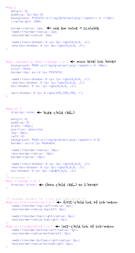
CSS3 range slider, checkbox + radio button
A demo of HTML input elements made with CSS3. They include realistic range sliders, checkboxes and radio buttons. The designer used minimal markup, no JavaScript and no images. Downside: there is a ton of messy CSS3 code, and Safari renders the page best. Chrome is close, but the 3D perspective doesn’t quite work.

Css-technique-409 in 50 New Useful CSS Techniques, Tutorials and Tools

CSS3 Media Queries
CSS2 allows you to specify stylesheet for specific media type such as screen or print. Now CSS3 makes it even more efficient by adding media queries. You can add expressions to media type to check for certain conditions and apply different stylesheets. For example, you can have one stylesheet for large displays and a different stylesheet specifically for mobile devices. It is quite powerful because it allows you to tailor to different resolutions and devices without changing the content. Continue on this post to read the tutorial and see some websites that make good use of media queries.

Css-technique-323 in 50 New Useful CSS Techniques, Tutorials and Tools

Proportional leading with CSS3 Media Queries
A fluid layout should be responsive to the width of the columns of text. This problem, of proportional leading, is what holds many designers back from adopting fluid layouts. In this article, Andy Clarke explains how you can achieve proportional leading for your typography using CSS3 Media Queries.

Css-technique-408 in 50 New Useful CSS Techniques, Tutorials and Tools

Responsive Web Design
This article by Ethan Marcotte explains how to use fluid grids, flexible images, and media queries to create elegant user experiences with responsive web design. Check out the demo — of course, don’t forget to resize the browser window.

Css-technique-414 in 50 New Useful CSS Techniques, Tutorials and Tools

Popout Details on Hover with CSS
This tutorial describes a technique that presents details of a content item on hover. The solution is quite simple and uses position: relative and z-index to achieve the effect.

Htmldemo2 in 50 New Useful CSS Techniques, Tutorials and Tools

CSS3 Border-Radius and Rounded Avatars
Trent Walton came up with a clever technique to create rounded images (in this case, rounded avatars) with the border-radius property. The solution is simple: create a frame class for your image, and give it a border. Then, round both the frame and image with the border-radius property, and you’re done: a simple technique with no additional images or scripts — just an extra line of code. You may want to checkTim Van Damme’s similar CSS technique, too.

Css-108 in 50 New Useful CSS Techniques, Tutorials and Tools

CSS3 Rounded Image With jQuery
“The other day I was trying to style CSS3 border-radius to image element and I realized that Firefox doesn’t display border-radius on images. Then I figured a way to work around it — wrap a span tag around with the original image as a background-image.”

Css-technique-379 in 50 New Useful CSS Techniques, Tutorials and Tools

The Simpler CSS Grid
Why restrict your layout so that it can fit into this 960gs? A grid is supposed to help you in design, not to limit your creativity. The 978 grid is not just about increasing the page width, but to loosen the gutter space, so users can read it more comfortably.

Css-technique-321 in 50 New Useful CSS Techniques, Tutorials and Tools

Correcting Orphans with CSS Overflow
When typesetting, designers try to avoid leaving just one or a few words hanging on a line at the end of a paragraph. Doing so is considered poor typography because it leaves too much white space between paragraphs and interrupts the reader’s eye movement (see the example below). A simple typographic solution is to rework the line by adding indented paragraph endings. But the problem is particularly annoying when aligning a paragraph next to an image that exceeds the paragraph’s height. Soh Tanaka has come up with a simple and quick solution to this problem with CSS.

Css-technique-412 in 50 New Useful CSS Techniques, Tutorials and Tools

Apple-like Retina Effect With jQuery
This tutorial explain how you can recreate the effect displayed on the image below, using jQuery and CSS.

Css-technique-500 in 50 New Useful CSS Techniques, Tutorials and Tools

How to create a kick-ass CSS3 progress bar
New features introduced in CSS3 allows developers to create stunning visual effects: this post exaplains how you can create a fancy progress bar using CSS3 and jQuery, without Flash or images.

Css-technique-335 in 50 New Useful CSS Techniques, Tutorials and Tools

CSS pseudo-element Solar System using semantic HTML
This is a complete reworking of another author’s basic reproduction of the classic model of our solar system using CSS. By using pseudo-elements (again) I wanted to reproduce as much as possible without presentational HTML and JavaScript. In addition, by hooking into HTML microdata I’ve put together a rough scale model of the solar system that demonstrates some further uses of CSS generated content.

Css-technique-415 in 50 New Useful CSS Techniques, Tutorials and Tools

Advanced Columns using the :nth-child(N)
Imagine this task: you have to display product listings as columns laid out in a zig zag pattern. The first instinct is to split each section into its own list, but if the site is running on a CMS, all products had to be spit out in one giant list. Given this scenario, you can use pseudo-selectors :nth-child(N) and a bit of jQuery to help with IE support.

Css-technique-324 in 50 New Useful CSS Techniques, Tutorials and Tools

Lost World’s Fairs
Trent Walton explains the workflow and design techniques used to create the Lost World’s Fairs website to celebrate the launch of Internet Explorer 9. The result is truly remarkable.

Css-technique-404 in 50 New Useful CSS Techniques, Tutorials and Tools

New Twitter Design with CSS and JQuery.
This post explains the techniques used by Twitter’s new web interface and re-creates its interactivity using CSS and jQuery.

Css-technique-314 in 50 New Useful CSS Techniques, Tutorials and Tools

Europe, CSS & jQuery clickable map
CSS converts a simple list of countries into the fully clickable map. Works with disabled style sheets and JavaScript, as well as on mobile devices. A simple code does not require Flash Player or other plug-ins!

Css-technique-413 in 50 New Useful CSS Techniques, Tutorials and Tools

Simple Tooltip w/ jQuery & CSS
There are a lot of tooltip plugins out there, but not many of them explain what exactly goes on in the logic of a tooltip. I would like to share how I’ve created mine today, and am also open to any critiques and suggestions for those jQuery ninjas out there. Lets take a look.

Css-technique-325 in 50 New Useful CSS Techniques, Tutorials and Tools

Super Cool CSS Flip Effect with Webkit Animation
Webkit support some fancy transform and animation effects that can really spice up the web experiences for users with Safari or Chrome browsers. Here’s a quick look at how the rotateY property can produce a flip effect, and how it can be used to create a Transformers themed top trumps design.

Css-technique-399 in 50 New Useful CSS Techniques, Tutorials and Tools

CSS3 Border Images for Beautiful, Flexible Boxes
The CSS3 buzz is in full swing, and many of CSS3′s most useful properties are receiving a fair bit of attention. Properties like border-radius, text-shadow, custom gradients, and even CSS3 transitions have been shown to be quite practical, resolving real-world design issues with minimal markup and maintainable code.

Css-199 in 50 New Useful CSS Techniques, Tutorials and Tools

Animated wicked CSS3 3D bar chart
Create a beautiful 3D bar chart. But instead of creating a “stacked” one, several bars are placed under each other. When hovering, the animation shows and the bar grows to the appropriate size.

Css-technique-411 in 50 New Useful CSS Techniques, Tutorials and Tools

CSS Border Tricks
Since I released my new redesigned blog, a lot of people have asked me how I styled the pressed effect on my category navigation. I would like to share some simple border style tricks to get various effects for your next project.

Beveled in 50 New Useful CSS Techniques, Tutorials and Tools

The Background Trick With CSS
This page provides links to a couple of examples for the trick used on Design Made In Germany 5 where a couple of layers are used and the middle layer has a fixed background, while other layers have absolute positioning. The visual effect is unique and interesting. Unfortunately, the explanations are in German, but the demos are self-explanatory.

Css-technique-403 in 50 New Useful CSS Techniques, Tutorials and Tools

Footnotes With CSS
in their simplest implementation — using sup tags and linking within the page — footnotes aren’t very user-friendly. They interrupt the experience, requiring the user to click the link, read the information and then return to the page with the browser’s “Back” button.” Lukas Mathis has come up with an elegant solution to improve this user experience: his jQuery script shows the content of footnotes as soon as the user indicates that they are interested in it — i.e. when they move the cursor over the footnote symbol.

Css-166 in 50 New Useful CSS Techniques, Tutorials and Tools

Why and how to create Microsoft Office Minibar with jQuery and CSS3
Although many will argue that Microsoft products are an example of a good design, Minibar was one of design refreshments that came out with the Office 2007. It is a variation of a toolbar that exposes context-related functionality. In case of MS Word, context is a text selection. Since Minibar always pops up near the mouse pointer it enables users to quickly perform actions related to a selection.

Css-technique-388 in 50 New Useful CSS Techniques, Tutorials and Tools

CSS image replacement with pseudo-elements (NIR)
An accessible image replacement method using pseudo-elements and generated-content. This method works with images and/or CSS off; works with semi-transparent images; doesn’t hide text from screen-readers or search engines; and provides fallback for IE6 and IE7.

Css-technique-416 in 50 New Useful CSS Techniques, Tutorials and Tools

Diagonal CSS Sprites – Aaron Barker
So you’ve got your sprite created, and it’s working great. 30+ icons in one image, and major HTTP connections saved. You have made your little corner of the interwebs a little happier and faster. Steve Souders would be proud.

Css-110 in 50 New Useful CSS Techniques, Tutorials and Tools

Sneak — Fixing the background ‘bleed’
I recently came up with an issue in Safari where the background colour of an element seemed to “bleed’ through the edge of the corners when applying both borders and a border-radius (see the image above). I then found a solution, and it came in the form of the -webkit-background-clip property.

Css-121 in 50 New Useful CSS Techniques, Tutorials and Tools

Zebra-striping rows and columns
Zebra-striping tables is certainly not a new thing; it has been done and discussed for years. They (allegedly) aid usability in reading tabular data by offering the user a coloured means of separating and differentiating rows from one another. We can create zebra-stripes using the nth-of-type selector — but we can apply it not only to rows but also columns.

Css-technique-341 in 50 New Useful CSS Techniques, Tutorials and Tools

Feature Table Design
“I ran into the feature table design and I was inspired to try and replicate it. First in Photoshop, then in HTML/CSS. Recreating cool stuff you find on the web is definitely an excise I recommend (a few days after, I read this – couldn’t agree more). As these exercises typically do, it lead me down some interesting paths.”

Css-technique-372 in 50 New Useful CSS Techniques, Tutorials and Tools

ShineTime – A jQuery & CSS3 Gallery With Animated Shine Effects
This article shows how you can create an animated Shine Effect with jQuery & CSS3 and then use it to create your very own Shiny Gallery ‘ShineTime’. This effect is useful in making your user interface elements look like they’re a real polaroid photo (or made of glass) and the best part is, it’s not that difficult to achieve.

Css-technique-373 in 50 New Useful CSS Techniques, Tutorials and Tools

The Mac-style Skype Application Menu with CSS3 and jQuery
This tutorial re-creates the Skype application menu in the web browser. The final design mimics not the full layout — only the menu where all your friends are listed. For the nifty layout CSS3 is used and jQuery is used for the extra functionality.

Css-technique-381 in 50 New Useful CSS Techniques, Tutorials and Tools

Further Interesting Techniques

Object-oriented CSS
All the resources you need to get started are linked from the left navigation. Start by downloading the base files. Exercises one and two can be completed in Firebug if you are comfortable with it. Then you can download the finished file at the beginning of Exercise 3.

Css-technique-326 in 50 New Useful CSS Techniques, Tutorials and Tools

clearfix Reloaded +
clearfix and overflow:hidden may be the two most popular techniques to clear floats without structural markup. This short article is about enhancing the first method and shedding some light on the real meaning of the second.

CSS3 text-shadow and box-shadow trick
All browsers that support the CSS text-shadow and box-shadow properties also support the new CSS3 RGBa syntax. Which means you can safely combine them today. That’s handy, because it means no worrying about matching a precise hex colour shadow to a specific hex colour background. Instead just let the browser blend.

Data theft with CSS
Mozilla has released security updates to Firefox 3.5 and 3.6 that include defenses for an old, little-known, but serious security hole: cross-site data theft using CSS. These defenses have a small but significant chance of breaking websites that rely on “quirks mode” rendering and use a server in another DNS domain (e.g. a CDN) for their style sheets.

Show Markup in CSS Comments
“Let’s say you are creating a CSS file for a modular bit of a webpage. Perhaps you are the type that separates your CSS files into bits like header.css, sidebar.css, footer.css, etc. I just ran across an idea I thought was rather clever where you include the basic markup you will be styling as a comment at the top of your CSS file.”

Css-114 in 50 New Useful CSS Techniques, Tutorials and Tools

How to Micro-Optimize Your CSS
Minification shrinks file size significantly, by as much as 30% or more (depending on input code). This size-reduction is the net result of numerous micro-optimization techniques applied to your stylesheet. By learning these techniques and integrating them into your coding practice, you’ll create better-optimized CSS during the development process. Sharper skills, cleaner code, faster downloads — it’s a “win-win” for everyone.

Css-157 in 50 New Useful CSS Techniques, Tutorials and Tools

Transparent Borders with background-clip
Have you ever seen an element on a page with transparent borders? I think Facebook originally popularized it giving birth to lightbox plugins like Facebox. I don’t think Facebook sports the look anymore, but it’s still rather neat.

Css-130 in 50 New Useful CSS Techniques, Tutorials and Tools

Showing and hiding content with CSS 3
One very common feature is the expanding/collapsing or shown/hidden box, whether this is a tabbed interface, a content “tray” on the side that can be slid out and then put away again, or a complex tree menu with expanding/collapsing sub-menus. Generally, these features are implemented via JavaScript, however using CSS3 it is possible to create such content using only HTML and CSS — no JavaScript required.

CSS for Blockin’ Stuff
If you want to use user stylesheets, ad blockers, flash blockers, or whatever else, more power to you. Here are some CSS projects intended for blockin’ stuff.

CSS Tools and Services

ProCSSor: Advanced CSS Prettifier
This online tool allows you to submit your CSS (either copy and paste the code, upload the file or point to a URL) and choose your formatting options. You can save options and reuse them every time you run code through ProCSSor. You can separate properties and selectors across multiple lines, indent up to four levels with either the space bar or tab key and even sort properties. The tool also has a “Columnize” mode, which groups elements into columns, making for a more elegant style sheet; you need to deactivate “Fail-safe mode” to use it.

Css-technique-417 in 50 New Useful CSS Techniques, Tutorials and Tools

Selectivizr – CSS3 selectors for IE 6-8
selectivizr is a JavaScript utility that emulates CSS3 pseudo-classes and attribute selectors in Internet Explorer 6-8. Simply include the script in your pages and selectivizr will do the rest. Selectivizr adds support for 19 CSS3 pseudo-classes, 2 pseudo-elements and every attribute selector to older versions of IE. It can also fix a few of the browsers native selector implementations.

Css-127 in 50 New Useful CSS Techniques, Tutorials and Tools

CSS Desk
CSSDesk is an online HTML/CSS sandbox. The tool allows you too experiment with CSS online, see the results live, and share your code with others. You may want to check Rendera , too.

Css-technique-423 in 50 New Useful CSS Techniques, Tutorials and Tools

The Square Grid
A quite simple CSS framework that is based on 35 equal-width columns. It aims to cut down on development time and help you create well-structured websites. The total width of the grid is 994 pixels – which the majority of modern monitors support. You can use the grid in a variety of columns: 18, 12, 9, 6, 4, 3 and 2. The pack contains sketch sheets for printing (PDF), design layout templates for Photoshop, InDesign and Illustrator and source code files with explanations.

Css-188 in 50 New Useful CSS Techniques, Tutorials and Tools

Instant Blueprint
Instant Blueprint allows you to quickly create a web project framework with valid HTML/XHTML and CSS in only a matter of seconds, allowing you to get your project up and running faster. You may want to checkProject Deploy, too.

Css-technique-418 in 50 New Useful CSS Techniques, Tutorials and Tools

HTML5 Boilerplate
HTML5 Boilerplate is the professional base HTML/CSS/JS template for a fast, robust and future-proof site. You get the best of the best practices baked in: cross-browser normalization, performance optimizations, even optional features like cross-domain ajax and flash. A starter apache .htaccess config file hooks you the eff up with caching rules and preps your site to serve HTML5 video, use @font-face, and get your gzip zipple on. You may want to check HTML5 Reset, too.

Css-technique-421 in 50 New Useful CSS Techniques, Tutorials and Tools

HTML5 Starter Pack
A a very basic HTML5 starter pack with a clean and ordered directory structure that will fit for most projects. The pack contains the most common files (HTML, CSS, JavaScript), as well as a basic Photoshop web design template, again with a group’s structure that would fit for most projects.

Css-technique-419 in 50 New Useful CSS Techniques, Tutorials and Tools

PrimerCSS
Primer undercoats your CSS by pulling out all of your classes and id’s and placing them into a starter stylesheet. Paste your HTML in to get started.

Css-technique-363 in 50 New Useful CSS Techniques, Tutorials and Tools

Hardboiled CSS3 Media Queries
These hardboiled CSS3 Media Queries are empty placeholders for targeting the devices and attributes that you may be interested in making responsive designs for. The stylesheet covers smartphones in portrait and landscape modes, iPads, iPhone and large screens.

Css-technique-422 in 50 New Useful CSS Techniques, Tutorials and Tools

Grid Generator
This tool allows you treate your own custom CSS grids. You can select base unit, number of columns, column width, gutter width and margins and download PNG as well as a CSS source code.

Css-technique-382 in 50 New Useful CSS Techniques, Tutorials and Tools

Baseline framework
Baseline makes it easy to develop a website with a pleasing grid and good typography. Baseline starts with several files to reset the browser’s default behavior, build a basic typographic layout — including style for HTML forms and new HTML 5 elements — and build a simple grid system.

Css-technique-426 in 50 New Useful CSS Techniques, Tutorials and Tools

Gridulator
Gridulator is a quick and easy grid calculator for web designers and developers. You can choose the overall width and number of columns, select the column width and gutter width and download the PNG of the grid.

Css-technique-309 in 50 New Useful CSS Techniques, Tutorials and Tools

Dust-Me Selectors
Dust-Me Selectors is a Firefox extension (for v1.5 or later) that finds unused CSS selectors. It extracts all the selectors from all the stylesheets on the page you’re viewing, then analyzes that page to see which of those selectors are not used. The data is then stored so that when testing subsequent pages, selectors can be crossed off the list as they’re encountered.

Css-technique-330 in 50 New Useful CSS Techniques, Tutorials and Tools

zen-coding – Project Hosting on Google Code
Zen Coding is an editor plugin for high-speed HTML, XML, XSL (or any other structured code format) coding and editing. The core of this plugin is a powerful abbreviation engine which allows you to expand expressions — similar to CSS selectors — into HTML code.

Css-technique-356 in 50 New Useful CSS Techniques, Tutorials and Tools

Turbine
Turbine is a collection of PHP-powered tools that are designed to decrease CSS development time. It includes packing, gzipping and automatic minification of multiple style files, “CSS variables”, selector aliases as well as nested css selectors and OOP-like inheritance, extensions and templating features.

Css-technique-338 in 50 New Useful CSS Techniques, Tutorials and Tools

CSS Usage
CSS Coverage is an extension for Firebug which allows you to scan multiple pages of your site to see which CSS rules are actually used in your site.

Css-technique-331 in 50 New Useful CSS Techniques, Tutorials and Tools

CSS Reloader
CSS Reloader is a browser extension for Mozilla Firefox and Google Chrome, that allows you to reload all the CSS of any site without you have to reload the page itself. The goal for this browser extension is to enable developers to become more productive.

Css-technique-332 in 50 New Useful CSS Techniques, Tutorials and Tools

CSS Frame Generator
This tool returns corresponding CSS in a line-by-line way indented with spaces to reflect XHTML structure — each selector and all of its properties and values in one line. This may be a bit strange for you at the beginning, but if you get used to it you’ll find it much better. It’s essential to use a predefined properties order, such as this one:

Css-technique-327 in 50 New Useful CSS Techniques, Tutorials and Tools

Switch CSS
Switch is a full featured, production ready CSS preprocessor. It runs under Apache with mod_python, or as an environment-agnostic command line tool.

Css-technique-317 in 50 New Useful CSS Techniques, Tutorials and Tools

CSS Tools: Diagnostic CSS
Validation is great, but it won’t catch everything. For example, if you have a link where you forgot to add a URL value to the href attribute, the validator won’t complain. The syntax is valid, even if it’s a broken experience. Similarly, the validator will be happy to let through empty class and id values.

Css-technique-301 in 50 New Useful CSS Techniques, Tutorials and Tools

IE Print Protector – ieCSS
IE Print Protector is a piece of javascript that allows you to print HTML5 pages in Internet Explorer. IE Print Protector helps IE render HTML5 elements correctly, both on screen and in print.

Css-technique-302 in 50 New Useful CSS Techniques, Tutorials and Tools

CSS reset, CSS framework, Toucan CSS reset
It is a reset stylesheet. Unlike Meyer’s or YUI’s, it not only removes the default styling of HTML elements, but also rebuilds the new generic rules for the typography, headings, paragraphs, lists, forms, tables etc. It’s light-weight, flexible and browser-friendly.

Css-technique-359 in 50 New Useful CSS Techniques, Tutorials and Tools

PHP CSS Browser Selector
CSS Browser Selector is a very small javascript with just one line php function which empower CSS selectors. It gives you the ability to write specific CSS code for each operating system and each browser.

Css-technique-362 in 50 New Useful CSS Techniques, Tutorials and Tools

CSS3Machine for iPad
CSS3Machine makes the most advanced CSS3 styles simple. Easily create stunning gradients, drop-shadows, and 3D transforms. CSS3Machine also builds, edits, and exports WebKit animations.

Css-technique-391 in 50 New Useful CSS Techniques, Tutorials and Tools

minify
Minify is a PHP5 app that helps you follow several of Yahoo!’s Rules for High Performance Web Sites. It combines multiple CSS or Javascript files, removes unnecessary whitespace and comments, and serves them with gzip encoding and optimal client-side cache headers.

Css-186 in 50 New Useful CSS Techniques, Tutorials and Tools

Modernizr
Modernizr adds classes to the element which allow you to target specific browser functionality in your stylesheet. You don’t actually need to write any Javascript to use it.

Css-149 in 50 New Useful CSS Techniques, Tutorials and Tools

Spritebaker: Easy Base64 encoding for designers
This free tool parses your CSS and returns a copy with all external media “baked” right into it as Base64 encoded datasets. The number of time consuming http-requests on your website is decreased significantly, resulting in a massive speed-boost (server-side gzip-compression must be enabled).

Css-technique-427 in 50 New Useful CSS Techniques, Tutorials and Tools

My DebugBar
IETester is a free application that allows you to have the rendering and JavaScript engines of IE9 preview, IE8, IE7 IE 6 and IE5.5 on Windows 7, Vista and XP, as well as the installed IE at the same time.

Css-technique-311 in 50 New Useful CSS Techniques, Tutorials and Tools

Less Framework 2
This framework is a CSS framework for cross-device layouts. The framework has a minimal set of features, and does away with things like predefined classes. All it really contains are a set of media-queries, typography presets aligned to a 24 px baseline grid and a grid, with its column sizes noted down within CSS comments. You can select what features you want to have in your framework files, and the tool will provide you with a zipped archive right away. Note that this framework isn’t related with LESS CSS, another framework that extends CSS with variables, mixins, operations and nested rules.

Css-technique-428 in 50 New Useful CSS Techniques, Tutorials and Tools

Last Click

Never Mind the Bullets
HTML5 is coming to modern browsers, and developers are already pushing its limits. To this end, Microsoft has created an online comic to show off HTML5/CSS3’s features (SVG background, JavaScript acceleration, etc.) as they function on IE9. It’s a fully interactive experience, complete with animations and other features that were until now possibly only with JavaScript or Flash.

Css-196 in 50 New Useful CSS Techniques, Tutorials and Tools

The comic is a Western in a fairly traditional comic-book style, but with a lot of extras. It’s viewable in other browsers, but not as fully as with all of the features built into IE9. There’s also a feature that lets you create your own comic strip using the same characters. We never thought we’d say these words, but the website is actually best viewed in Internet Explorer 9.

Have something useful? Get in touch with us!

Our job is to promote good, high-quality content and resources. If you wrote or developed something useful, contact us — we will do our best to spread the word and help you out.

Silhouette Fadeins | CSS-Tricks


Silhouette Fadeins

Posted on: 12/9/2009   By: Chris Coyier 79 Comments

Some friends of mine’s band recently went through a small member lineup change. They needed to replace the photo on their homepage. I thought it might be fun to do something slightly interactive there. We went with silhouettes of the band members, which fade into real photographs upon rollover.

There are probably quite a few ways to do this… This one just popped into my head and I went with it. The idea is to have a div with the silhouettes as a background image. Then have four images within that div, all of the exact same size, with each band member highlighted. These images are hidden by default. Then have four absolutely positioned region sitting on top in the div. These are the rollover area / links. In the jQuery, we watch hover events on them, and fade in the appropriate image.

HTML

Like I mentioned, just a div with four images inside it and four rollover areas. All with unique ID’s and common class names.

CSS

Commonalities covered by class names (e.g. position style), unique things covered by the ID’s (specific left position).

#home-photos-box { float: left; width: 352px; background: url(../images/guys-allblack.png) no-repeat; padding: 334px 0 0 0; position: relative; }
#aller { left: 0; }
#neil { left: 25%; }
#aaron { left: 50%; }
#scott { left: 75%; }
.home-roll-box { position: absolute; z-index: 1000; display: block;  height: 334px; top: 0; width: 25%; }
.single-guy { position: absolute; top: 0; left: 0; display: none; opacity: 0; }
jQuery

Watch for hovers, when they happen, pull the ID of the hover area, which corresponds to the ID of the image, and fade it in. We make sure to use .stop() here to prevent queuing up of animations and we’re using an opacity setting instead of .fadeToggle() which likes to do partial-fades when moused in and out too quickly.

$(function() {

    var name = "";

    $(".home-roll-box").hover(function() {
        name = $(this).attr("id");
        $("#image-"+name).stop().show().animate({ opacity: 1 });
    }, function() {
        name = $(this).attr("id");
        $("#image-"+name).stop().animate({ opacity: 0 });
    });

});

Silhouette Fadeins | CSS-Tricks

Image Rollover Borders That Do Not Change Layout | CSS-Tricks


It’s a fact of CSS life that the ‘border’ of any block level element gets factored into it’s final box size for layout. That means that if you add a border on a hover to an element that didn’t already have a border of that exact size, you will cause a layout shift. It’s one of my pet peeves, for sure, when I see it in final designs. I find those little shifts, even 1 pixel, jarring and awkward. (quick little video example)

CSS does provide us with one very useful property that allows for borders that do not affect layout, and that is the outline property. Outline is nice, but it is limited in that you cannot apply one side or another. It’s all or nothing. Also, outlines can only be applied outside an element. We’ll be using the regular border property to get around that to create some inner borders.

View Demo

Problem CSS
#example-problem a img, #example-problem a   { border: none; float: left; }
#example-problem a:hover                     { border: 3px solid black; }

This CSS applies a border on a hover where there was none before. Layout problems ensue.

Fix #1: Inner Borders
#example-one a img, #example-one a           { border: none; overflow: hidden; float: left; }
#example-one a:hover                         { border: 3px solid black; }
#example-one a:hover img                     { margin: -3px; }

This CSS applies a negative margin on all sides of the image of the exact size of the border. This pulls the border inside and causes no layout changes.

Fix #2: Outer Borders
#example-two a img, #example-two a           { border: none; float: left; }
#example-two a                               { margin: 3px; }
#example-two a:hover                         { outline: 3px solid black; }

This CSS uses the outline property to ensure no layout changes take place. Alternatively, you could apply a border color that matches the background color and simply change it’s color on rollover, but this is more elegant.

Thanks to Ney Ricardo Barão who got the idea from this site.

Update

Read Mattijs Bliek writes in with another idea:

When the image is inside a containing element however, there’s an easier solution which works cross browser. You can use the css clip property to crop the image, and then apply a regular border. You can just move the clip of the image by the same amount of px as your border width. For instance if you have a 60×60 image, and you want a 1px border, you clip it at 1px left, 1px top and give it a width and height of 58px (all done via the css clip property).

Image Rollover Borders That Do Not Change Layout | CSS-Tricks

How to: CSS Large Background


Since I posted the huge collection of Large Background Websites, I received several email requests on how to make a large background site with CSS. So, I thought it would be a good idea to share my techniques on designing large background websites. In this tutorial, I will provide various CSS examples on how you can create a large background site using either a single or double images.

Common Mistake: Background Gets Cropped (see demo)

Take a look at the demo file, it looks fine under 1280px. But if you have a high resolution display, you will see the background gets cut off on the sides.

background cuts off

Example #1: Single Image (see demo)

A quick solution to fix the problem mentioned earlier: make the edge of the image the same color as the BODY background color. Here, I’m going to use Web Designer Wall as an example. Take a look at the image below and notice the edge is a solid color?

WDW background image

CSS Part

The CSS part is very simple. Specify the background image (position it center, top) for the BODY element.

CSS overview

Here is the CSS code:

body {
  padding: 0;
  margin: 0;
  background: #f8f7e5 url(wdw-bg.jpg) no-repeat center top;

  width: 100%;
  display: table;
}

Notice there are two extra lines in the BODY selector. That is to prevent the background image from shifting when you resize the browser smaller than the content width (it happens in Firefox).

Firefox bug

Example #2: Double Images (see demo)

For this example, I’m going to use the job board design, Design Jobs on the Wall. I have a cork board pattern repeating in the BODY tag and a wrapper background in the center.

cork board

The trick here is to export the GIF matte with a brown color that is similar to the cork board pattern.

cork board overlay background

Example #3: Sky Background (see demo)

In this example, I have a 1px gradient that is repeated horizontally for the BODY tag. Then I attached a cloud background in the center of the #wrapper tag.

sky background

Update: Sky Background Using HTML Selector (see demo)

Thanks to the comments from the readers. Below is an example of the sky background using HTML selector to display the gradient background, so the #wrapper DIV tag is not required. It is a much more cleaner approach.

sky background 2

Download the demo zip now and don’t forget to check out the Large Background Websites.

Credits: thanks to Alex from markup4u.com for the {width: 100%; display: table} CSS trick.

How to: CSS Large Background

CSS3 Dropdown Menu


While I was coding the Notepad theme, I’ve learned some new CSS3 features and now I would like to share it with you. View the demo to see a Mac-like multi-level dropdown menu that I’ve created using border-radius, box-shadow, and text-shadow. It renders perfect on Firefox, Safari and Chrome. The dropdown also works on non-CSS3 compitable browsers such as IE7+, but the rounded corners and shadow will not be rendered.

View Demo CSS3 Dropdown

Preview

The image below shows how the menu will look if CSS3 is not supported.

menu preview

One Gradient Image is Used

A white-transparent image is used to achieve the gradient effect. Because the new CSS3 gradient feature is not supported by all browsers yet, it is safer to use a gradient background image.

gradient image

The instensitiy of the gradient can be changed by shifting the background image up or down. Also, the gradient color can be easily adjusted by changing the background color.

gradient image

CSS Code

I’m not going to explain the CSS line by line. The images below explain the key points on how this dropdown is coded.

menu css

css code