A few weeks ago, as everybody, I saw the Twitter Star turned into a Heart. The favorite into a like.
That was a huge source for debates for sure … but the only thing that I had in mind was … is it possible to make it with only CSS (not a single picture or SVG) ?
I know it’s not a matter of life and death but when something like that gets in my head it’s too late, I can’t sleep until I have a viable answer.
After a few trials on this challenge I finally have my answer. The result is not perfect (and it’s a lot of SCSS / CSS — almost 400 lines) but it’s satisfying (based on my expectations at least).

I will now describe the steps I went through to find it.
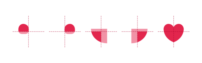
First I divided it in 3 layers : the Heart (.heart), the Ring (.ring) and the Circles (.circles), and grouped them in a wrapper (.heart-wrapper). After this, I made the drawing for each layer, then the animation of each layer and finally mixed them all together.
Drawing
Heart
First part was the Heart.
I separated the full area in 4 rectangles :
- Top / Left and Top / Right : 25% high / 50% wide
- Bottom / Left and Bottom / Right : 75% high / 50% wide

And I used a pseudo element (:after) inside every rectangle and played withborder-radius property to be as close as possible to the original shape for each part.
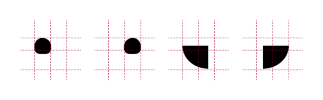
Then I applied the color and overflow:hidden
Ring
The second part was the Ring.
This one is a simple rounded element with different border-size values andwidth / height values.

Circles
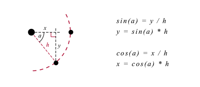
The third part was the Circles.
I built this one using a transparent rounded element in the middle and adding shadow boxes on it.
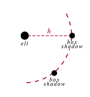
A shadow-box value for each circle, comma separated. The position x / y is computed based on the angle with sin / cos using Compass
Animation
Heart
Nothing too complex.
Increasing / decreasing the width / height of the main element (and setting the position left / top accordingly). The only thing is to make sure everything inside is relative to this element to adjust.

Ring
Adjusting the size of the border and the circle inside and the positionaccordingly as well as the color.

Circles
This one is a bit more tricky because all the border-shadow values have to be udpated all at the same time (position x / y, size, color) as it’s only one property with several comma separated values.
For instance :
And this is only for one step…
To make it easier to read and adjust, I created a SASS function to handle this :
This function loops through all the Circles (stored in a SASS Map) and set 2 by 2 (the big and the small Circles) the box-shadow values accordingly, based on the distances, the sizes, the angle of shift between them and the progression in the color, all passed as arguments.
Completion
Then I adjusted the timings / percentages of the animations according to what is explained in this post https://medium.com/@chrismabry/how-did-they-do-that-the-twitter-like-animation-2a473b658e43 by @chrismabry
Therefore I separated in 28 steps
$animStep: 100% / 27;
that run in 0.8s
$animDuration: 0.8s;
using a function to generate the percentages of the various steps :
@function setStep($n) { @return ($n — 1) * $animStep }
For instance :
#{setStep(6)}
will output :
18.51852%
And make the three layers superimpose with the good timing.
A picture will be better than a long explanation :

The animation will be active / inactive just by adding / removing the class(.active) on the container (.heart-wrapper). In my example this class toggles on click.
Conclusion
I achieved my goal but as you can imagine for me it was more a question of winning this personal challenge, nothing more.
Browser support is the same as the current version (IE10+) because the most advanced requirement is CSS3 Animation (http://caniuse.com/#feat=css-animation).
This is what it looks like :
I tried to keep the code as clean and structured as possible, and I used SASS variables for settings at the top to let people easily make some tests and changes. Feel free to let me know what you think and if you find something that can be improved (by setting the debug to true in the JS you’ll be able to see the animation step by step, with 1 click for each step).
Thanks for reading
 Hom Digitalis