We’ve been experimenting lately with SVG path animations, creating transitions for our image slider and hero slider. Today’s tutorial shows you how to animate at once multiple SVG paths to create a stylish background effect for a modal window.
Inspiration: UI8 Nav on Dribbble
Creating the structure
The HTML structure is composed by 2 main elements: a <section>, used to wrap the action button (#modal-trigger), and a div.cd-modal, the modal window, containing the modal content (.cd-modal-content) and the div.cd-svg-bg, used to create the background covering effect.
An additional div.cd-cover-layer has been used to cover the main content when the modal window is fired (it is positioned between the modal window and the main content of the page).

Adding style
The .cd-modal window has, initially, visibility: hidden, height: 100% and width: 100% and is in fixed position.
When user clicks the a#modal-trigger, the visibility of the modal window is changed to visible (using the .modal-is-visible class).

To create the modal background covering effect, we animate the ‘d’ attribute of the<path> elements inside the div.cd-svg-bg > svg (more in the Events handling section).
Our first approach to creating the “masked” text effect consisted in using the SVGforeignObject to include the modal content into the SVG element. This way we could use the path elements as a reference to cut the text outside the animated background. However, we had several issues, mostly related to browsers compatibility.
That’s why we decided to use this simple trick instead: when the modal window is fired, a layer (.cd-cover-layer) becomes visible, right below the modal background, and, immediately after, the text becomes visible as well. The .cd-cover-layer and the text have the same color, this way only the text over the blue paths is visible during the animation.
More in details: when a user clicks the a#modal-trigger, the .modal-is-visible class is added to the .cd-cover-layer and the .cd-modal. This class changes the .cd-cover-layeropacity from 0 to 1 and its visibility from hidden to visible, so that the .cd-cover-layerentirely covers the page main content.

As soon as the .cd-cover-layer opacity transition is over, the opacity of the .cd-modal-content is set to 1:

Since the color of the .cd-modal-content is the same of the .cd-cover-layer background color, the only visible content will be the one over the blue svg background (which is still animating), while the one over the .cd-cover-layer won’t be visible.
Events handling
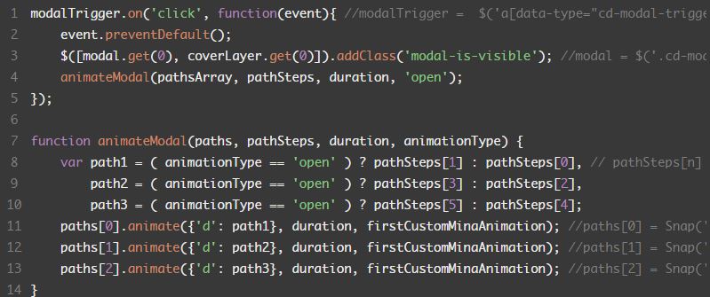
To animate the modal background, we animated the 'd' attribute of the 3 <path> elements inside the svg.
First, we defined the two steps of our animation, using the same process described in the Animated SVG Hero Slider article (Events handling section).
Once defined the paths, we added to the .cd-svg-bg a data-stepn attribute (one for each step) equal to the 'd' attribute of the defined path (to easily retrieve it with JavaScript).
We then used the animate() method provided by Snap.svg to animate the path element.
Fonte: SVG Modal Window | CodyHouse

 Hom Digitalis