Dina Rodriguez’s step-by-step process for creating a hand-lettered logo design that tells a vivid brand story.
Step 1: Discover the meaning of the brand
Before you begin sketching concepts, you need to reveal the purpose behind what you’re creating. You need to in your audience.
The most powerful tool a graphic designer has in creating logo design is typography. The typestyle you choose can have a strong effect on how your logo is perceived. You first need to understand the meaning of certain types of letters and how they can uniquely represent your company. This will help you decide which typography is best suited for your logo design.

Serif
A serif is a small line, flourish or embellishment trailing from the main stroke of a letter. Aside from the decorative element, serifs were created to increase the legibility of letters.
Font psychology: Traditional, Professional, Elegant, Strong, and Universal.
Sans Serif
Sans-serif fonts do not have the small projecting features called “serifs” at the end of strokes. The term comes from the French word sans (without).
Font psychology: Balanced, Modern, Clean, Simple, and Corporate.

Slab Serif
Slab Serif or Egyptian fonts resemble sans serifs in their simplicity but include boxy serifs on the end of each letter.
Font psychology: Authority, Heavy, Antiquity, Friendly, and American.

Script
Script lettering, which is similar to cursive or calligraphy, is often created with fluid strokes using a brush or nib.
Font psychology: Classic, Romantic, Welcoming, Warm, and Soft.

Blackletter
Blackletter script features elaborate thick-to-thin strokes and serifs and is seen with long swirls ascending from diagonal serifs.
Font psychology: Masculet, Hard, Historic, Dramatic, and Cold.
 Sign Painter
Sign painting is similar to Script, but the look needs to appear like it was made with a paint brush or brush pen for the desired hand-painted effect.
Font psychology: Vintage, Craftsmanship, Artistic, Playful, and Affordable.
Reveal the symbolism behind the company
Your logo is a visual representation of everything your company stands for. Far beyond a simple, pretty picture, a strong logo is filled with symbolism, both obvious and hidden. To help figure the symbolism behind the brand, focus on your message by writing ten words that illustrate a business’s key benefits. These words can be feelings, adjectives, objects or time periods.
Here are my 10 words: 1. Artistic 2. Valuable 3. Bold 4. Natural 5. Warm 6. Classic 7. Simple 8. Confident 9 Handmade 10. Welcoming.
Then, as a fun exercise, I want you to draw out your favorite word and illustrate its meaning through typography, decorations, and illustrations.
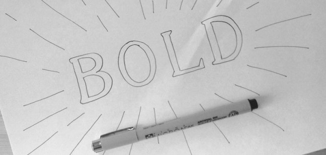
For example, I drew “bold” in a tall serif font with a stroke sunburst coming towards you. In my mind, this is what I envision when I think of the word “bold” as it pertains to my brand. Thanks to this exercise, I now know that this vintage serif style will be perfect for the supporting text in my logo design.
Inspiration and visual research
At this point in my process, I like to create a mood board so I can visualize the style I have in my head. By creating my Pinterest board for Letter Shoppe, you can tell that I’m gearing towards a vintage script style. I encourage you to develop a mood board of your own that consists of at least 20 images to help mold your style for the brand.

Hint: be careful when pursuing popular trends because usually that design can become stale very quickly once that trend fades from popularity. So no matter what style you’re thinking of, make sure it remains timeless and unique.
Break time!
Now it’s time to take a 1-day breather to really get your ideas to steep. Breaks allow your brain to gather outside information so you can build a larger set of references that will be at your mental disposal when you start the sketching process.
Step 2: Experiment through sketching
Whether you’re a seasoned hand-letterer or a graphic designer who usually sticks to a digital canvas, I encourage you to start sketching your logo concepts with an old-fashioned pencil and paper. Without looking at any of your references, start to develop various thumbnails so you can explore some ideas.
This is your opportunity to experiment and really go wild with as many concepts as you can imagine. I usually rough out anywhere from 10 to 20 thumbnails for a complete look at all the possible design solutions.
Hint: A good way to get started is to build the skeleton of your letters first by simply writing out the words. Then, as you continue to experiment, make your drawings more and more refined by adding thickness and decorations.
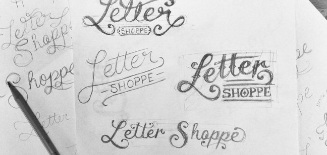
As you get more comfortable drawing, allow yourself to break the rules and stir away from the most rigid forms of typography. Mix up upper- and lower-case letters, connect your marks, play with different sizes, and most importantly HAVE FUN!
Break time!
Alright, time for another break. Take anywhere from an hour to a day to go back to your sketches with fresh eyes.
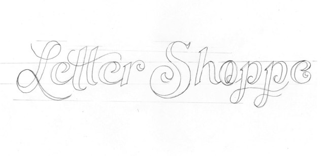
Revisit your thumbs and choose a few of your favorites to experiment further. Enlarge each of your drawings by filling up an 8.5 x 11 piece of paper so you have room to play. Remember to start off using a light pencil. You can go darker and darker as you build out the details.
At this point don’t be afraid to redraw your logo several times. Spend the time to trace over your lettering and play with the spacing, perfect your balance or try out various styles and details.
Once your outline is complete, you can ink your piece using thin and thick Sharpies or Micron pens. This will help you see the weight of your letters so you can make sure each of your letters are consistent.
Hint: Use a thin marker for the outline of your drawing first, and then color it in with a thicker marker to fill in. Whether you feel more comfortable going to the computer at this point or perfecting your hand-lettered solution is up to you. Keep in mind when you’re building a logo from scratch, the more work you do in the drawing process, the less effort it’ll take to digitalize your work.
Step 3: Digitalize your final concept
Whether you want a rough or clean look for your logo will determine your digital process. This next part is going to go over some design techniques for digitizing your logo and requires an intermediate knowledge of Photoshop and Illustrator.
Cleaning up in Photoshop
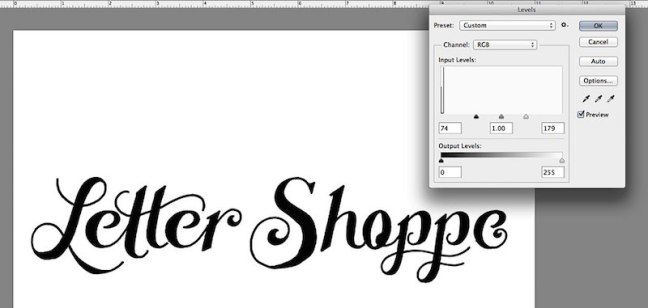
1. Scan your image at 600 DPI—and please don’t just use your iPhone
2. Open up your scanned image of your sketch in Photoshop
3. Go to Image > Adjustments > Levels and pull in your whites and blacks so you can really see your lettering
Hit Command-R to pull up your rulers. Pull down some guides for your sketch to ensure all your letters rest on the same axis. You’ll want to place your guides on the base, descender, body, ascender and t line
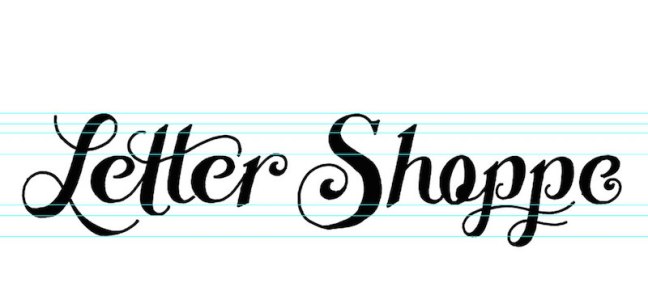
Hint: Letters like C, S, O, capital Q and G rest slightly above and below your guides. This allows your letters to appear to be resting on the same plain.
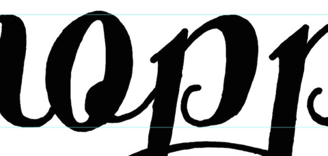
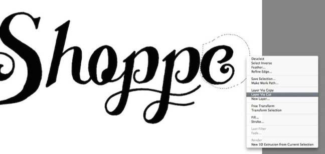
5. Feel free to use your Lasso Tool to Select > Right Click > Cut out your letters to fix any alignment issues.
6. Now it’s time for a serious clean up. Zoom in close to add or remove anything else that may help to perfect your drawing.
Break time!
Hit Save. Now, step away from your drawing to take a break. Try not to go from screen to screen so you can give your eyes a proper rest.
7. After about an hour, go back to Photoshop and turn your drawing upside down. See any more imperfections? Maybe only some of your letters are straight while others are tilted, or your S’s and O’s look more oblong than round. Looking at your work from this perspective really helps in finalizing the details.
8. Turn your art board right-side up, hit Save, and you’re ready to vector!
Using Live Trace to vectorize your work
If you want a more natural look to your lettering, I recommend using Live Trace to vectorize your work. This will give your artwork a more organic, rough feel that looks more hand-drawn with tiny imperfections.
1. Open up Illustrator and place your PSD into your art board.
2. Select your piece and go to Object > Live Trace > Tracing Options. Once your dialog box shows up, hit Preview and play with your settings until you get your desired result. I usually start off with the Black and White Logo preset and go from there.
Here’s a look at my settings for my Letter Shoppe logo. The reason we placed a .psd file rather than a static .JPG is that now you can review your traced logo and still make changes. Maybe you realize that your lines aren’t connecting, or you have additional scuff marks that need to be edited. Simply go to you .psd file, make the changes, and hit Save. Your changes will automatically update in your live traced art.

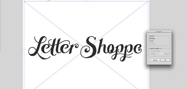
3. If everything is looking good, go to Object > Expand to flatten your image.
4. Feel free to edit your anchor points accordingly until your logo is exactly how you want it. I usually use the smooth tool under the Pencil Palette to smooth out any rough edges. Check out the amazing before and after below.

Creating a perfect vector logo
Thanks to an awesome article by AGCS, I have a completely new approach to clean vectors using 0 and 90-degree bezier handles. I’ll use my letter S as an example using this new method.
1. Open up Illustrator and Place a PSD of your sketch into Illustrator.
2. Select your image and lower the opacity of your sketch. Hit Command-2 to lock your layer.
3. Create a new layer Command-L and place your nodes strategically along the curves of your letter’s outermost point. Check out my diagram below illustrating where each of my anchor points lie.

4. Remember to hold Shift when dragging out your handles to snap them horizontally and vertically.

This will no doubt take some practice to perfect, but keeping your bezier handles straight will allow you to use fewer nodes and have an all around cleaner result. Yes, there will be times when perfect handles won’t work, and that’s fine. It’s more important that your vectors look good over anything else. Now, let’s check out that sexy S.

Adding textures to your lettering
For some added roughness, you can add subtle jagged lines on the outside of your letters so it appears to be more hand-lettered. The more subtle the lines, the bigger you’ll have to scale your artwork before adding the effect. Go to Effects > Distort & Transform > Roughen.
Feel free to play with the settings in order to get your desired result, and be sure to checkAbsolute.
Once it’s complete, go to Object > Expand Appearance to lock in the image.

Now for the icing on the cake: texture! I like to use this vector texture pack from Seanwes, but feel free to create your own textures. Some people like to apply their textures directly into Photoshop and then live trace, but I’ll allow you to select your preference.

Adding just the right color
I always save color for last, but I usually have a general color palette in mind while I’m brainstorming and sketching.
A good way to choose a color palette is to base your selection on those words we came up with in the beginning. For example, some of my main words are “artistic” and “handmade,” so my plan was always to keep my logo design one color in either black or white. I’ve also chosen my supporting colors by placing my lettering on all-natural matte blacks, pearl whites, wood browns, and paper creams to help bring a clean artisan look to my hand-lettering portfolio.
Hint: Do not exceed 3 colors unless it’s absolutely necessary! A 5-color logo could be gorgeous, but once it comes time to produce it, things can get pretty pricey to print.
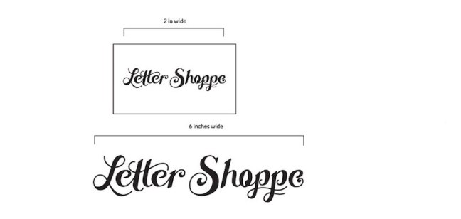
Test for readability
It needs to have an interesting visual hook, accompanied by well-kerned typography. Make sure that your logo reads in seconds and is memorable. I usually test my logo at a business card size (3.5 x 2) to ensure its readability.
Get some outside feedback
Especially when you first start creating your logo design by hand, it’s important to get feedback from colleagues and other designers. This is where places like Instagram andDribbble come in handy, not to mention just showing a friend who isn’t a designer.
It’s important to get the perspective of other people because they may see a flaw or improvement that you can’t. Sometimes it can be hard to recognize improvements or faults with a design when you’ve been focusing on the design too long.
I know: no one likes to get their work criticized, but it’s a necessary evil in our industry. Try to stay open-minded and experiment with the changes others suggest. It may result in an even better logo because even a little change can make all the difference.
Fonte: Creating a hand-lettered logo design – InVision Blog