Dica Windows 10: Como obter mapas para acesso offline
Com o Windows 10 a Microsoft passou a disponibilizar no seu sistema uma app de Mapas. A base de dados da app é a mesma da versão web e mobile do HERE Maps e logo por aí está tudo dito.
Há no entanto uma funcionalidade “escondida” que pode dar jeito quando não temos conectividade. Hoje ensinamos como podem obter os mapas para acesso offline.

Obter os mapas no Windows 10 para acesso offline é algo bastante simples e rápido. Para isso basta que abra a app Mapas e depois carregue no ícone lateral inferior. Aí dentro devem carregar na opção transferir ou actualizar mapas.

Depois basta carregar em Transferir mapas

Escolham o Continente

E por fim devem indicar qual o país que pretendem. No caso de Portugal os mapas ocupam 218 MB. Há mapas para todos os países.

E está feito! Depois de descarregados os conteúdos, o utilizador pode usar na mesma a aplicação de mapas de uma forma actualizada mesmo não tendo acesso à Internet.
Fonte: Dica Windows 10: Como obter mapas para acesso offline – Pplware
Linux: Como aumentar a velocidade de acesso à Internet?
Infelizmente no mundo da tecnologia/comunicações não existem “milagres”! Quando se fala em acesso à Internet tudo depende da velocidade contratada ao operador e como sabemos essa largura de banda é normalmente partilhada por outros utilizadores.
No entanto é sempre possível fazer algumas afinações no sistema de modo a garantir a velocidade mais rápida possível. Para quem usa Linux, aqui ficam algumas dicas.
Alteração do DNS
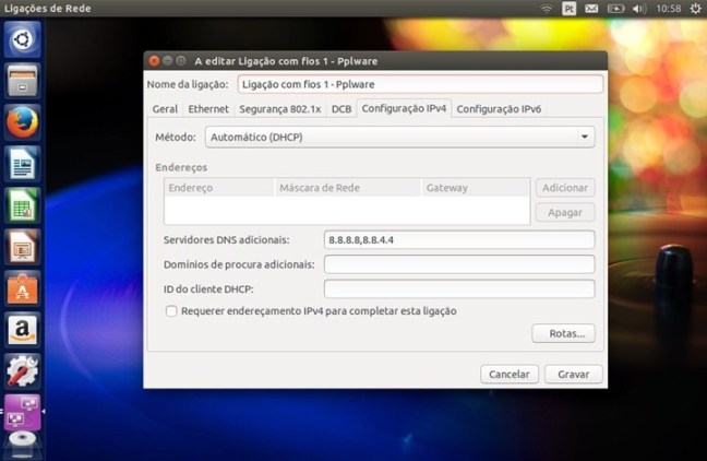
Um dos serviços mais importantes em qualquer rede é o DNS (Domain Name System)). Este serviço é responsável pela tradução de nomes, em endereços de IP e vice-versa e funciona à base de pedidos e respostas, isto é, uma máquina faz um pedido para saber o IP associado a um determinado nome e o serviço envia-lhe essa informação.
Quanto mais rápido for essa resposta mais rápida será a ligação da nossa máquina ao servidor (ex. servidor web) que pretendemos aceder. Um dos serviços de DNS mundiais mais rápidos actualmente é o da Google com os endereços 8.8.8.8 e 8.8.4.4 (isto para IPv4) e 2001:4860:4860::8888 (para IPv6).

Alteração do MTU
MTU é a abreviatura para Maximum Transmission Unit. O MTU é basicamente o parâmetro que determina o tamanho máximo dos pacotes (por exemplo, se vão enviar um filme de 800 MB pela rede, esse conteúdo tem de ter “partido” em pedaços mais pequenos (fragmentação) para que seja recebido pelo destinatário).
Se o valor do MTU é pequeno isso traduz-se num maior número de pacotes criados o que significa a ocupação do canal de transmissão por mais tempo. Mas afinal qual o melhor MTU?
Podemos fazer testes e verificar qual a melhor valor para nossa ligação. Para isso podem recorrer à popular ferramenta ping e começar com um MTU de 1472 (o standard para Ethernet é 1500 bytes) e depois incrementar /decrementar 10 até encontrarem qual o melhor valor.

Depois de encontrarem o melhor valor basta ir ao ficheiro /etc/network/interfaces e acrescentar a linha “mtu 1472” (indicando qual o vosso melhor valor encontrado.

Browser
Ao nível do browser é também possível fazer algumas afinações. Tanto o Firefox com Chrome/Chromium permitem activar um tipo de “fast caching” que pode aumentar a velocidade dos nossos acessos regulares. Para activar tal funcionalidade (no chrome) basta escrever o endreço

Fonte: Linux: Como aumentar a velocidade de acesso à Internet? – Pplware
Wiko Fever: octacore com 3 GB de memória abaixo dos 250 euros

O Fever é o novo topo de gama da marca francesa, que continua a apostar na relação qualidade/preço.
As características parecem impressionantes para o preço anunciado: processador de outro núcleos a 1,3 GHz, 3 GB de memória RAM, 16 GB de armazenamento, ecrã Full HD de 5,2 polegadas, 4G, Dual SIM e sistema operativo Android 5.1. O Wiko Fever, o novo topo de gama da marca francesa, vai chegar ao mercado nas próximas semanas por um preço recomendado de 249 euros.
De acordo com o comunicado da Wiko, o Fever mede 148×73,8×8,3 mm e pesa 143 gramas.
A Wiko, que garante ocupar a segunda posição no mercado livre em Portugal, apresentou ainda duas outras novidades, o Pulp (€179) e o Pulp Fab (€199). Estes dois smartphones 3G também recorrem a um processador de oito núcleos, mas apresentam menos memória RAM (2 GB). A grande diferença entre estes dois terminais está no ecrã: o Pulp Fab tem um ecrã de 5,5”, enquanto o Pulp tem um ecrã de 5”. Ambos são HD.
Fonte: Wiko Fever: octacore com 3 GB de memória abaixo dos 250 euros
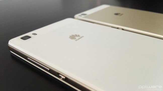
Análise ao smartphone Huawei P8 lite

O Huawei P8 lite foi lançado este ano a lado do Huawei P8, uma versão ligeiramente inferior ao P8 em termos de especificações, mas muito mais acessível e com um desempenho que faz jus às suas características de smartphone de gama média.
Conheça em pormenor o Huawei P8 lite.
Aspectos positivos
- Câmaras fotográficas
- Qualidade do ecrã
- Desempenho
- Construção
Aspectos negativos
- Falhas pontuais de rede móvel
1 – Características Gerais
Apesar de já ter sido lançado em Maio, o Huawei P8 lite é ainda hoje alvo de muitas questões por parte dos nossos leitores. Na verdade, ele é ainda uma excelente opção de compra mesmo com os vários equipamentos que já foram lançados posteriormente.
O Huawei P8 lite tem um ecrã de 5 polegadas, o design é simples e elegante, com linhas que o aproximam do Huawei P8. Vem equipado com um processador HiSilicon Kirin 620, Octa-core 1.2 GHz Cortex-A53 e tem um GPU Mali-450MP4.
Está disponível com 2 GB de RAM e 16 de armazenamento interno, expansível através de micro SD, abdicando da utilização de um cartão SIM, já que tem opção de utilizar dois cartões SIM (nano e micro SIM).
A câmara principal é de 13 megapíxeis (MP) e conta com o auxílio de um flash LED, e a câmara secundária é de 5 MP.
A caixa onde vem o Huawei P8 lite, além do smartphone, traz o manual de instruções rápidas, o acessório para abrir a ranhura dos cartões, um cabo USB/microUSB, o carregador e ainda uns auriculares.
2 – Design
Da Huawei já é comum uma elegância presente nos seus smartphones pelo que o Huawei P8 lite não é excepção. Construído em plástico, bastante leve, com uma moldura a imitar metal (tal como a Samsung fazia nos seus modelos mais antigos) e uma traseira em branco escovado. Pesa 131 g e tem 7,7 mm de espessura.

Na frente tem o ecrã de 5 polegadas, a cima, o LED de notificações, os sensores de luminosidade e proximidade, o altifalante e a câmara de 5 MP. A baixo não existe qualquer botão capacitivo, apenas a inscrição da marca.

Nas laterais, do lado esquerdo não existe qualquer botão, porta ou ranhura de cartões, em cima estão o jack de áudio de 3,5 mm e o microfone. Do lado direito encontra-se o botão de volume, o botão de power, a ranhura para cartão nano-SIM/microSD e a ranhura para o outro cartão micro SIM. Na lateral de baixo, está a grelha de áudio, onde do lado esquerdo se encontra o microfone e do lado direito o altifalante e a meio a porta micro USB.


Na traseira em cima encontra-se a câmara de 13 MP e o flash LED. A capa traseira não é removível e não inclui nada mais além do logótipo da Huawei.

3 – Interface, aplicações e funcionalidades
O Huawei P8 lite vem com a versão 5.0 do Android Lollipop personalizada através da interface própria da Huawei, a Emotion 3.1 UI. Esta interface não tem diferenças relativamente ao que o Huawei P8 apresenta, apenas tem menos algumas funcionalidades, o que é normal tendo em conta a diferença de hardware entre ambos.

Aqui não existe um menu com todas as apps instaladas no smartphone. Existem sim, as aplicações distribuídas por vários ecrãs, todos eles personalizáveis, mais ou menos ao estilo do iOS, mas com a vantagem de se poderem utilizar todos os widgets, que acabam por trazer uma melhoria em termos de produtividade e informação disponível ao utilizador.
A barra de notificações, basicamente contém todas as informações comuns de um Android, as notificações são mostradas por ordem cronológica, com informação da hora a que foram recebidas. Algumas destas notificações são interactivas e permitem acesso a algumas acções rápidas.
Em termo de aplicações, o utilizador pode contar com as várias aplicações Google, um Gestor de Telefoneque permite, entre outras opções, optimizar o desempenho do smartphone, activar Filtros de assédio que bloqueia chamadas e mensagens de números pré-definidos pelo utilizador, números de origem duvidosa ou desconhecido, e ainda o bloqueio de aplicações que passam a poder ser acedidas apenas através de um código PIN.

Vem ainda com um bloco de notas, um gestor de temas comum nos smartphones da Huawei, um gestor de Ficheiros, Gravador de voz e ainda uma série de Ferramentas úteis, como calculadora, Rádio FM, Espelho, Lupa, Gestor de Cartões SIM e Lanterna, entre outros.
Em termos de desempenho, o Huawei P8 lite comportou-se de forma exemplar tendo em conta a gama onde se insere. Muito fluido, sem bloqueios ou desfasamentos entre troca de aplicações. Há, no entanto, que referir que o Huawei P8 perde sinal de rede esporadicamente, não é algo que tenha afectado muito a comunicação, contudo, em 2 ou 3 situações, durante a análise, foi necessário desligar a chamada em curso e voltar a retomar devido à perda de rede.
Através do Benchmarck Antutu, o P8 lite conseguiu uma pontuação de 31111, um valor muito próximo do conseguido em smartphones como o InnJoo One 3G HD, o Xiaomi Mi 4i, ou até mesmo do UMI Iron.
Resta referir que a qualidade do ecrã, tendo em conta o tamanho e a resolução, é muito boa, tem uma definição e um contraste que fazem dele um aspecto positivo a destacar, principalmente, na gama de preços onde se insere. Já o som é um pouco ruidoso com o volume no máximo.
4 – Câmaras
O P8 lite vem equipado com uma câmara principal de 13 MP e uma secundária de 5 MP. A câmara principal conta ainda com o auxílio de um flash LED e faz gravação de vídeo a 1080p.

A câmara principal vale a pena ser comparada com a do Huawei P8 já que partilham características comuns. Apesar do P8 lite apresentar menos opções de captura que o P8, a verdade é que os resultados finais de uma foto são igualmente satisfatórios, não sendo o desempenho em fotografia ou vídeo que pesem na decisão de compra entre um ou outro modelo.

Relativamente à câmara frontal os resultados são bons, mas nada de espectacular. O modo de Beleza a partir do nível 3 começa a deformar a cara das pessoas, mas isso é algo transversal entre os smartphones da Huawei.
Estes são alguns exemplos de imagens fotografadas com o Huawei P8 lite:


5 – Veredicto
O Huawei P8 lite revelou-se ao longo da análise um smartphone bastante competente tendo em conta as suas características. De notar que ao preço a que se encontra actualmente, o Huawei P8 lite apresenta-se como uma das melhores opções já que pode ser adquirido a menos de 200 euros.
Um problema que tem sido apontado por alguns utilizadores, mas que na minha experiência se revelou ao nível dos demais smartphones já aqui analisados, prende-se com a autonomia. Na verdade, não considero que seja um problema, com uma utilização comum, alguns minutos de chamadas, notificações e sincronização do e-mail activas, visualização de vídeos no YouTube durante 30~40 minutos diários e outras tarefas, nunca cheguei ao fim de um dia sem bateria, tendo mesmo conseguido utilizar durante 2 dias inteiros. Além do mais, o Huawei P8 lite tem várias opções e perfis de poupança de energia que o utilizador pode adaptar às suas necessidades.
Huawei P8 ou Huawei P8 lite, qual a melhor opção?

Durante os últimos meses o Huawei P8 foi um dos smartphones que utilizei com mais frequência. A interface da Huawei é algo que me agrada por ser simples, intuitiva e até minimalista e o Huawei P8 é um smartphone que sempre se apresentou fluido e com uma autonomia suficiente para a minha utilização diária. A minha expectativa inicial era de vir a notar diferenças significativas em termos de desempenho ao começar a utilizar o Huawei P8 lite, mas não foi o que aconteceu. Apesar de ser ligeiramente mais lento a diferença não justifica os quase 200 euros a mais do P8.
Este e outros smartphones estão disponíveis na loja online GearBest, com envio a partir da União Europeia, sem quaisquer taxas adicionais. O Huawei P8 lite em análise foi cedido pela GearBest a quem deixamos um agradecimento.
Accelerating the Mobile Web | Project AMP
O Projeto AMP é uma iniciativa da Google para melhorar a performance das páginas web em mobile. AMP HTML faz com que as páginas carreguem instantaneamente em dispositivos móveis. O WordPress irá brevemente desenvolver um plugin de AMP…
Today we’re announcing support for Accelerated Mobile Pages for WordPress, a new open source initiative spearheaded by Googleto dramatically improve performance of the mobile web.
“Speed has always been a cornerstone of Google Search and we’re thrilled to be working alongside others in the tech industry and publishers around the world to bring the Accelerated Mobile Pages Project to life.”
—Dave Besbris, VP Engineering, Google Search
The mission of the WordPress project is to democratize publishing, and with 24.6% of sites running the software—making WordPress the most popular CMS on the web—we feel we’re making good progress.
That success has been built on our openness, our flexibility, and our commitment to delivering the best possible user experience—both for publishers, and their readers.
To that end, we are developing a plugin to support the AMP specification, enabling publishers to produce AMP-formatted content from WordPress without lifting a finger (other than clicking “publish”, naturally). The plugin is still in early stages, but you can see it in action onWordPress.com or even this very post.
If you’re interested in kicking the tires, submitting improvements, or squashing bugs, we’d love your help.
We believe that open source is one of the most powerful ideas of our generation. We strongly and actively support a free, open internet. We’re very happy to support an open source initiative like AMP, which brings publishers and technology companies together to make a better mobile experience for everyone.
6 Secrets Designers Won’t Tell
Trade secrets are hard to find out. Designers try to keep them as secret as they can, but to no success. Well, they won’t get any help from us. We are here to share tips and tricks, so every creative professional’s dream comes to reality.We have rounded up six secrets designers won’t tell.
Take these secrets kindly – they won’t make you a better designer nor they will help you win awards. They are just useful tips and tricks that will probably suit your needs. It all comes down to how you want to work. Scroll down below and see what all the fuss is about.
1. Steal stuff

Yup. Steal stuff, and make it your own. I don’t mean plagiarize other people’s stuff. I mean get inspired by their work, take their craft and make something of your own. Designers will never admit to this, but every successful creative professional has done this, and will do this.
Let’s put it this way – you have an idol in the creative business, he is an incredibly talented artist, and you want to become like him. First off, read what he reads, visit places that he visits. Be in the medium that he puts himself constantly. See what inspires him and steal it for yourself. Make it your inspiration. Adapt it to your needs.
You will soon be on the way of stealing his clients if you are so passionate about the work you do. There is no shame in being better at the game than your peers. It’s a pity of not playing it, regardless of the outcome.
2. Procrastinate as long as you can

Inspiration will hit when you least expect it, so why not do the things you love the most? Procrastinate until you can work, those are words that I live by. Explore different things and ideas. Read a good book, watch an awesome movie that you are postponing for such a long time.
Or you could do the most menial task there is like arranging your music collection backwards, by age – what album is the closest to Michael Jacksons last album. By all means, go crazy.
We all know the fear of a deadline creeping, and how we fluster getting back to work. Eventually, you will have to get back to work and leave the art of procrastinating for another day.
3. Don’t overpromise

You will be inclined to overpromise a lot of stuff, just to snag that client under your fingers. The most important thing here is to realize how much time you have on your hands, and if you can finish the project that you promised.
You just promised your client that you will have three revisions, and a new layout for him till’ tomorrow, didn’t you? Keep doing that and you will lose them faster than saying – Deadline not met. Be sincere and realist, so you have time to meet his expectations of quality and quantity.
4. Pretty doesn’t count

Don’t just make your project eye-candy, make it also fully responsive. Prioritize on the functionality and how will it make it get viral, rather than just creating only a beautiful design. People will stare at the beauty, but they will come back if it is useful.
Pretty doesn’t count if you don’t bring anything else to the table, and pretty will fade soon in front of other mesmerizing things that will eventually appear. Think on the long-term, and how your project will stand the test of time. Will it be remembered? Or will it be forgotten?
Don’t get me wrong here, it is nothing bad in creating a beautiful design, but you need utility for it to flourish and grow to its full capacity.
5. Don’t prioritize on being unique

John Oliver once said – “ I like to think of news and advertising as the separation of guacamole and Twizzlers. Separately, they are good. But if you mix them together, you make them both gross.”; if you prioritize on only creating unique projects, of only shocking your peers and the world, you will meet a dead end, filled only with frustration, and despair. You don’t have to be ashamed on creating designs that just fit the norm.
By doing so, you will have the opportunity of finding your niche, on being unique by exploring the standards and pushing boundaries to the limit. When you get past the limit that was set by your predecessors, you will not recognize it as being unique, you will just tell yourself that you are in the norm. Others will do that for you, others will applaud and gawk at your designs, and call them unique.
6. Finish one before starting another

Working on different projects and expecting to get them all to be innovative has to be one of the silliest things I have heard in a while. Focus on each task appropriately, and indulge in the art form the proper way. If you get clustered with tons of projects, not only they will lack the quality that you and the client desire, but they will become a burden, and you will soon start hating the thing that you love the most – designing, creating art.
Inspiration will hit, but where to use it? How to use it? It will become a stressful situation that you don’t need in your life. This doesn’t mean that you should work on just one project at a time, you create your pace, but be careful how you multitask – it can lead to ruin.
Take into consideration these neat tips and tricks, these disclosed secrets and use them wisely. Do you have one that you would like to share with us? Feel free to post in the comments section below. We would just love to hear you out!
Editor’s Note: This post was originally published in September 2014 and has been completely revamped and updated for accuracy and comprehensiveness.
Fonte: 6 Secrets Designers Won’t Tell, by Claudia
Make Any WordPress Theme Responsive (Mobile-Friendly)
Here is the scenario: You’ve searched high and low and found the perfect WordPress theme for yourself or your client. But, there’s one big problem: it’s not mobile-friendly. With mobile web traffic soon expected to exceed desktop web traffic, being mobile-friendly is critical.
I often have to go through the exercise of converting a non mobile-friendly WordPress theme to be mobile-friendly, or “responsive” (the term used to describe a site that uses the size of the browser to reconfigure itself for optimum viewing). In this article, I’ll guide you through the process I use.
Note, I am assuming you are familiar with HTML and CSS here. I’ll give you some broad strokes, along with some detailed code, but of course much of the work will depend on the inner workings of your theme. Hopefully, you can use some of the principles I talk about for your project.
Let’s look at one of the most common layouts for a WordPress theme, namely, one with a header, menu bar, main content section, sidebar, and footer. Here is a graphic depiction of this structure:

Making the Header Fluid
The first thing to do is make all of the elements “fluid” or variable-width. Ironically, in the early days of web development, everyone made containers fluid. When we discovered that this made things hard to control, we went to fixed size containers. And now we’re back to making everything fluid again!
Anyway, you need to find the main containers (divs) for the major sections of your site, as indicated in my diagram above. An easy way to do this is to use the Firebug Firefox plugin or Google Chrome. If you install it, you can hit F12 or CTRL-SHIFT-I (or ALT-CMD-I on a Mac) and it will tell you the name of all of the containers surrounding any element you click on. It’s super-useful for this type of work.
For example, your header might be contained in a div like this:
|
1
2
3
|
<div id=”header”>
(bunch of HTML here)
</div>
|
Next, look at the CSS for that div. It might look something like this:
|
1
2
3
4
|
#header {
width: 900px;
(more properties here)
}
|
To make this element fluid, remove the fixed with and change it to look like this:
|
1
2
3
4
5
|
#header {
max–width: 900px;
width: 100%
(more properties here)
}
|
Your header should now be fluid. The magic is accomplished by defining the width using a percentage instead of fixed pixels. The “max-width” property prevents it from getting too big. If you want, you can add a “min-width” if you want to prevent the window from getting too small. I generally use a value of 300px for my min width.
Re-size the browser to see if it worked! If not, there might be elements inside the header that are keeping it from shrinking. Search for any fixed-width CSS definitions. You’ll have to change them to be variable using percentage-based widths. I’ll describe how to do that by showing you how to resize the main content block and sidebar. Other problems in the header, like the text being too big, will be fixed later with media queries.
As elements wrap, the containers will need to get taller. Remove any heights that are set in pixels so they can expand as needed.
If your header still isn’t fluid, it might be inside a container that has fixed width. Use the tools to search for those, and make them fluid.
Content Block and Sidebar
Let’s assume your main content and sidebar containers look like this:
|
1
2
3
4
5
6
7
8
9
10
11
|
<div id=”wrapper”>
<div id=”content”>
(bunch of HTML here)
</div>
<div id=”sidebar”>
(bunch of HTML here)
</div>
</div>
|
Let’s say the corresponding CSS looks like this:
|
1
2
3
4
5
6
7
8
9
10
11
12
13
14
|
#wrapper {
width: 900px;
(more properties here)
}
#content {
width: 600px;
(more properties here)
}
#sidebar {
width: 300px;
(more properties here)
}
|
Now, the numbers might not exactly add up to 900 due to padding and so forth, but for simplicity, let’s say they do.
As we re-size the browser, we want to maintain the ratio of the container and sidebar widths. Here’s how we accomplish that:
|
1
2
3
4
5
6
7
8
9
10
11
12
13
14
15
16
17
|
#wrapper {
max–width: 900px;
width: 100%;
(more properties here)
}
#content {
max–width: 600px;
width: 66.7%; /* 600/900 = 66.7% */
(more properties here)
}
#sidebar {
max–width: 300px;
width: 33.3%; /* 300/900 = 33.3% */
(more properties here)
}
|
Basically, you need to work out the ratio of the contained elements to the width of the containing element, and set your width equal to that percentage.
If you want to add padding or margin, express those as percentages as well, and adjust the other widths accordingly so the total is always 100% or less. This is really key. The widths of all of the elements that take up horizontal space need to be expressed in percentages. Note that you can use max-width to prevent things from getting too big.
If the elements are not re-sizing, look for absolutely-sized elements within those divs. Convert those widths, margins, and padding to percentages as well.
Let’s say there is a div within #content called #single-post with width 550px and 25px margins on either side. The CSS for that would look like
|
1
2
3
4
5
6
|
#single-post {
max–width: 92%; /* 550/600 = 92% */
margin–left: 4%; /* 25/600 = 4% */
margin–right: 4%;
(more properties here)
}
|
Since this div is contained in another div, the horizontal widths should total 100%, not 66.7%.
Use this technique if your header is not re-sizing. Repeat the same process that you used on the header with your footer. If anything isn’t re-sizing, check for any fixed-width contained elements.
The Menu Bar
OK, now all of the elements on the site should be resizing nicely as you adjust the width of the browser window… except for the menu bar. The menu bar can be tricky, since it can be implemented in a variety of ways.
The easiest way to deal with the shrinking window is to simply have the menu “double-back” on itself and wrap. We’re not going to hide the main menu with a button in this case. Here are some screen shots to show what I’m talking about. First we have the desktop version.

Here is the mobile version. Notice how the menu bar just folds back on itself. We are not doing a fancy menu button here, but it’s still very usable, and less work.

Okay, since the structure of menu bars can vary widely, I’m going to do some hand-waving and give you some broad brush strokes here. It’s impossible to give a step-by-step method that will work in all cases, unfortunately. Here’s the general idea though.
First, replace any widths defined in pixels using the techniques above. That alone is probably not enough. Menu bars often have fixed height, so you’ll have to replace any heights defined in pixels with “min-height” along with “height: 100%”, or something to that effect.
In my case, this only partially worked. The menu wrapped in a weird way until I added “display: inline-block” to the div containing the menu items. After I did that, the menu was no longer centered, so I had to wrap it in a new div which was centered.
After all of the hoopla, my menu was centered and wrapped when I made the browser narrow, but it took me over an hour of experimentation to figure out. More fancy solutions, like a menu that collapses into a Menu Button (sometimes known as a “hamburger”) require JavaScript or jQuery… I reserve that for a future article.
Resizing Images
Okay, hopefully your containers are now resizing, but what about the images? Chances are they were hard coded with dimensions like this:
|
1
|
<img width=500 height=150 src=“images/image.jpg />
|
To make them resize properly, the technique is similar to resizing divs. Remove the hard-coded width and height from the images and replace them with “width:100%;” and “max-width:” set to whatever you want the normal desktop size to be. The result is this:
|
1
|
<img style=“width:100%; max-width:500px;” src=“images/image.jpg />
|
Images set up this way will shrink down when you resize the browser window.
Media Queries
OK, now we have a completely fluid layout that resizes as you make the browser window narrow. But, it still looks terrible on a thin mobile device screen because the elements are too scrunched up. We need to separate them so that only one column of content is visible at a time. In addition, your header probably looks bad, and we’ll have to fix that too.
These problems can be fixed through the use of media queries in your CSS file. Let’s fix the main content container and sidebar first. Play with the browser size and determine roughly at what point you want the sidebar to hop below (or above) your main content. Estimate or measure in pixels how wide the browser window is at that point. For me, it was at 540 pixels.
Next, we have to “undo” the widths we defined for the content and sidebar to make them fill the whole width of the screen as follows:
|
1
2
3
4
5
6
7
8
9
10
11
12
13
14
15
|
@media screen and (max–width: 540px) {
#sidebar {
display: block;
min–width: 200px;
max–width: 400px;
margin: 0px 3%;
float: none;
width: 94%;
}
#content {
width: 94%;
margin:0px 3%;
}
}
|
The key is making the widths 100% (or 94% in my case, with 3% margin on each side). Experiment with these settings until you get what you want.
The Header
We are almost there. The header probably still looks bad when you make the browser really thin. For example, the font size might be too big and it might wrap or do other unpleasant things. This is simple to fix. Let’s say the original font size was 36px, which is too big when the screen is narrow. Pick a point where you want to resize it, and add the code below. For me, the break point was at 400px wide, where I resized the header text to 28 pixels as follows:
|
1
2
3
4
5
6
7
|
@media screen and (max–width: 400px) {
.blogname h1 {
font–size: 28px;
}
}
|
The Final Bit
I’ve undoubtedly glossed over many of the little details in your theme that you will need to fix to make it completely responsive. But hopefully with the broad strokes I’ve given you, you’ll be able to fill in the details.
But even after you get your site fully responsive, you might be surprised to still see a shruk-down version of the non-responsive site when you view it on a phone! What gives?
You have to add one last line of code to tell the phone not to “zoom out” when viewing your site. It’s easy. Just add this line to the head section of your HTML code:
|
1
|
<meta name=“viewport” content=“width=device-width, initial-scale=1” />
|
This tells the phone’s browser not to zoom out when viewing your page. Everything should be kosher now.
If you want to see a real example of a non-responsive WordPress theme that I made responsive, check out http://disablemycable.com/blog. The CSS file shows these techniques.
Hope this has helped!! Let me know how it works for you. – Brian
I am a freelance web developer and consultant based in Santa Monica, CA who uses WordPress, PHP, and JavaScript to create web applications for small businesses and organizations.
Fonte: Make Any WordPress Theme Responsive (Mobile-Friendly)
Developing WordPress Themes Using Responsive Frameworks
What Is Responsive Design?
It used to be you only had to worry about website consistency across multiple browsers, but now we have to look at the bigger picture – consistency across multiple devices. The computer used to be our only gateway to the Internet, but now we jump online from our phones, TVs, tablets and who knows what else will come down the pipe. Having your website appropriately render and perform on any device should be a top priority this year.
Responsive design is all about making things fluid and adjusting according to screen size. Although WordPress doesn’t always play nice with responsive design methods, there are ways it can be achieved. How responsive you decide to make your website is really about how much time you want to spend doing it.
Responsive Frameworks
There are several responsive frameworks out there to choose from. You might want to spend some time investigating each one to determine which has the included features your project might require. If you aren’t sure where to start, here are a few to consider:
Bootstrap
Bootstrap from Twitter is built on a responsive 12 column grid. It has included fixed- and fluid-width layouts based on that system. It also comes with support for optional JavaScript plug-ins such as an image carousel, Typeahead, togglable tabs, and many more.
Less Framework
Less Framework is based on 4 layouts and 3 sets of typographic presets. Less Framework uses a default layout as a starting point and then uses CSS3 media queries to code ‘child layouts’.
Foundation
Foundation is a grid system based on 12-columns that do not have a fixed width; they can vary based on the resolution of the screen or size of the window. Foundation comes pre-packaged with buttons and built in form styles, alerts, and more.
YAML
YAML is a multi-column layout based on a grid system with percentage widths. It comes with several built in features and supports several jQuery plugins such as Accessible Tabs and SyncHeight.
This list of frameworks is hardly complete, but for the sake of this tutorial, I’m going to show you how to incorporate Foundation into your next WordPress theme.
Step 1 Downloading and Applying the Framework
To get started, go download Foundation and add the files to your css and js folders in your theme’s directory. The easiest way to add the required files to your theme would be to use wp_enqueue_script and wp_enqueue_style.
For this tutorial I’m going to show you what you place in your functions.php file to make Foundation work right off the bat, but for more details on adding files this way, check out the tutorial on how to include JavaScript and CSS in your theme.
To add the needed JavaScript for Foundation to work properly in your theme, you need to create a function that calls the wp_enqueue_script to serve them up.
|
01
02
03
04
05
06
07
08
09
1
|
function responsive_scripts_basic(){ //register scripts for our theme wp_register_script('foundation-mod', get_template_directory_uri() . '/js/modernizr.foundation.js', array( 'jquery' ), true ); wp_register_script('foundation-main', get_template_directory_uri() . '/js/foundation.js', true ); wp_register_script('foundation-app', get_template_directory_uri() . '/js/app.js', true ); wp_enqueue_script( 'foundation-mod' ); wp_enqueue_script( 'foundation-main' ); wp_enqueue_script( 'foundation-app' );}add_action( 'wp_enqueue_scripts', 'responsive_scripts_basic', 5 ); |
Next, add the Foundation stylesheets to make the grid flexible. Paste this function after the one you just created.
|
1
2
3
4
5
6
7
8
9
|
function responsive_styles(){ //register styles for our theme wp_register_style( 'foundation-style', get_template_directory_uri() . '/css/foundation.css', array(), 'all' ); wp_register_style( 'foundation-appstyle', get_template_directory_uri() . '/css/app.css', array(), 'all'); wp_enqueue_style( 'foundation-style' ); wp_enqueue_style( 'foundation-appstyle' );}add_action( 'wp_enqueue_scripts', 'responsive_styles' ); |
Once saved, go back and check your source code to make sure your files were added correctly. It should look something like this:
<link rel='stylesheet' id='foundation-style-css'  href='http://thatonegeek.com/sandbox/wp-content/themes/Starkers/css/foundation.css?ver=all' type='text/css' media='all' />
<link rel='stylesheet' id='foundation-appstyle-css'  href='http://thatonegeek.com/sandbox/wp-content/themes/Starkers/css/app.css?ver=all' type='text/css' media='all' />
http://thatonegeek.com/sandbox/wp-includes/js/jquery/jquery.js?ver=1.7.1
http://thatonegeek.com/sandbox/wp-content/themes/Starkers/js/modernizr.foundation.js?ver=1
http://thatonegeek.com/sandbox/wp-content/themes/Starkers/js/foundation.js?ver=3.3.1
http://thatonegeek.com/sandbox/wp-content/themes/Starkers/js/app.js?ver=3.3.1
Step 2 Add IE Only Conditions
Everyone loves to go that extra mile to make things work in Internet Explorer right? To make sure your Foundation framework stays responsive in Internet Explorer, you need to add a few conditional statements. These should go in your header.php file before the closing head tag.
<!--[if lt IE 9]>
<link rel="stylesheet" href="/css/ie.css">
<![endif]-->

<!--IE Fix for HTML5 Tags-->
<!--[if lt IE 9]>
http://html5shiv.googlecode.com/svn/trunk/html5.js
<![endif]-->>
Step 3 Working With the Framework
Now that your theme has Foundation setup, to make use of all its responsive features you need to design using the Foundation grid system. Like other responsive frameworks, it’s a system made up of 12 columns. Other included features are pre-set button styles, tabs, tables and much more. Check out the Foundation documentation to view all bells and whistles and instructions on how to work with the grid.
Going With a Pre-Packaged Theme
There are plenty of free and premium WordPress themes available that make use of responsive design. If you would rather start with something out of the box, you can try out these themes:
WordPress Bootstrap, By 320Press
WordPress Bootstrap is a theme developed on Twitter’s Bootstrap v.2.0.1. It’s fully responsive with four different page templates to choose from, shortcodes, and multiple sidebar options. Once installed, you can check out bootswatch.com to download different color versions of the theme.
iTheme2
Based on the Themify framework, iTheme2 uses media queries to target different displays, comes with a customizable feature slider, a social media widget, two different theme skins and you can have up to four footer widgets.
Responsive Twenty Ten
The Responsive Twenty Ten theme supports flexible images, margins, and mobile images. It was created as a child theme for the included Twenty Ten theme.
Good Minimal (Premium)
Good Minimal is a clean, minimalist responsive layout that adapts to a multitude of displays and devices. Good Minimal comes with two different styles, supports unlimited custom sidebars, shortcodes, multiple drop down menus, and several other features.
Conclusion
Responsive design is continuing to grow in popularity and knowing how to utilize it within your future theme construction will be crucial for success. Whether you are adding a framework to your theme or using a pre-built theme supporting responsive design, your clients are going to expect multiple device support as a basic service.
Fonte: Developing WordPress Themes Using Responsive Frameworks – Tuts+ Code Tutorial
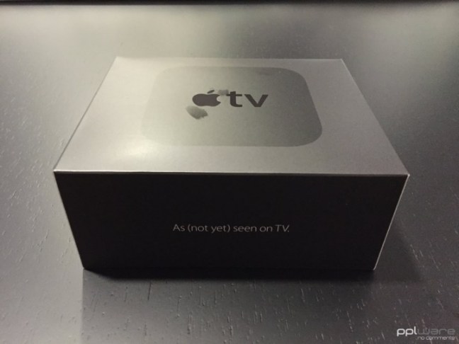
Apple TV 4: Specs & Unboxing

A Apple, finalmente, decidiu actualizar a Apple TV que durante vários anos não tinha mostrado grande evolução. Embora esta evolução não seja um salto na vanguarda de várias tecnologias utilizadas é, contudo, uma nova fase neste dispositivo. Agora está mais abrangente e preconiza mais um grande negócio para developers e para fornecedores de conteúdos.
Depois de muitos meses de rumores, a Apple lançou na última keynote a nova versão da Apple TV.

Há várias tecnologias “novas”, que estão agora disponíveis neste produto. Temos assim a integração com a Siri, que permite um controlo sem qualquer contacto e também um novo comando, com capacidades de toque.
Características
Tamanho e peso
- Altura: 35 mm
- Largura: 98 mm
- Profundidade: 98 mm
- Peso: 425 g
Capacidade e preços
- 32GB – 149 dólares
- 64GB – 199 dólares
Controlo remoto Siri
- Tecnologia sem fio Bluetooth 4.0
- Transmissor IR
- Acelerómetro e giroscópio
- Porta Lightning para recarregar
- Bateria recarregável
Portas e Interfaces
- HDMI 1.4 3
- Wi-Fi 802.11ac com MIMO
- Ethernet 10 / 100BASE-T
- Tecnologia sem fio Bluetooth 4.0
- Receptor IR
- USB-C para serviço e suporte
- Fonte de alimentação interior
Processador
- Chips A8 com arquitectura de 64 bits
Sistema Operativo
- tvOS
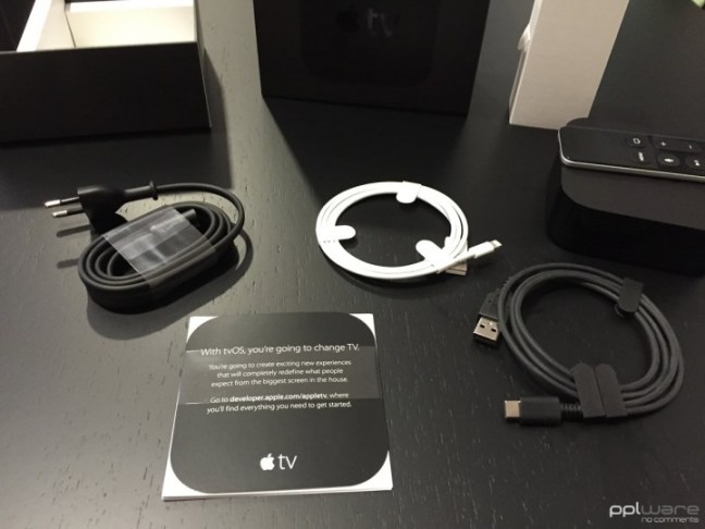
Na caixa
- Apple TV
- Comando remoto Siri
- Cabo de alimentação
- Cabo Lightning para cabo USB
- Documentação

Notámos logo um impacto no que vemos, não, estamos já a falar na Interface totalmente redesenhada. Esta está agora muito mais simple e muito mais integrada com os conteúdos.
Também a Siri tem aqui um papel importante ao permitir que todas as pesquisas sejam feitas directamente com a voz.
O novo comando é o ponto central da Apple TV. Temos de aprender ainda a lidar com os comandos, mais ainda porque o idioma ainda não é o que pretendemos! Mas está muito apurada a Siri.
Como já foi referido, a Apple dá tanta importância a esta nova Apple TV que lhe criou um sistema operativo próprio, com APIs e ferramentas de programação próprias.
Assim nasceu um novo ecossistema dentro de um ecossistema. Mais uma fonte de produção, agora totalmente virada para a TV.
Iremos facilmente ter acesso a apps que ajudarão a gerir a programação, mais jogos, mais ferramentas utilitárias e até haverá mais diversão com o modo multi-player que pode ser usado nos jogos, com a Apple TV a suportar nativamente.
Compras, pesquisas, acesso a redes redes sociais e muito mais. Há muito ainda para pesquisar e é o que vamos fazer nos próximos tempos, tirar proveito para ver o alcance desta novidade da Apple.
Quando chega a Portugal?
O anúncio oficial, no evento, dizia-nos que a Apple TV chegaria já em Outubro a 80 países, Portugal incluído, é esse o timing oficial, contudo têm circulado rumores que dizem que o lançamento ficará adiado até inícios de Novembro. Esperemos que seja já neste mês.
 Hom Digitalis