SVG Animation with GreenSock Animation Platform (GSAP)

GSAP brings vector images to life using scalable vector graphic (SVG) animations. You can animate a scene, develop HTML5 banner ads, improve project interfaces – the options are endless. My aim is to give you an introduction to GreenSock, the benefits of the platform and how to use it effectively.

To help illustrate how the platform works, I’ve embedded the development of an animation so you can see how we built it. I’ll then show you what the finished element turned out like. I’ve kept it basic on purpose but have provided links to further resources and information if you’re interested.

While you can use GSAP to animate any type of element, my focus is on using it with SVG images as there’s potential to create some awesome animations.

But first, a quick word on SVG images…

If you are unfamiliar with how SVG images and their properties, these two resources will help:

  • Jakob Jenkov has put together a great series of tutorials on his website. He is great at explaining SVG properties and including demos on how to use them.
  • Sara Soueidan writes in-depth articles on SVG for her website, making it easy to understand how it all works. She dives into the properties and provides great reference images.

On to Greensock.

Previously, you might’ve used Flash to animate for the web. But as support for Flash continues to die due to security flaws and lack of browser support, there’s a need for a worthy replacement. SVG has a range of benefits and with growingbrowser support, it makes good sense as a replacement for Flash.

One of the pain points with animating an SVG image is the inconsistencies in how browsers handle these types of images – in particular CSS transforms. Thankfully, this is where a tool such as GreenSock is handy. It solves browser inconsistencies and makes sure everything works as expected.

GSAP is a JavaScript animation library. It has a strong community, thorough documentation, large forums and plenty of demos to help educate you on how the platform works. GreenSock has multiple libraries that specialise in different areas and it’s worth browsing through the list to see what you can use.

Greensock’s performance in the browser is great. It gives you smooth transitions with the GSAP team claiming it’s “20x faster than jQuery” and “faster than CSS3 animations and transitions in many cases”.

If you want to test its performance for yourself, you can run a stress test on the GreenSock website. The test has two variables: the amount of dots animating around the screen; and the JavaScript library used to animate the dots. You can run the animation with different libraries and compare how they perform.

TweenLite is the core animation library for GSAP. It’s small and can be used alongside other GreenSock libraries. It will most likely be all you need for basic SVG animation. TweenMax is a larger library, containing Tweenlite, plus nine other GreenSock libraries. It provides a lot more functionality.

You can build a large animation without Tweenlite but you will find it hard to manage when you enter the editing phase.  This is because when you are animating elements one after another, you will need to set a duration and a delay for each element in your animation. As you tweak an element’s duration, your previously correct delays on other elements will now be too long or too short.  You’ll find yourself spending time re-tweaking delays so it still animates correctly.

GreenSock’s Timeline library comes in handy here, because it solves the above timing issues by completely removing the dependency for delays.  Each element in your stack waits for the previous elements to finish animating before it starts animating. Since the full animation runs in a cascading order you can reorder elements and change durations as you please.

Getting started

In the following examples, we will be using the TimelineMax library because it has more features. You could do these examples with TimelineLite though for a lighter weight version of the plugin.

The first thing to do is create a Timeline instance and store it as a variable. Your animations append to this new timeline. You are not restricted to only one timeline. If your animation was made up of lots of pieces you could createmultiple timelines for each piece and nest them under one master timeline.

var tl = new TimelineMax();

This line of code creates a timeline instance with a bunch of settings that are pre-configured. It’s possible to change the default behaviour, such as having the animation pause upon creation, or changing how many times the animation plays by passing in an object. To learn more about what you can do and how to do it at this point, refer to this documentation.

Animating elements in a timeline is straightforward. Below is an example of how to use the .to() method to change an element’s opacity to zero as it moves 100px on the x axis.

The tl variable we created in the previous step comes first and holds the timeline instance. Inside the to() method, the element to animate is passed in, along with the duration of the animation. After that, you can list anything you want to animate in a comma-separated list.

tl.to(element, duration, {
   x: 100,
   opacity: 0
});

Labels + timing.

Animations will be queued and played in whatever order you list them. They play one after the other, which is expected right? But what if we want to overlap animations, have a delay/pause between animations, or want to run multiple animations at the same time?

One way to achieve this is to add a string to the end of the method containing a time value.

The string will either need to include a += or -= followed by a duration. The += will add in the specified amount of time before it starts animating, creating a delay/pause effect between animations.

The -= will do the opposite, making the elements animation start early, creating an overlap effect between animations. In the first example below, the element waits 0.5 seconds before it starts animating. In the second example, the element starts animating 0.5 seconds before the first element finishes animating.

tl.to(element, duration, {
    x: 100,
    opacity: 0
}, "+=0.5");

tl.to(element, duration, {
    x: 100,
    opacity: 0
}, "-=0.5");

Another way of organising animated elements is to use labels. Labels group elements that you want to animate together in a string. You can name the label anything you choose. Elements with the same label will animate at the same time, rather than playing one after another. Labels can also be appended with += time and -= time if you want to add offsets to an element’s animation. Below are three examples of how you might implement labels in your timeline.

Example 1

tl.to(element, duration, {
    x: 100,
    opacity: 0
}, "myLabel");

Example 2

tl.to(element, duration, {
    x: 100,
    opacity: 0
}, "myLabel+=0.5");

Example 3

tl.to(element, duration, {
    x: 100,
    opacity: 0
}, "myLabel-=0.5");

Easing

Easing changes the rate of speed through an element’s animation. A linear ease will move an element at a constant speed from start to finish. An ease-out ease will start fast and slow down as the animation comes to an end. Adding the correct easing to your animations makes your animation more realistic and a lot better.

GreenSock offers a lot of easing types and offer a great visualiser tool on theirwebsite. If you want to learn more about easing and how it can be used, Ryan Brownhill wrote an article on crafting easing curves for user interfaces. It’s well worth a read and helps to further illustrate this concept.

You can also set the ease for an element’s animation. Below is an example of animating an element’s opacity and assigning a custom ease via the ease property.

tl.to(element, duration, {
    x: 100,
    opacity: 1,
    ease: SlowMo.ease.config(0.5, 0.7, false)
});

When you create a timeline instance, the setup with a default ease is Power1.easeOut. It’s possible to change the default ease with this line of code.

TimelineMax.defaultEase = add easing you want here;

Control

One of my favourite features of Timeline is that your animations are on a timeline and you can add controls. These controls pause, play, resume, reverse and restart the animation. You can build on this functionality to create some pretty cool interactive animations.

Chris Gannon, for example, created this demo to show you how you can scrub through an animation with your mouse. I also really like Adrian Parr’s demo on how to scrub through an animation using an on scroll event.

Key methods

If the information above is too dense for you, these are the fundamentals you need to get started. If nothing else, start attaching these methods to elements to see how they work. It’s also a great cheat sheet for when you’re getting started as these are methods you’ll find yourself using regularly. For an in-depth cheat sheet, check out the one Petr Tichy has put together here.

  • Set() is the equivalent of animating an element with a zero second duration. It alters an element’s appearance or position without any transition.
  • To() animates an element to a state.
  • FromTo() animates an element from one state to another state.
  • StaggerTo() animates a group of elements at the same time but with a staggered start time that you specify.
  • StagerFromTo() is a combination of the above fromTo() and staggerTo().

Helpful methods

In addition to the functionality I’ve provided in this article, I also wanted to briefly highlight three methods that I found helpful in Greensock.

  • Seek() is handy when it comes to tweaking and polishing your animation. It can be time consuming if watching the whole animation over and over. Seek takes either a time or label as its parameter. This means if you just want to view a part of your animation you can pass in a label and it will start from that point.
  • Pause() is great for inspecting what’s happening in your animation. It can be useful to chain this after a Seek call to see how things look.
  • Timescale() speeds up or slows down the overall timeline of your animation. Sometimes it can be hard to dissect an animation when it’s playing at a normal pace. Slowing it down gives you a better insight into how it’s fitting together. Timescale also comes in handy once you have built an animation and want to speed it up or slow it down without going through and tweaking the values.

The finished animation!

Putting all the above examples together, here is the finished animation I built using the tools and methods mentioned here. I encourage you to read the code and comments to see how it fits together.

View the animation on Codepen and play around with it in your browser. Don’t be scared of breaking it – go ahead and edit the code, tweak values and re-order events. Experimenting with the animation will improve your understanding of how it works. If you have any questions, feel free to add them to the comments below – I’m more than happy to try and help you out if I can.

Further resources

If you can’t get enough of GreenSock and want to read more about animating SVG images with it. Check out these links for more information.

Wrapping up

This article is meant to be an introduction to GSAP. I hope you’ve found it useful. Take these foundation ideas and create something simple or make it as intricate as you want. I’ve mentioned in a previous article that Codepen is a great source of inspiration and this is definitely the case for animations.

Here are some of my favourite GSAP animations. I recommend viewing the animations and reading the source code to see how different people create them. Viewing animations at a slower pace will help you get a better look at how it moves and fits together. As I mentioned earlier in the article, we can apply aTimescale to the timeline to slow it down.

After viewing the demos and learning how to animate using GreenSock, I hope you’re inspired to go off and make something of your own.

Post a link to your work in the comments, I’d love to see it. If you are thinking “I want to make something but I can’t think of anything to make”, check out theCodepen Creative Challenge.

It’s a growing community where users create pens around a theme. There are no prizes – it’s all for the fun of it. But it’s a great way to get inspired and to build something, share knowledge and be part of a community. It’s super-cool to see what others come up with.

Happy animating!

Allan gives us a run down of the GreenSock Animation platform and create an awesome animation for this blog article in the process. Check it out!


Fonte: SVG Animation with GreenSock Animation Platform (GSAP) | August

Want to learn JavaScript in 2015?

Uma excelente história de Vincent O que durante um ano, focou-se a aprender Javascript, e hoje trabalha nessa área.

Para contar esta história, Vincent utilizou o serviço Medium, website onde podemos contar as nossas histórias num layout simples e amigável.

This is a walk-through of the steps I personally took in a single year, to begin learning JavaScript. My goal was to be able to get a job…

Fonte: Want to learn JavaScript in 2015? — Medium

Tinderesque – building a Tinder-like interface with CSS animations and vanilla JS #justcode

Tinder is a very successful dating app, and one of its features is a way to say yes or no to prospective partners by swiping right or left or pressing a yes or no button. The interface is cards that drop when you press the buttons.

As with any successful interface, a lot of clones that mimick them happen very fast. One of those is FontFlame – a Tinder for Font Pairings. When I saw this one, I thought the animation isn’t right (it just moves to the right or left and fades, there’s no turning or popping up). I tried to fix the CSS animation to match more closely what Tinder is doing, but to my dismay I found out that whilst Fontflame uses CSS animations, they get over-ridden by jQuery ones. I contacted the author and offered my CSS animation to replace the current one.

Just for fun, I packed this up into a quick solution consisting of a CSS animation and some JavaScript to control the voting process.

I called it Tinderesque. You can see it in action, Get the code and read the instructionshow to use it on GitHub.

Here’s some explanations on how Tinderesque works.

THE TINDERESQUE ANIMATION

Animating the cards is no rocket science: we rotate the card after setting the transformation origin to the bottom of the card and shift it up a bit to get a “discard” effect.

First up, we need to define the HTML of the collection of cards we want to vote on. This should be pretty straight forward:

html

To achieve the animation effect we need to give the card we want to animate some dimensions and set its transform origin to its bottom:
.card {
  width: 150px;
  height: 200px;
  display: block;
  background: #666;
  transform-origin: 50% 99%;
}

This ensures that the card doesn’t get rotated around its centre but the bottom instead.

For the positive scenario, we rotate the card clockwise and push it up a bit to get the discard effect. This can be done using a rotate and translateY transformation. We also animate the opacity of the card from 1 to 0, effectively hiding it.

@keyframes yay {
  from {
    transform: rotate(0deg);
    opacity: 1;
  }
  to {
    transform: rotate(40deg) translateY(-80px);
    opacity: 0;
  }
}

For the negative use case, we rotate the card counter-clockwise:

@keyframes nope {
  from {
    transform: rotate(0deg);
    opacity: 1;
  }
  to {
    transform: rotate(-40deg) translateY(-80px);
    opacity: 0;
  }
}

We then trigger these animations by adding and removing classes on the parent elmement of the cards:

.cardcontainer.yes .card {
  animation: yay 0.7s ease-out;
}
.cardcontainer.nope .card {
  animation: nope 0.7s ease-out;
}

GOING THROUGH THE WHOLE CARD DECK

In order to go through the card deck two things must happen:

  • We need to animate the current card using the positive or negative animation
  • When the animation is finished, we need to remove the card from the document and show the next one.

By default, we hide all the cards in the deck. Only the one with the class of current is visible:

.list .card {
  display: none;
}
.list .current {
  display: block;
}

This means that we need to shift the class of current to the next card once this one has been approved or discared. But first, we need to trigger the animation. In order to achieve this, we need either a hover or some clever trickery with checkboxes in CSS. It is more extensible though to use JavaScript.

TRIGGERING THE ANIMATIONS

All we need to trigger the animations is adding an event handler attached to the buttons in the HTML. Depending on which button was pressed we add a yes or nope class to the parent element of the button – in this case, the cardcontainer DIV.

function animatecard(ev) {
  var t = ev.target;
  if (t.className === 'but-nope') {
    t.parentNode.classList.add('nope');
  }
  if (t.className === 'but-yay') {
    t.parentNode.classList.add('yes');
  }
}
document.body.addEventListener('click', animatecard);

We’re using event delegation here with a click handler on the body of the document. We can of course extend this to pointer or touch handlers to allow for touch events and simulating swipe gestures.

ACTING AFTER THE ANIMATION USING EVENTS

Our card has now been animated and is invisible, but it is still in the document and the next card isn’t visible yet. We need to remove the card and shift the current class to the next card in the deck.

Every CSS animation has an animationend event we can use for that. The event gives us the name of the event, which gives us the name of the class to remove.

function animationdone(ev) {
 
  // get the container
  var origin = ev.target.parentNode;
 
  // remove the appropriate class
  // depending on the animation name
  if (ev.animationName === 'yay') {
    origin.classList.remove('yes');
  }
  if (ev.animationName === 'nope') {
    origin.classList.remove('nope');
  }
 
  // if any of the card events have 
  // ended…
  if (ev.animationName === 'nope' ||
      ev.animationName === 'yay') {
 
  // remove the first card in the element
    origin.querySelector('.current').remove();
 
  // if there are no cards left, do nothing
    if (!origin.querySelector('.card')) {
      // no more cards left - 
      // TODO other functionality
    } else {
 
  // otherwise shift the 'current' class to 
  // the next card 
      origin.querySelector('.card').
        classList.add('current');
    }
  }
}
document.body.addEventListener(
  'animationend', animationdone
);

That’s more or less all we need to do. Except that Safari still hasn’t joined us in the year 2015. That’s why we need to repeat both the CSS animation definitions in our CSS with –webkit– prefixes and add an event handler for webkitAnimationEnd. I refuse to do so here, as this is depressing, but you can see it in the tinderesque source code.

EXTENDING THE FUNCTIONALITY USING CUSTOM EVENTS

The functionality now is pretty basic, which means we want to make it as easy as possible to extend it. The simplest way to do that is to add Custom Events that fire when things happen to our card deck. This is as easy as using this function:

function fireCustomEvent(name, payload) {
  var newevent = new CustomEvent(name, {
    detail: payload
  });
  document.body.dispatchEvent(newevent);
}

Custom events can get a payload – you can define what the listener gets as parameters. In the case of tinderesque, the animatecard function has been extended to send a reference to the button that was clicked, its container element (in case you have several decks) and a copy of the current card.

function animatecard(ev) {
  var t = ev.target;
  if (t.className === 'but-nope') {
    t.parentNode.classList.add('nope');
    fireCustomEvent('nopecard',
      {
        origin: t,
        container: t.parentNode,
        card: t.parentNode.querySelector('.card')
      }
    );
  }
  if (t.className === 'but-yay') {
    t.parentNode.classList.add('yes');
    fireCustomEvent('yepcard',
      {
        origin: t,
        container: t.parentNode,
        card: t.parentNode.querySelector('.card')
      }
    );
  }
}

This allows you to read the content of the card before it gets removed from the document.

var b = document.body;
b.addEventListener('nopecard', function(ev) {
  console.log(
    ev.detail.card,
    ev.detail.card.innerHTML
  );
});
b.addEventListener('yepcard', function(ev) {
  console.log(
    ev.detail.card,
    ev.detail.card.innerHTML
  );
});

Tinderesque also fires a custom event called deckempty when the last card got removed from the list. In the demo page this is used to re-stack the deck:

var b = document.body;
b.addEventListener('deckempty', function(ev) {
  var container = ev.detail.container;
  var list = container.querySelector('.cardlist');
  var out = '<li class="card current">#1</li>';
  for (var i = 2; i < 6; i++) {
    out += '<li class="card">#' + i + '</li>';
  }
  list.innerHTML = out;
});

This should get you well on the way to build your own Tinder-like interface. If I find the time, I will record a screencast doing exactly that.

CUTER – A QUICK DEMO USING TINDERESQUE

As a demo, I put together Cuter – a way to say yes or no to cute animal pictures and end up with a list of the ones you chose.
You can see it on YouTube:

https://www.youtube-nocookie.com/embed/6kvDBUTPV74?rel=0

Fonte: Tinderesque – building a Tinder-like interface with CSS animations and vanilla JS #justcode | Christian Heilmann

Customising the OpenCart navigation bar

Learn how to create a customised OpenCart Navigation bar to choose what links your menu contains, no matter the destination!

In this blog we are going to be looking at how to customise the OpenCart navigation bar to show whatever links you want it to show. We will be setting them manually so they can even be to other websites other than the one OpenCart is installed on.

First of all you need to find the file which sets out the navigation menu template which is in the header.tpl file (incidently, for those who don’t know what a .tpl extension is, it just means “Template File”) located at:

  • catalog/view/theme/[YOUR THEME]/template/common/header.tpl

The Quick Way To Add Custom Links To Your OpenCart Nav Bar

Now open up the file in your editor and find the section that looks like:

header

Looks like a bit of a mess but don’t be put off if you’re not that good at PHP just a little bit of HTML will get you adding in your own links. Basically this code is looking through all the product categories in your OpenCart database and adding them to the Nav bar on your website, you just need to get in the middle of that process with your own links!

Towards the end of the section you will need to put a space in the code and add your unique links to be included towards the end of the navigation bar. I have shown an example below:

header02

Connecting OpenCart’s Database to Google Cloud SQL

Learn how to host OpenCart’s database on Google’s infrastructure using the new Cloud SQL service from the Google Cloud Platform for reliability, speed and automatic software patches.

I got an email from the Google Could Platform yesterday telling me that the Cloud SQL engine is now readily available worldwide so I thought I would give it a go and see how difficult it was to move OpenCart’s database to the cloud and run a version of the eCommerce store from Google’s infrastructure. Setting up the clod database and choosing your plan was very easy, where it gets tricky is where we need to import the database which I will give a bit of a guide to although if you are installing OpenCart from scratch it is much easier.

Google Cloud SQL is a newly available service which joins the Cloud Platform family. Using the same infrastructure which is responsible for keeping Google Search and GMail up (they go down so occasionally that people often think it is the end of the world!) developers can run their apps from the cloud which increases reliability, availability, speed and performance by replicating information across multiple databases and protecting against failing hardware which can cause downtime on traditional hosting accounts. You also get the benefit of automatic software patches applied to the MySQL software to cover vulnerabilities and bugs without having to worry about it.

In this blog I will be taking the OpenCart database and placing it into the Google Cloud SQL service. I’ll show you two different ways to do it, both with an existing store and as a new OpenCart installation. Please make sure you grab a copy of your database, if you have one, as you will need it later on in this OpenCart tutorial and make a copy of your account just in case.

Setting up your Google Cloud SQL instance

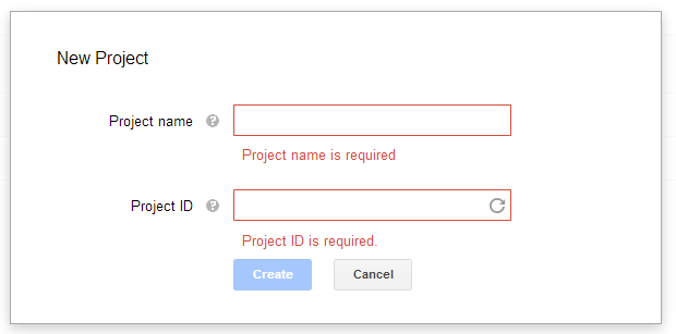
Kudos to Google for making the process so simple for creating your Cloud Databases although bear in mind you will need to have a registered card on the account before you can go ahead. You simply need to login to your current Google Account and then head over to the Google Developer Console where you will see a list of your projects (if you have any) and clicking the red button in the top left will let you create a new project which we will use for our test OpenCart installation. Just give your project a name and let Google generate a unique, random project ID.

Once that has finished processing, click on the Cloud SQL link in the left hand sidebar then click the red “New Instance” button. Now you will see a simple form to create the MySQL database, we will go through the steps here though just for an extra explanation on what they are for.

Instance ID

Here you can create a unique name which will be used to reference this particular database instance within your project. KEEP IT SECRET!

Region

Choose the default region to keep all of the data stored, the options I have are US and Europe but not sure if that is because I am based in the UK. Choose whichever you is relevant for your store, business and main customer-base.

Tier

This is the section where you can choose the level of resources that your database requires. Since I am just following this as a test, I will choose the lowest tier (D0) but have a word with your developer and web host to see how much your site is currently using to choose the right tier so your not paying too much but have enough power to manage your store. Bear in mind, one of the great things about cloud based databases is that you can change this tier at any point if you need a little extra juice.

Billing Plan

This depends on how busy and resource hungry your site is. For this test I just went with a Pay As You Go pricing model but if you have a lot of visitors you may save money with a billing plan.

Preferred Location

You can use this to choose a zone within your chosen country to keep data closest to your most active users. I left this as No Preference.

Backup Window

Have a look into your Analytics software and decide when the site is least busy and choose a window within that timeframe to perform backups.

Replication

I left this as Synchronous, simply for the reliability factor.

IP Address

For an extra $0.01 an hour you can have a dedicated IP address for your database which you are going to need. OpenCart requires a hostname, or IP Address, to connect to the database so in order to run an OpenCart database from the cloud you will need to have an IP allocated.

Authorised IP Address

You will need the IP address which your website runs on, this means that only your website can access the database, everything else will be rejected. Get in touch with your web host if you don’t know what this is.

Authorised App Engine Applications

This is for developers who have other projects in their developer console so leave this blank unless you know what it is for.

Then click submit and let it process, then you have a brand new MySQL database to use for your OpenCart store. The next step should be to change the root password to something more memorable for you to use, go into the developer console, select your database instance and click “Access Control”, from there you can choose a new root password.

Pointing phpMyAdmin to Google Cloud SQL

By default your webhost will likely have phpMyAdmin installed so you can follow this guide to point your application to use the Google Cloud SQL database instead of your own. Go into your web hosting account file manager and get to the phpMyAdmin config settings by going to the file:

  • phpmyadmin/libraries/config.default.php

Then, find the following variables and change them to your new Cloud Instance using the IP address which Google has assigned your database.

1
2
3
4
5
$cfg['Servers'][$i]['host'] = '[GOOGLE CLOUD SQL IP ADDRESS]';
$cfg['Servers'][$i]['user'] = '[DATABASE USERNAME - DEFAULT ROOT]';
$cfg['Servers'][$i]['password'] = '[DATABASE PASSWORD - YOU HAVE JUST CHANGED THIS]';
$cfg['Servers'][$i]['extension'] = 'mysql';
$cfg['Servers'][$i]['AllowNoPassword'] = false;

OK, so now when you load up phpMyAdmin you will be connected to Google’s Cloud SQL database rather than the default web hosts and you can manage it through phpMyAdmin as you would normally. Bear in mind there are a few restrictions on the commands and privilege settings which shouldn’t affect you too much.

Installing A new Cloud Database-powered OpenCart

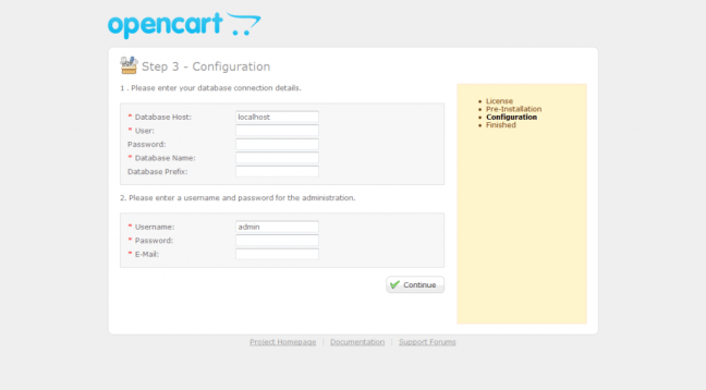
OK, in this example we will be assuming that you are installing a brand new OpenCart instance on your server. In which case simply follow the installation instructions as in the step below but make sure to enter the same hostname, username and password that you used in changing the phpMyAdmin config settings.

Then just let OpenCart do it’s thing and it will be using the new Cloud SQL database rather than the localhost one on your web hosting account.

Moving your existing OpenCart installation to use Cloud SQL

So, if you have a currently existing OpenCart store and you simply want to move the database into the cloud, log into your newly configured phpMyAdmin and simply use the database backup you took at the start of this tutorial and import it into your new Cloud SQL database using the import button along the top. Then you will need to edit the Database information inside your OpenCart store so open up your site in FTP and find the following files:

  • config.php
  • admin/config.php

All you need to do then is change the database connection settings (the hostname, username and password) to point towards your new Cloud SQL database rather than the localhost version and then you are good to go! By the way, the database driver is still “mysql” so you can leave that as it is.

Fonte: Connecting OpenCart’s Database to Google Cloud SQL | Cart Advisor

Windows 10 é instalado sem os utilizadores saberem

Um leitor de um site de tecnologias descobriu uma diretoria com mais de 3,5 GB e um nome fora de comum. E assim se ficou a saber que o Windows 10 é pré-instalado nas máquinas que não desativaram os upgrades automáticos.

Os utilizadores que não desligaram a opção de upgrade automático nas versões Windows 7 e 8 arriscam-se a ver as suas máquinas a descarregarem o Windows 10 – mesmo que não tenham intenção de fazer o upgrade do sistema operativo.

Na origem deste download não autorizado encontra-se o update KB3035583, que procede à pré-instalação do Windows 10 nos computadores que podem beneficiar do upgrade gratuito (máquinas que têm Window 7 e 8).

A Ars Technica já confirmou que se trata de um situação aparentemente exclusiva dos computadores que têm ativada a funcionalidade de upgrade automático.

A Microsoft já confirmou que faz a pré-instalação automática do novo sistema operativo «ajudando os dispositivos que podem fazer o upgrade a ficarem aptos para o Windows 10, através do download do ficheiros necessários».

O curioso caso começou por ser levantado por um leitor do Inquirer quando descobriu a diretoria “$Windows.~BT”, com uma volume de dados entre os 3,5 e os 6 GB. O utilizador estranhou tal descoberta, uma vez que não havia solicitado o upgrade para o Windows 10.

Fonte: Windows 10 é instalado sem os utilizadores saberem

Afinal o Windows Media Center pode ser instalado no Windows 10

O Windows Media Center foi, até à chegada do Windows 10, um dos softwares mais usados pelos utilizadores do sistema operativo da Microsoft.

A decisão que a Microsoft tomou de o deixar fora do Windows 10 não foi do agrado dos utilizadores, mas agora surgiu a possibilidade de voltar a ser instalado, mas de forma não oficial.

A decisão da Microsoft de não permitir que o Windows Media Center fosse instalado no Windows 10 deixou muitos utilizadores descontentes, tendo muitos ponderado se realmente valeria a pena fazer a actualização, pelo menos imediata.

A alternativa não é a melhor, tendo ainda por cima um custo de 15 euros, algo que muitos não entendem e não aceitam.

As alternativas existem desde o primeiro dia, mas muitos preferiam ter o bom e fiel Windows Media Center.

Felizmente um grupo de utilizadores do Fórum MDL encontraram uma forma de trazer de volta o Windows Media Center, conseguindo-o instalar no Windows 10.

Os passos a serem seguidos não são complicados e estão explicados abaixo:

  1. Descarregar e descomprimir o ficheiro “WindowsMediaCenter_10.0.10134.0.zip” que podem encontrar neste link.
  2. Procurar o ficheiro”_TestRights.cmd“, clicar com o botão direito e escolher a opção “Correr como Administrador“.
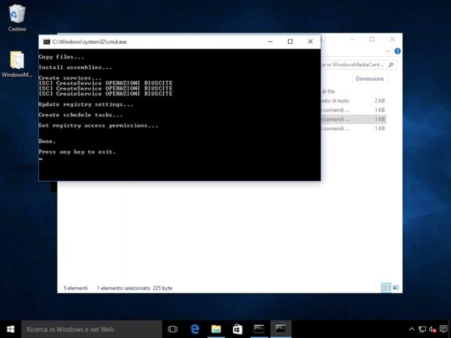
  3. Surgirá uma janela de comandos, que executará um conjunto de instruções. No final reinicie o seu PC.
  4. Procure o ficheiro “Installer.cm,” clique com o botão direito e escolha a opção “Correr como Administrador“.
  5. Quando a instalação terminar será apresentada uma mensagem com o texto “Press any key to exit.”

Agora que o Windows Media Center está instalado só precisam de o procurar na pesquisa e depois fixarem-no na barra de tarefas ou no Menu Iniciar.

Tal como antes esta excelente aplicação vai estar disponível para terem acesso aos vossos conteúdos, numa interface própria e com todas as funcionalidades que precisam.

Quem achava que o Windows Media Center tinha morrido de vez e que a Microsoft não o traria de volta enganou-se. Não é uma distribuição oficial, mas consegue trazer de volta o Windows Media Center a todos os que o queriam no Windows 10.

Fonte: Afinal o Windows Media Center pode ser instalado no Windows 10

10 Useful WordPress Security Tweaks – Smashing Magazine


Security has always been a hot topic. Offline, people buy wired homes, car alarms and gadgets to bring their security to the max. Online, security is important, too, especially for people who make a living from websites and blogs. In this article, we’ll show you some useful tweaks to protect your WordPress-powered blog.

[Offtopic: by the way, did you know that there is a Smashing eBook Series? Book #1 is Professional Web Design, 242 pages for just $9,90.]

1. Prevent Unnecessary Info From Being Displayed

The problem
When you fail to log into a WordPress blog, the CMS displays some info telling you what went wrong. This is good if you’ve forgotten your password, but it might also be good for people who want to hack your blog. So, why not prevent WordPress from displaying error messages on failed log-ins?

The solution
To remove log-in error messages, simply open your theme’s functions.php file, and paste the following code:

view source

print?

1
add_filter('login_errors',create_function('$a', "return null;"));

Save the file, and see for yourself: no more messages are displayed if you fail to log in.

Please note that there are several functions.php files. Be sure to change the one in your wp-content directory.

Code explanation
With this code, we’ve added a simple hook to overwrite the login_errors() function. Because the custom function that we created returns only null, the message displayed will be a blank string.

Source

2. Force SSL Usage

The problem
If you worry about your data being intercepted, then you could definitely use SSL. In case you don’t know what it is, SSL is a cryptographic protocol that secures communications over networks such as the Internet.

Did you know that forcing WordPress to use SSL is possible? Not all hosting services allow you to use SSL, but if you’re hosted on Wp WebHost or HostGator, then SSL is enabled.

The solution
Once you’ve checked that your Web server can handle SSL, simply open your wp-config.php file (located at the root of your WordPress installation), and paste the following:

view source

print?

1
define('FORCE_SSL_ADMIN', true);

Save the file, and you’re done!

Code explanation
Nothing hard here. WordPress uses a lot of constants to configure the software. In this case, we have simply defined the FORCE_SSL_ADMIN constant and set its value to true. This results in WordPress using SSL.

Source

3. Use .htaccess To Protect The wp-config File

The problem
As a WordPress user, you probably know how important the wp-config.php file is. This file contains all of the information required to access your precious database: username, password, server name and so on. Protecting the wp-config.php file is critical, so how about exploiting the power of Apache to this end?

The solution
The .htaccess file is located at the root your WordPress installation. After creating a back-up of it (it’s such a critical file that we should always have a safe copy), open it up, and paste the following code:

view source

print?

1
<files wp-config.php>

2
order allow,deny

3
deny from all

4
</files>

Code explanation
.htaccess files are powerful and one of the best tools to prevent unwanted access to your files. In this code, we have simply created a rule that prevents any access to the wp-admin.php file, thus ensuring that no evil bots can access it.

Source

4. Blacklist Undesired Users And Bots

Sm4 in 10 Useful WordPress Security Tweaks

The problem
This is as true online as it is in real life: someone who pesters you today will probably pester you again tomorrow. Have you noticed how many spam bots return to your blog 10 times a day to post their annoying comments? The solution to this problem is quite simple: forbid them access to your blog.

The solution
Paste the following code in your .htaccess file, located at the root of your WordPress installation. As I said, always back up the .htaccess file before editing it. Also, don’t forget to change 123.456.789 to the IP address you want to ban.

view source

print?

1
<Limit GET POST PUT>

2
order allow,deny

3
allow from all

4
deny from 123.456.789

5
</LIMIT>

Code explanation
Apache is powerful and can easily be used to ban undesirable people and bots from your website. With this code, we’re telling Apache that everyone is allowed to visit our blog except the person with the IP address 123.456.789.

To ban more people, simply repeat line 4 of this code on a new line, using another IP address, as shown below:

view source

print?

1
<Limit GET POST PUT>

2
order allow,deny

3
allow from all

4
deny from 123.456.789

5
deny from 93.121.788

6
deny from 223.956.789

7
deny from 128.456.780

8
</LIMIT>

Source

5. Protect Your WordPress Blog From Script Injections

The problem
Protecting dynamic websites is especially important. Most developers always protect their GET and POST requests, but sometimes this is not enough. We should also protect our blog against script injections and any attempt to modify the PHP GLOBALS and _REQUEST variables.

The solution
The following code blocks script injections and any attempts to modify the PHP GLOBALS and _REQUEST variables. Paste it in your .htaccess file (located in the root of your WordPress installation). Make sure to always back up the .htaccess file before modifying it.

view source

print?

1
Options +FollowSymLinks

2
RewriteEngine On

3
RewriteCond %{QUERY_STRING} (\<|%3C).*script.*(\>|%3E) [NC,OR]

4
RewriteCond %{QUERY_STRING} GLOBALS(=|\[|\%[0-9A-Z]{0,2}) [OR]

5
RewriteCond %{QUERY_STRING} _REQUEST(=|\[|\%[0-9A-Z]{0,2})

6
RewriteRule ^(.*)$ index.php [F,L]

Code explanation
Using the power of the .htaccess file, we can check requests. What we’ve done here is check whether the request contains a <script> and whether it has tried to modify the value of the PHP GLOBALS or _REQUEST variables. If any of these conditions are met, the request is blocked and a 403 error is returned to the client’s browser.

Sources

6. Fight Back Against Content Scrapers

The problem
If your blog is the least bit known, people will no doubt try to use your content on their own websites without your consent. One of the biggest problems is hot-linking to your images, which saps your server’s bandwidth.

The solution
To protect your website against hot-linking and content scrapers, simply paste the following code in your .htaccess file. As always, don’t forget to back up when modifying the .htaccess file.

view source

print?

1
RewriteEngine On

2
#Replace ?mysite\.com/ with your blog url

3
RewriteCond %{HTTP_REFERER} !^http://(.+\.)?mysite\.com/ [NC]

4
RewriteCond %{HTTP_REFERER} !^$

5
#Replace /images/nohotlink.jpg with your "don't hotlink" image url

6
RewriteRule .*\.(jpe?g|gif|bmp|png)$ /images/nohotlink.jpg [L]

Once you’ve saved the file, only your website will be able to link to your images, or, to be more correct, no one would link to your images, because it would be way too complicated and time-consuming. Other websites will automatically display the nohotlink.jpg image. Note that you can also specify a non-existent image, so websites that try to hot-link to you would display a blank space.

Code explanation
With this code, the first thing we’ve done is check the referrer to see that it matches our blog’s URL and it is not empty. If it doesn’t, and the file has a JPG, GIF, BMP or PNG extension, then the nohotlink image is displayed instead.

Source

7. Create A Plug-In To Protect Your Blog From Malicious URL Requests

Sm7 in 10 Useful WordPress Security Tweaks

The problem
Hackers and evil-doers often use malicious queries to find and attack a blog’s weak spots. WordPress has good default protection, but enhancing it is possible.

The solution
Paste the following code in a text file, and save it as blockbadqueries.php. Once you’ve done that, upload it to your wp-content/plugins directory and activate it as you would any other plug-in. Now your blog is protected against malicious queries.

view source

print?

01
<?php

02
/*

03
Plugin Name: Block Bad Queries

04
Plugin URI: http://perishablepress.com/press/2009/12/22/protect-wordpress-against-malicious-url-requests/

05
Description: Protect WordPress Against Malicious URL Requests

06
Author URI: http://perishablepress.com/

07
Author: Perishable Press

08
Version: 1.0

09
*/

10

11
global $user_ID

12

13
if($user_ID) {

14
if(!current_user_can('level_10')) {

15
if (strlen($_SERVER['REQUEST_URI']) > 255 ||

16
strpos($_SERVER['REQUEST_URI'], "eval(") ||

17
strpos($_SERVER['REQUEST_URI'], "CONCAT") ||

18
strpos($_SERVER['REQUEST_URI'], "UNION+SELECT") ||

19
strpos($_SERVER['REQUEST_URI'], "base64")) {

20
@header("HTTP/1.1 414 Request-URI Too Long");

21
@header("Status: 414 Request-URI Too Long");

22
@header("Connection: Close");

23
@exit;

24
}

25
}

26
}

27
?>

Code explanation
What this code does is pretty simple. It checks for excessively long request strings (more than 255 characters) and for the presence of either the eval or base64 PHP functions in the URI. If one of these conditions is met, then the plug-in sends a 414 error to the client’s browser.

Source

8. Remove Your WordPress Version Number… Seriously!

The problem
As you may know, WordPress automatically displays the version you are using in the head of your blog files. This is pretty harmless if your blog is always up to date with the latest version (which is certainly what you should be doing anyway). But if for some reason your blog isn’t up to date, WordPress still displays it, and hackers will learn this vital piece of information.

The solution
Paste the following line of code in the functions.php file of your theme. Save it, refresh your blog, and voila: no more WordPress version number in the header.

view source

print?

1
remove_action('wp_head', 'wp_generator');

Code explanation
To execute certain actions, WordPress uses a mechanism called “hooks,” which allow you to hook one function to another. The wp_generator function, which displays the WordPress version, is hooked. We can remove this hook and prevent it from executing by using the remove_action() function.

Source

9. Change The Default “Admin” Username

Sm9 in 10 Useful WordPress Security Tweaks

The problem
Brute force is one of the easiest ways to break a password. The method is simple: try as many different passwords as possible until the right one is found. Users of the brute force method use dictionaries, which give them a lot of password combinations.

But knowing your username certainly makes it easier for them to guess the right combination. This is why you should always change the default “admin” username to something harder to guess.

Note that WordPress 3.0 let you choose your desired username by default. Therefore, this tip is still usefull if you still use the old “admin” account from older WordPress versions.

The solution
If you haven’t changed the “admin” username yet, simply run the following SQL query to your database to change it for good. Don’t forget to specify your desired username.

view source

print?

1
UPDATE wp_users SET user_login = 'Your New Username' WHERE user_login = 'Admin';

Code explanation
Usernames are stored in the database. To change one, a simple UPDATE query is enough. Note that this query will not transfer posts written by “admin” to your new username; the source post below shows you how to easily do that.

Source

10. Prevent Directory Browsing

The problem
By default, most hosts allow directory listing. So, if you type www.yourblog.com/wp-includes in the browser’s address bar, you’ll see all of the files in that directory. This is definitely a security risk, because a hacker could see the last time that files were modified and access them.

The solution (Updated)
Just add the following to the Apache configuration or your .htaccess file:

view source

print?

1
Options -Indexes

Code explanation
Please note that it’s not enough to update the blog’s robots.txt file with Disallow: /wp*. This would prevent the wp-directory from being indexed, but will not prevent users from seeing it.

Source

Smarter Grids With Sass And Susy

Michelle Barker shows how to create fast, responsive, fully customizable grids in CSS without touching your markup with Susy, a Sass-based grid framework.

If you’re a designer, you’ll know that grids are your friends. More often than not, they’re the vital architecture that holds a beautiful design together; they create rhythm, structure your page, lead the eye, and prevent the whole thing collapsing in a sloppy mess.

I’m a firm advocate for designing with the browser: prototyping with HTML and CSS has many clear advantages over static Photoshop comps, which have less value for the responsive web. Unfortunately, HTML, CSS and grids aren’t natural bedfellows: the progression of web standards over the years has been lacking in this area, meaning we have to grapple with floats (which were never designed to be used this way) and clearfixes — not ideal when you want to spend less time debugging layout and more time crafting experiences.

The relatively new implementation of the flexbox and CSS grid layout modules are on course to free us from the constraints of floats and allow us to create some pretty interesting layouts — which I’m excited about — but they’re not a magic bullet. Even with those, coding up a layout can still be a lengthy process for a designer, and require you to remember a bunch of not very intuitive properties.

Happily, lots of tools currently exist to enable you to quickly design grids for the web, from CSS frameworks like Bootstrap and Foundation, to sites like Responsive Grid System. However, frameworks have their drawbacks, such as requiring you to add a large number of classes to your markup, and delivering a bloated codebase that can be bad for performance.

Luckily for us, solutions exist to the problem of creating fast, responsive, fully customizable grids: Susy is a Sass-based grid framework. It’s very lightweight and enables you to create entirely custom grids in CSS without touching your markup.

Susy was developed by Eric M. Suzanne, with support from Chris Eppstein — creator of Compass and co-creator of Sass — so it’s very well supported in the Sass community and it’s rapidly gaining in popularity.

Framework Or Not? Link

I tend to refer to Susy as a framework, but it may be more accurate to call it a grid system. Unlike more traditional frameworks, Susy doesn’t require you to add classes to your HTML elements. Susy is written entirely in your SCSS file by adding mixins and functions, using media queries to customize your layout at your own specified breakpoints. It enables you to keep content and style entirely separate — not essential all the time, but widely viewed as best practice.

Before we continue, I should point out that Susy isn’t the only solution: Zen Grids by John Albin and Jeet by Cory Simmons are two others. Singularity is also a pretty interesting framework, which works in a similar way to Susy, using Sass mixins rather than adding classes to your HTML. However, Susy has a growing community and helpful documentation, making it a good choice to get started with.

Advantages Link

Why might you want to use Susy in your next project? There are several advantages:

  1. (Relatively) Easy to Learn
    If you’ve used other frameworks (like Bootstrap or Foundation), and if you’re familiar with Sass at all, Susy shouldn’t be too difficult for you to pick up. Even if you’re fairly new to Sass, Susy doesn’t require in-depth knowledge and is a great way to start! The examples in this article assume a working knowledge of Sass, so it’s worth reading up a little if you’re not familiar.
  2. Speed Up Your Workflow
    Unlike many other frameworks, Susy doesn’t come with a bunch of default styling that you need to overwrite. In fact, Susy has no styling: it’s purely a grid layout system. Its purpose is to do the maths for you — anything else is for you to add. Once you’re familiar with a few of Susy’s mixins, you’ll find it’ll save you time and free you up to concentrate on design.
  3. Use as Much or as Little as You Like
    As with Sass, you can pick and choose what works for you. We’ll focus on a few fairly simple examples here, but you can use Susy to do some pretty complex things if you’re so inclined!

I should also point out that while Susy currently relies on traditional floats to position your grid, the documentation indicates that flexbox and CSS grid layout could well be forthcoming, which will make it even more powerful!

Getting Started Link

Susy was designed to work with Compass, so if you already have Compass installed then setting up Susy is straightforward. You don’t actually need to use Compass in order to use Susy — Susy is compatible with just about any Sass workflow — but for the purpose of getting started I’ll be using Compass as a primary example.

To install Susy, simply run the following in the command line:

$ gem install susy

(If you get an error, you may need to prefix this command with sudo.)

Then set up your new project. If you’re using Compass, in your config.rb you need to add require 'susy'. Then, in your main SCSS file (in this case screen.scss) add @import "susy"; to import Susy into your project.

Alternatively, CodeKit is an excellent app for getting up and running with everything you need and allows you to add Susy to your project quickly and easily.

Finally, we need to create an index.html file in our project folder to house our markup, and link it to our style sheet.

Building Our First Susy Grid Link

Assuming you’ve gone through the necessary steps to run Susy in your project, we’re ready to create our first layout. First of all, we need to define some parameters for our grid in a map at the beginning of our main SCSS file. If you’ve come across Sass maps, you’ll be familiar with the syntax:

$susy: (
  columns: 12,
  container: 1200px,
  gutters: 1/4,
  global-box-sizing: border-box,
  debug: (image: show)
);

In this map you can define pretty much any of the global settings for your grid, from the number of columns to gutter width, all of which are listed in the Susy documentation. If you don’t enter a setting in your map, Susy will simply use its default settings. There are a few things we’ll need to define to create our grid:

  • The number of columns we’ll use.
  • The maximum width of the container. If you don’t specify a width, your container will be 100% of the width of the viewport, like any block element. You might want this in some cases but, especially while we’re learning, setting a maximum width allows us to see more clearly what’s going on.
  • Gutters. By default Susy includes gutters as right-hand margins on your columns and at one quarter (1/4) of the column width. You can change the gutter ratio here, or use gutter-position to decide how you want gutters to behave.
  • Box-sizing. I always prefer to set this to border-box. (Susy’s default is content-box.)
  • The debug image. Setting this to show displays a background image showing your column grids, useful for making sure everything is aligned correctly and your elements behave as they should.

Creating A Basic Layout Link

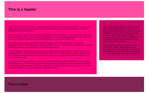
We’re going to start by creating this simple layout using Susy:

We’ll start with some markup containing a header, a main content area with article and sidebar, and a footer.

<main class="wrapper">
  <header></header>
  <article></article>
  <aside></aside>
  <footer></footer>
</main>

As I previously mentioned, Susy depends entirely on CSS and Sass to customize your grid, so you don’t need to add anything else to your HTML. The most important feature for creating grids in Susy is the span mixin. Use @include to include the mixin in your Sass. As you can see from the image, we want our header and footer to take up 100% of the container width, so we don’t need to do anything here. But we need our<article> and <aside> elements to take up eight columns and four columns respectively in our twelve-column grid. In order to achieve this we need to use thespan mixin:

/* SCSS */

article {
  @include span(8 of 12);
  /* More styles here */
}

aside {
  @include span(4 of 12 last);
  /* More styles here */
}

There are a couple of things to note here:

  1. Susy depends on context: we could easily write @include span(8) for the<article> element, which would produce the same result because we already defined our layout as four columns in the map. However, if we wanted to override the map for this particular element (say, subdivide this area of our layout into a greater number of columns), we need to specify the context — in this case, twelve columns.
  2. We want the <aside> to be the last item in the row, so we’ve added the wordlast to the mixin. This tells Susy to remove the right-hand margin on that element so that it fits on the row.

If we take a look at our CSS file, we’ll see the above Sass compiles to:

article {
  width: 66.10169%;
  float: left;
  margin-right: 1.69492%;
}

aside {
  width: 32.20339%;
  float: right;
  margin-right: 0;
}

You can see that Susy has calculated our column widths and gutters based on the settings we specified in our map.

In the Codepen example I’ve included some dummy content, as well as a little padding and a background color on our elements. Without these our grid would simply be invisible, as Susy has no default styling.

As we’re floating elements, we also need to remember to clear our footer:

    
header {
  padding: 2em;
  background-color: #FF4CA5; /* Of course, you can define your colours as variables if you prefer! */
}

article {
  @include span(8);
  padding: 2em;
  background-color: #ff007f;
}

aside {
  @include span(4 last);
  padding: 2em;
  background-color: #CC0066;
}

footer {
  clear: both;
  padding: 2em;
  background-color: #7F2653;
}

Finally, we’ll include the container mixin in our main element to give our content a maximum width and position it in the center of the page by setting the left and right margins to auto:

main.wrapper {
  @include container;
}

With these additions, we get this result:

Refining Our Grid Link

We could do with separating the elements to make our layout more pleasing. Let’s add a bottom margin to our <header>, <article> and <aside> elements. What would make an even more appealing layout would be to make our bottom margins the same width as our column gutters. With Susy, we can do this using the gutter function (as opposed to the mixin):

header, article, aside {
  margin-bottom: gutter();
}

As we haven’t specified a value in the gutter function, Susy will use our map settings; that is, 1/4 column-width in a twelve-column layout. But if, for instance, the section we were working on was only eight columns wide, we may want to specify gutter(8) to create the same effect.

Our SCSS file now looks like this:

main {
  @include container;
}

header, article, aside {
  margin-bottom: gutter();
}

header {
  padding: 2em;
  background-color: #FF4CA5;
}

article {
  @include span(8);
  padding: 2em;
  background-color: #ff007f;
}

aside {
  @include span(4 last);
  padding: 2em;
  background-color: #CC0066;
}

footer {
  clear: both;
  padding: 2em;
  background-color: #7F2653;
}

Now our layout looks like this:

Mixins Vs. Functions Link

We just used gutter as a function, as opposed to including it in a mixin. It’s worth noting that span, gutter and container can all be used as both mixins and functions. The Susy documentation outlines use cases for each, but our next example should help give you an understanding of the circumstances in which a function might be useful.

There’s one more thing that will no doubt be extremely handy to you as a designer: thegallery mixin. As the Susy documentation succinctly puts it, “Gallery is a shortcut for creating gallery-style layouts, where a large number of elements are layed [sic] out on a consistent grid.” It’s great for unordered lists, for example, if you want to create a portfolio page.

We’ll use the following markup for a gallery of twelve items — again, I’ve added some placeholder content in the Codepen example:

<main>
  <header></header>
  <article>
    <ul class="gallery">
      <li></li>
      <li></li>
      <li></li>
      <li></li>
      <li></li>
      <li></li>
      <li></li>
      <li></li>
      <li></li>
      <li></li>
      <li></li>
      <li></li>
    </ul>
  </article>
  <aside></aside>
  <footer></footer>
<main>

We’ll keep the same SCSS from the previous example, with the addition of the following:

ul.gallery {
  padding: span(1 of 8);
  list-style: none;
}
    
.gallery li {
  @include gallery(2 of 6);
  margin-bottom: gutter(6);
  
  &:nth-last-child(-n + 3) {
    margin-bottom: 0;
  }
}

There are a few things going on here:

  1. First, we’re using span as a function to add one column-width of padding all the way around our gallery. As the element is eight columns wide, taking up one column-width on either side leaves us with the remaining six columns for our gallery items.
  2. Using the gallery mixin on our <li> element (@include gallery(2 of 6)), we’re telling Susy that each item should take up two columns in our six-column width. That means that each row will hold three gallery items.
  3. Using the gutter function (margin-bottom: gutter(6)) we’re adding a bottom margin the equivalent of one gutter-width in our six-column context to each item in our gallery. I’m using the :nth-child pseudo-class to remove the bottom margin from our last row, giving us a perfectly even amount of spacing around our gallery.
  4. As we’re floating elements, we’ll also need a clearfix on the parent element (in this case the ul element). In the example, I’m using Compass’s clearfix, but you could create your own mixin, or write it longhand.
    ul.gallery {
      @include clearfix;
    }

Result:

Susy For Responsive Web Design Link

Although the examples we’ve walked through so far are based on fluid grids (Susy’s default), they aren’t responsive — yet. At the beginning of this article I mentioned that Susy is a great tool for designing responsively. Let’s look at one more example to see how we can use Susy to create a layout that adapts to different viewport sizes.

In this demo we’ll use use media queries in our Sass, along with Susy’s layout mixin to customize our grid for different breakpoints.

You’ll recall that at the beginning of our SCSS file we created a map with our global settings. In fact, we can create any number of maps and summon them at will into our layout with this mixin. This is useful if at a certain breakpoint you want to switch from, for instance, a twelve-column to a 16-column layout with no gutters. Our second map may look something like this:

$map-large: (
  columns: 16,
  container: auto,
  gutters: 0,
  global-box-sizing: border-box
);

For this example I’ve created a simple gallery webpage displaying a collection of photos of found typography. Taking a mobile-first approach, our first step is to create a single-column view, where our main elements take up the full width of the page. However, in our gallery section, we want our images to display in rows of two once our viewport gets wider than, say, 400px and in rows of three after 700px. We’re using atwelve-column grid in our global settings, so all we need to do is instruct Susy to set our gallery items at six columns out of twelve, and four columns out of twelve respectively, in min-width media queries:

li {
  @media (min-width: 480px) {
    @include gallery(6);
    margin-bottom: gutter();
  }
  @media (min-width: 700px) {
    @include gallery(4);
    margin-bottom: gutter();
  }
}

At widths above 700px, this is what our webpage looks like:

At desktop sizes we’re going to make our layout a little more complex. Here we want our header to display as a bar on the left-hand side and our gallery items to display in rows of four on the right of the screen, with no gutters. To achieve this we’re going to switch to a 16-column layout, as defined in the new map we created a moment ago.

We’re going to use the layout mixin as follows:

@media (min-width: 1100px) {
  @include layout($map-large);
  
  header {
    @include span(4);
  }
  
  main {
    @include span(12 last);
  }
  
  li {
    @include gallery(3 of 12);
    margin-bottom: 0;
  }
}

The layout mixin sets a new layout for our grid. Any code following this mixin will be affected by the 16-column layout we specified. (Note: if you want to revert back to a different layout, you’ll need to use this mixin again to call a different map, as your code will be affected by this mixin until you specify otherwise!)

In this instance, the <header> element will span 4 colomns out of 16 and the main content area will span the remaining 12 out of 16 columns. Because our gallery items are nested within this 12-column section, we should specify that they take up 3 columns out of 12 (rather than 16).

The above code gives us this layout at desktop sizes:

Dealing With Sub-Pixel Rounding Link

If you’re working with percentage-based grids you’re going to come up against sub-pixel rounding issues. These occur when percentages result in column widths that subdivide a pixel, so the browser rounds your column width up or down by a pixel to compensate. This may mean your layouts don’t always behave as you might expect. For a full explanation of sub-pixel rounding, read “Responsive Design’s Dirty Little Secret” by John Albin Wilkins.

Susy provides a workaround for dealing with sub-pixel rounding via its isolatetechnique, and it’s a handy port of call when your layouts aren’t playing nice.

Conclusion Link

I hope this article has helped you get started with Susy and provided a small taste of what is possible. Once you spend a little time getting the hang of it, you’ll see how easy and fast it is to create simple or complex layouts without a huge amount of code; and it really will save you time in the long run.

Here are some useful links and resources to help you get started with Susy:

(ds, ml, og)

Fonte: Smarter Grids With Sass And Susy