Loading JSON content via Ajax

Loading JSON content via Ajax

http://icant.co.uk/articles/things-to-know-about-ajax/load-json.html

Example

Source Code

JavaScript
$(document).ready(function(){
  var container = $('#target');
  container.attr('tabIndex','-1');
  $('.ajaxtrigger').click(function(){
    var trigger = $(this);
    var url = trigger.attr('href');
    container.html('');
    if(!trigger.hasClass('loaded')){
      trigger.append('<span></span>');
      trigger.addClass('loaded');
      var msg = trigger.find('span::last');
    } else {
      var msg = trigger.find('span::last');
    }
    doAjax(url,msg,container);
    return false;
  });
 
  function doAjax(url,msg,container){
    var tag = url.split('/');
    var tag = tag[tag.length-1];
    $.getJSON("http://api.flickr.com/services/feeds/"+
               "photos_public.gne?tags="+tag+
               "&tagmode=any&format=json&jsoncallback=?",
     function(data){
       msg.html(' (ready.)');
       $.each(data.items, function(i,item){
         $("<img/>").
          attr("src", item.media.m).
            attr("alt",item.title).
              appendTo(container);
         if ( i == 3 ) return false;
       });
       container.focus().effect("highlight",{},1000);
    });
  }
});

Top WordPress Hacks 2009

2009 has been a very prolific year for WordPress hacks. In this article, I’ll show you the most useful hacks I came across during the whole year. Enjoy!

Monetizing your old blog posts

Let’s start this post with a nice hack dedicated to help you make more money online, initially published on my other blog Cats Who Blog.
If you don’t want to bore your loyal readers but still want to earn some bucks, what about monetizing only your old blog posts instead? This code will add some advertisements only if the post is more than 15 days old.

The following function has to be pasted in your functions.php. If you are using the Thesis theme this file is named custom_functions.php.

view source

print?

01.function is_old_post($post_id=null){

02. $days = 15;

03. global $wp_query;

04. if(is_single() || is_page()) {

05. if(!$post_id) {

06. $post_id = $wp_query->post->ID;

07. }

08. $current_date = time();

09. $offset = $days *60*60*24;

10. $post_id = get_post($post_id);

11. $post_date = mysql2date('U',$post_id->post_date);

12. $cunning_math = $post_date + $offset;

13. $test = $current_date - $cunning_math;

14. if($test > 0){

15. $return = true;

16. }else{

17. $return = false;

18. }

19. }else{

20. $return = false;

21. }

22. return $return;

23.}

Once you’ve successfully inserted the code in your function.php file, you are now ready to call the functions in your single.php template as shown below:

view source

print?

1.<?php if(is_old_post()){ ?>

2.INSERT AD CODE HERE

3.<?php } ?>

Source : http://www.catswhoblog.com/how-to-monetize-your-old-blog-posts

Display your posts word count

Many people asked me about being able to get the post word count and display it. It is definitely easier to do than you may think at first.
Simply open your functions.php file and paste this function in it:

view source

print?

1.function wcount(){

2. ob_start();

3. the_content();

4. $content = ob_get_clean();

5. return sizeof(explode(" ", $content));

6.}

Once finished, you can call the function within the loop to get the number of words for the current post:

view source

print?

1.<?php echo wcount(); ?>

Source : http://www.wprecipes.com/wordpress-function-to-display-your-posts-words-count

Detect the visitor browser within WordPress

One of my favorite WordPress hacks of the year is definitely this one, which is incredibly useful. While conditional comments are a great way to target specific browsers, WordPress has one detection function that you can use to make your web developer life easier.

view source

print?

01.<?php

02.add_filter('body_class','browser_body_class');

03.function browser_body_class($classes) {

04. global $is_lynx, $is_gecko, $is_IE, $is_opera, $is_NS4, $is_safari, $is_chrome, $is_iphone;

05.

06. if($is_lynx) $classes[] = 'lynx';

07. elseif($is_gecko) $classes[] = 'gecko';

08. elseif($is_opera) $classes[] = 'opera';

09. elseif($is_NS4) $classes[] = 'ns4';

10. elseif($is_safari) $classes[] = 'safari';

11. elseif($is_chrome) $classes[] = 'chrome';

12. elseif($is_IE) $classes[] = 'ie';

13. else $classes[] = 'unknown';

14.

15. if($is_iphone) $classes[] = 'iphone';

16. return $classes;

17.}

18.?>

The final result will look something like this, if you view the source code of your page:

view source

print?

1.<body class="home blog logged-in safari">

Source : http://www.nathanrice.net/blog/browser-detection-and-the-body_class-function/

Get short urls for social bookmarking

With the rise of Twitter and its 140 characters limit, bloggers have to use short urls to fully take advantage of this new social media phenomenon.
Lots of quality url shorteners are available, but this trick will create a shorter version of your urls automatically, making you save time and hassle.
Paste the following code on your single.php file:

view source

print?

1.<?php echo get_bloginfo('url')."/?p=".$post->ID; ?>

It will output a url similar to:

view source

print?

1.http://www.catswhocode.com/?p=54

Source : http://www.wprecipes.com/how-to-get-short-urls-for-social-bookmarking

Get the first image from the post and display it

This hack has been a favorite of WpRecipes during the year 2009. And I understand that because this hack is very useful, especially for “magazine” themes: It allows you to automatically get the first image from the current post, and display it.

The first thing to do is to paste the function below on your functions.php file.

view source

print?

01.function catch_that_image() {

02. global $post, $posts;

03. $first_img = '';

04. ob_start();

05. ob_end_clean();

06. $output = preg_match_all('/<img.+src=[\'"]([^\'"]+)[\'"].*>/i', $post->post_content, $matches);

07. $first_img = $matches [1] [0];

08.

09. if(empty($first_img)){ //Defines a default image

10. $first_img = "/images/default.jpg";

11. }

12. return $first_img;

13.}

Once finished, you can simply call the function within the loop to display the first image from the post:

view source

print?

1.<?php echo catch_that_image() ?>

Source : http://www.wprecipes.com/how-to-get-the-first-image-from-the-post-and-display-it

Use SSL on wp-admin directory

On the internet, security is always a concern. If your hosting provider supports it (Wp WebHost and HostGator does) you should definitely enable SSL support.
SSL is a cryptographic protocol that provide security and data integrity for communications over TCP/IP networks such as the Internet. TLS and SSL encrypt the segments of network connections at the Transport Layer end-to-end.
Open the wp-config.php file and paste the following:

view source

print?

1.define('FORCE_SSL_ADMIN', true);

Next, save the file, and you’re done!
Source : http://www.wprecipes.com/how-to-force-using-ssl-on-wp-admin-directory

Enhancing the search function

WordPress has a built-in “search” function which isn’t bad, but should have been better. For example, one of the things that could enhance it is to highlight the search results.
To do so, open your search.php file and insert this code:

view source

print?

1.<?php

2. $title = get_the_title();

3. $keys= explode(" ",$s);

4. $title = preg_replace('/('.implode('|', $keys) .')/iu',

5. '<strong class="search-excerpt">\0</strong>',

6. $title);

7.?>

Then, you’ll have to define a style for the search-excerpt CSS class. Just open style.css and paste:

view source

print?

1.strong.search-excerpt { background: yellow; }

Source : http://yoast.com/wordpress-search/

Post on your WordPress blog using PHP

Many of you have enjoyed my “Awesome things to do with cURL” article, published in June. One of the most interesting snippets from that article is showing how to post articles on your WordPress blog, using PHP and cURL.

Here is the function. This code is not made for being used within WordPress, so don’t paste it on your functions.php file (or any other).

Please note that you must activate the XMLRPC posting option in your WordPress blog. If this option isn’t activated, the code will not be able to insert anything into your blog database. Another thing, make sure the XMLRPC functions are activated on your php.ini file.

view source

print?

01.function wpPostXMLRPC($title, $body, $rpcurl, $username, $password, $category, $keywords='', $encoding='UTF-8') {

02. $title = htmlentities($title,ENT_NOQUOTES,$encoding);

03. $keywords = htmlentities($keywords,ENT_NOQUOTES,$encoding);

04.

05. $content = array(

06. 'title'=>$title,

07. 'description'=>$body,

08. 'mt_allow_comments'=>0,  // 1 to allow comments

09. 'mt_allow_pings'=>0,  // 1 to allow trackbacks

10. 'post_type'=>'post',

11. 'mt_keywords'=>$keywords,

12. 'categories'=>array($category)

13. );

14. $params = array(0,$username,$password,$content,true);

15. $request = xmlrpc_encode_request('metaWeblog.newPost',$params);

16. $ch = curl_init();

17. curl_setopt($ch, CURLOPT_POSTFIELDS, $request);

18. curl_setopt($ch, CURLOPT_URL, $rpcurl);

19. curl_setopt($ch, CURLOPT_RETURNTRANSFER, 1);

20. curl_setopt($ch, CURLOPT_TIMEOUT, 1);

21. $results = curl_exec($ch);

22. curl_close($ch);

23. return $results;

24.?>

Source : http://www.wprecipes.com/post-on-your-wordpress-blog-using-php

Rewrite author name with custom field

If you often invite other bloggers to post on your blog, this tip is a must have. It simply allows you to create a custom field with the name of the guest author, and it will overwrite the the_author(); functions.
Simply paste the following code on your single.php and page.php, where you want the author name to be displayed.

view source

print?

1.<?php $author = get_post_meta($post->ID, "guest-author", true);

2.if ($author != "") {

3. echo $author;

4.} else {

5. the_author();

6.}  ?>

Source : http://www.wprecipes.com/rewrite-author-name-with-custom-field

Detect mobile visitors on your WordPress blog

Mobile devices as such the Blackberry or iPhone are more and more popular everyday, and this is why you definitely should take those readers in consideration by offering them a mobile version of your blog.
This hack is definitely easy to implement, thanks to Jeff Starr and Chris Coyier, the author of the excellent “Digging into WordPress” book.

To achieve this recipe, you first have to get the code from detectmobilebrowsers.mobi and upload it to your theme directory.

Then, simply open your header.php file and place the following at the top of the file. Don’t forget to edit line 5 according to the page where you’d like to redirect mobile users.

view source

print?

1.include('mobile_device_detect.php');

2.$mobile = mobile_device_detect();

3.

4.if ($mobile==true) {

5. header( 'Location: http://your-website.com/?theme=Your_Mobile_Theme' ) ;

6.}

Source : http://digwp.com/2009/12/redirect-mobile-users-to-mobile-theme/

An Awesome CSS3 Lightbox Gallery with jQuery


Demo Download

In this tutorial we are going to create an awesome image gallery which leverages the latest CSS3 and jQuery techniques. The script will be able to scan a folder of images on your web server and build a complete drag and drop lighbox gallery around it.

It will be search-engine friendly and even be compatible with browsers which date back as far as IE6 (although some of the awesomeness is lost).

We are using jQuery, jQuery UI (for the drag and drop) and the fancybox jQuery plugin for the lightbox display in addition to PHP and CSS for interactivity and styling.

Before reading on, I would suggest that you download the example files and have the demo opened in a tab for reference.

So lets start with step one.

Step 1 – XHTML

The main idea is to have PHP as a back-end which will generate the necessary XHTML for each image. The generated code is later included in demo.php and completes the gallery XHTML front-end.

demo.php

view source

print?

01
<!-- The gallery container: -->

02
<div id="gallery">

03

04
<?php

05
/* PHP code, covered in detail in step 3 */

06
?>

07

08
<!-- The droppable share box -->

09
<div class="drop-box">

10
</div>

11

12
</div>

13

14
<div class="clear"></div>

15

16
<!-- This is later converted to the modal window with the url of the image: -->

17
<div id="modal" title="Share this picture">

18
<form>

19
<fieldset>

20
<label for="name">URL of the image</label>

21
<input type="text" name="url" id="url" class="text ui-widget-content ui-corner-all" onfocus="this.select()" />

22
</fieldset>

23
</form>

24

25
</div>

Nothing too fancy here. Notice the modal div – it is used to generate the modal window that is shown when the user drops a picture on the share box. But more on this later on.

The gallery

The gallery

Step 2 – CSS

Now that we have all the markup in place, it is time to style it. First we need to include the CSS files in the head section of the page.

demo.php

view source

print?

1
<link rel="stylesheet" type="text/css" href="demo.css" />

2
<link rel="stylesheet" href="http://ajax.googleapis.com/ajax/libs/jqueryui/1.7.2/themes/ui-darkness/jquery-ui.css" type="text/css" media="all" />

3
<link rel="stylesheet" type="text/css" href="fancybox/jquery.fancybox-1.2.6.css">

After we’ve done that, we can start writing the styles.

demo.css

view source

print?

01
body{

02
/* Styling the body */

03
color:white;

04
font-size:13px;

05
background: #222222;

06
font-family:Arial, Helvetica, sans-serif;

07
}

08

09
#gallery{

10
/* The pics container */

11
width:100%;

12
height:580px;

13
position:relative;

14
}

15

16
.pic, .pic a{

17
/* Each picture and the hyperlink inside it */

18
width:100px;

19
height:100px;

20
overflow:hidden;

21
}

22

23
.pic{

24
/* Styles specific to the pic class */

25
position:absolute;

26
border:5px solid #EEEEEE;

27
border-bottom:18px solid #eeeeee;

28

29
/* CSS3 Box Shadow */

30
-moz-box-shadow:2px 2px 3px #333333;

31
-webkit-box-shadow:2px 2px 3px #333333;

32
box-shadow:2px 2px 3px #333333;

33
}

34

35
.pic a{

36
/* Specific styles for the hyperlinks */

37
text-indent:-999px;

38
display:block;

39
/* Setting display to block enables advanced styling for links */

40
}

41

42
.drop-box{

43
/* The share box */

44
width:240px;

45
height:130px;

46
position:absolute;

47
bottom:0;

48
right:0;

49
z-index:-1;

50

51
background:url(img/drop_box.png) no-repeat;

52
}

53

54
.drop-box.active{

55
/* The active style is in effect when there is a pic hovering above the box */

56
background-position:bottom left;

57
}

58

59
label, input{

60
/* The modal dialog URL field */

61
display:block;

62
padding:3px;

63
}

64

65
label{

66
font-size:10px;

67
}

68

69
fieldset{

70
border:0;

71
margin-top:10px;

72
}

73

74
#url{

75
/* The URL field */

76
width:240px;

77
}

One of the classes above, probably needing additional clarification is the pic CSS class. This is used to style the images to look like polaroids. To achieve this, it basically puts a white border around each image.

Also used in the class is the box-shadow CSS3 property, which casts a shadow under each polaroid.

If you’ve looked around the demo of the gallery, you’ve noticed that the images are scattered on the page and rotated in a random fashion. This is done solely with CSS in the PHP side, as you will see in a moment.

The rest of the styles are pretty straightforward and won’t be covered in detail here.

The pics explained

The pics explained

Step 3 – PHP

As you remember, in step 1 we covered the XHTML part and mentioned that PHP is responsible for generating the markup that comprises the individual images. And here is how this is actually done:

demo.php

view source

print?

01
/* Configuration Start */

02
$thumb_directory = 'img/thumbs';

03
$orig_directory = 'img/original';

04
$stage_width=600;

05
$stage_height=400;

06
/* Configuration end */

07

08
$allowed_types=array('jpg','jpeg','gif','png');

09
$file_parts=array();

10
$ext='';

11
$title='';

12
$i=0;

13

14
/* Opening the thumbnail directory and looping through all the thumbs: */

15
$dir_handle = @opendir($thumb_directory) or die("There is an error with your image directory!");

16
$i=1;

17

18
while ($file = readdir($dir_handle))

19
{

20
/* Skipping the system files: */

21
if($file=='.' || $file == '..') continue;

22

23
$file_parts = explode('.',$file);

24
$ext = strtolower(array_pop($file_parts));

25

26
/* Using the file name (withouth the extension) as a image title: */

27
$title = implode('.',$file_parts);

28
$title = htmlspecialchars($title);

29

30
/* If the file extension is allowed: */

31
if(in_array($ext,$allowed_types))

32
{

33
/* Generating random values for the position and rotation: */

34
$left=rand(0,$stage_width);

35
$top=rand(0,400);

36
$rot = rand(-40,40);

37

38
if($top>$stage_height-130 && $left > $stage_width-230)

39
{

40
/* Prevent the images from hiding the drop box */

41
$top-=120+130;

42
$left-=230;

43
}

44

45
/* Outputting each image: */

46
echo '

47

"pic-'.($i++).'" class="pic" style="top:'.$top.'px;left:'.$left.'px;background:url('.$thumb_directory.'/'.$file.') no-repeat 50% 50%; -moz-transform:rotate('.$rot.'deg); -webkit-transform:rotate('.$rot.'deg);">

48

49
class="fancybox" rel="fncbx" href="'.$orig_directory.'/'.$file.'" target="_blank">'.$title.'

50

51

';

52
}

53
}

54

55
/* Closing the directory */

56
closedir($dir_handle);

First, we open the thumbnail directory with opendir (using the @ modifier to prevent any possible errors from getting shown to the user) and looping through all the images.

In the loop, we skip the non-image files and generate some XHTML code for each image, which is directly printed to the screen.

As mentioned in the CSS part, PHP handles the rotation and scattering of the images on the page. Each image is positioned at random X and Y coordinates, and rotated in an angle between -40 and 40 degrees (to prevent upside-down images). Those are generated with the use of the rand() PHP function and included as CSS styles in the picture’s style attribute.

There are two image folders used by the gallery – thumbs, which holds the 100×100 px thumbnails, and original, which holds the big versions of the images. It is important that the thumbnail and original image have the same name, otherwise the gallery won’t function properly.

The only thing left is to throw in some interactivity.

Step 4 – jQuery

We now have a good looking CSS gallery on our hands. But that means nothing if we cant drag the pretty pictures around the screen and zoom them in a fancy lightbox display, does it?

This is where jQuery comes into play.

script.js

view source

print?

01
$(document).ready(function(){

02
// Executed once all the page elements are loaded

03
var preventClick=false;

04
$(".pic a").bind("click",function(e){

05

06
/* This function stops the drag from firing a click event and showing the lightbox */

07
if(preventClick)

08
{

09
e.stopImmediatePropagation();

10
e.preventDefault();

11
}

12
});

13

14
$(".pic").draggable({

15

16
/* Converting the images into draggable objects */

17
containment: 'parent',

18
start: function(e,ui){

19
/* This will stop clicks from occuring while dragging */

20
preventClick=true;

21
},

22
stop: function(e, ui) {

23
/* Wait for 250 milliseconds before re-enabling the clicks */

24
setTimeout(function(){ preventClick=false; }, 250);

25
}

26
});

27

28
$('.pic').mousedown(function(e){

29
/* Executed on image click */

30
var maxZ = 0;

31

32
/* Find the max z-index property: */

33
$('.pic').each(function(){

34
var thisZ = parseInt($(this).css('zIndex'))

35
if(thisZ>maxZ) maxZ=thisZ;

36
});

37

38
/* Clicks can occur in the picture container (with class pic) and in the link inside it */

39
if($(e.target).hasClass("pic"))

40
{

41
/* Show the clicked image on top of all the others: */

42
$(e.target).css({zIndex:maxZ+1});

43
}

44
else $(e.target).closest('.pic').css({zIndex:maxZ+1});

45
});

46

47
/* Converting all the links to a fancybox gallery */

48
$("a.fancybox").fancybox({

49
zoomSpeedIn: 300,

50
zoomSpeedOut: 300,

51
overlayShow:false

52
});

53

54
/* Converting the share box into a droppable: */

55
$('.drop-box').droppable({

56
hoverClass: 'active',

57
drop:function(event,ui){

58

59
/* Fill the URL text field with the URL of the image. */

60
/* The id of the image is appended as a hash #pic-123 */

61
$('#url').val(location.href.replace(location.hash,'')+'#' + ui.draggable.attr('id'));

62
$('#modal').dialog('open');

63
}

64
});

65

66
/* Converts the div with id="modal" into a modal window  */

67
$("#modal").dialog({

68
bgiframe: true,

69
modal: true,

70
autoOpen:false,

71

72
buttons: {

73
Ok: function() {

74
$(this).dialog('close');

75
}

76
}

77
});

78

79
if(location.hash.indexOf('#pic-')!=-1)

80
{

81
/* Checks whether a hash is present in the URL */

82
/* and shows the respective image */

83
$(location.hash+' a.fancybox').click();

84
}

85
});

First we are binding a click function to the images, which prevents the lightbox from showing once we start dragging the pic around.

After this we make all the pictures draggable, and then we set up the lightbox.

Later we turn the “Drop to share” box into a droppable, which enables it to detect when a picture is hovered and dropped. This allows us to add a special hover style to the container, and to open the modal window on drop.

The modal window itself is a user interface component that comes with jQuery UI. It hides all the page elements under a semi-transparent overlay, and thus blocking them for the user. The only thing occupying the their attention is the message window, which in our case holds the text box with the URL of the image, as defined in the div with id of modal in step one.

Last, we have a few lines of code which check whether a hash of the type #pic-123 is present in the URL, which would cause the respective image to be shown in the lightbox on page load.

With this our awesome CSS3 gallery is complete!

Conclusion

Today we created a fancy gallery, which uses a wide set of web technologies to bring you a new kind of dynamic experience.

In addition, it is extremely easy to add to an existing site – you just need upload it and provide a folder with images, no databases required.

You are free to modify and use this gallery in your own sites. Be sure to share all your awesome creations based on this gallery with the community via our Tutorial Mash-ups (above the comment section).

Silhouette Fadeins | CSS-Tricks


Silhouette Fadeins

Posted on: 12/9/2009   By: Chris Coyier 79 Comments

Some friends of mine’s band recently went through a small member lineup change. They needed to replace the photo on their homepage. I thought it might be fun to do something slightly interactive there. We went with silhouettes of the band members, which fade into real photographs upon rollover.

There are probably quite a few ways to do this… This one just popped into my head and I went with it. The idea is to have a div with the silhouettes as a background image. Then have four images within that div, all of the exact same size, with each band member highlighted. These images are hidden by default. Then have four absolutely positioned region sitting on top in the div. These are the rollover area / links. In the jQuery, we watch hover events on them, and fade in the appropriate image.

HTML

Like I mentioned, just a div with four images inside it and four rollover areas. All with unique ID’s and common class names.

CSS

Commonalities covered by class names (e.g. position style), unique things covered by the ID’s (specific left position).

#home-photos-box { float: left; width: 352px; background: url(../images/guys-allblack.png) no-repeat; padding: 334px 0 0 0; position: relative; }
#aller { left: 0; }
#neil { left: 25%; }
#aaron { left: 50%; }
#scott { left: 75%; }
.home-roll-box { position: absolute; z-index: 1000; display: block;  height: 334px; top: 0; width: 25%; }
.single-guy { position: absolute; top: 0; left: 0; display: none; opacity: 0; }
jQuery

Watch for hovers, when they happen, pull the ID of the hover area, which corresponds to the ID of the image, and fade it in. We make sure to use .stop() here to prevent queuing up of animations and we’re using an opacity setting instead of .fadeToggle() which likes to do partial-fades when moused in and out too quickly.

$(function() {

    var name = "";

    $(".home-roll-box").hover(function() {
        name = $(this).attr("id");
        $("#image-"+name).stop().show().animate({ opacity: 1 });
    }, function() {
        name = $(this).attr("id");
        $("#image-"+name).stop().animate({ opacity: 0 });
    });

});

Silhouette Fadeins | CSS-Tricks

Image Rollover Borders That Do Not Change Layout | CSS-Tricks


It’s a fact of CSS life that the ‘border’ of any block level element gets factored into it’s final box size for layout. That means that if you add a border on a hover to an element that didn’t already have a border of that exact size, you will cause a layout shift. It’s one of my pet peeves, for sure, when I see it in final designs. I find those little shifts, even 1 pixel, jarring and awkward. (quick little video example)

CSS does provide us with one very useful property that allows for borders that do not affect layout, and that is the outline property. Outline is nice, but it is limited in that you cannot apply one side or another. It’s all or nothing. Also, outlines can only be applied outside an element. We’ll be using the regular border property to get around that to create some inner borders.

View Demo

Problem CSS
#example-problem a img, #example-problem a   { border: none; float: left; }
#example-problem a:hover                     { border: 3px solid black; }

This CSS applies a border on a hover where there was none before. Layout problems ensue.

Fix #1: Inner Borders
#example-one a img, #example-one a           { border: none; overflow: hidden; float: left; }
#example-one a:hover                         { border: 3px solid black; }
#example-one a:hover img                     { margin: -3px; }

This CSS applies a negative margin on all sides of the image of the exact size of the border. This pulls the border inside and causes no layout changes.

Fix #2: Outer Borders
#example-two a img, #example-two a           { border: none; float: left; }
#example-two a                               { margin: 3px; }
#example-two a:hover                         { outline: 3px solid black; }

This CSS uses the outline property to ensure no layout changes take place. Alternatively, you could apply a border color that matches the background color and simply change it’s color on rollover, but this is more elegant.

Thanks to Ney Ricardo Barão who got the idea from this site.

Update

Read Mattijs Bliek writes in with another idea:

When the image is inside a containing element however, there’s an easier solution which works cross browser. You can use the css clip property to crop the image, and then apply a regular border. You can just move the clip of the image by the same amount of px as your border width. For instance if you have a 60×60 image, and you want a 1px border, you clip it at 1px left, 1px top and give it a width and height of 58px (all done via the css clip property).

Image Rollover Borders That Do Not Change Layout | CSS-Tricks

How to: CSS Large Background


Since I posted the huge collection of Large Background Websites, I received several email requests on how to make a large background site with CSS. So, I thought it would be a good idea to share my techniques on designing large background websites. In this tutorial, I will provide various CSS examples on how you can create a large background site using either a single or double images.

Common Mistake: Background Gets Cropped (see demo)

Take a look at the demo file, it looks fine under 1280px. But if you have a high resolution display, you will see the background gets cut off on the sides.

background cuts off

Example #1: Single Image (see demo)

A quick solution to fix the problem mentioned earlier: make the edge of the image the same color as the BODY background color. Here, I’m going to use Web Designer Wall as an example. Take a look at the image below and notice the edge is a solid color?

WDW background image

CSS Part

The CSS part is very simple. Specify the background image (position it center, top) for the BODY element.

CSS overview

Here is the CSS code:

body {
  padding: 0;
  margin: 0;
  background: #f8f7e5 url(wdw-bg.jpg) no-repeat center top;

  width: 100%;
  display: table;
}

Notice there are two extra lines in the BODY selector. That is to prevent the background image from shifting when you resize the browser smaller than the content width (it happens in Firefox).

Firefox bug

Example #2: Double Images (see demo)

For this example, I’m going to use the job board design, Design Jobs on the Wall. I have a cork board pattern repeating in the BODY tag and a wrapper background in the center.

cork board

The trick here is to export the GIF matte with a brown color that is similar to the cork board pattern.

cork board overlay background

Example #3: Sky Background (see demo)

In this example, I have a 1px gradient that is repeated horizontally for the BODY tag. Then I attached a cloud background in the center of the #wrapper tag.

sky background

Update: Sky Background Using HTML Selector (see demo)

Thanks to the comments from the readers. Below is an example of the sky background using HTML selector to display the gradient background, so the #wrapper DIV tag is not required. It is a much more cleaner approach.

sky background 2

Download the demo zip now and don’t forget to check out the Large Background Websites.

Credits: thanks to Alex from markup4u.com for the {width: 100%; display: table} CSS trick.

How to: CSS Large Background

CSS3 Dropdown Menu


While I was coding the Notepad theme, I’ve learned some new CSS3 features and now I would like to share it with you. View the demo to see a Mac-like multi-level dropdown menu that I’ve created using border-radius, box-shadow, and text-shadow. It renders perfect on Firefox, Safari and Chrome. The dropdown also works on non-CSS3 compitable browsers such as IE7+, but the rounded corners and shadow will not be rendered.

View Demo CSS3 Dropdown

Preview

The image below shows how the menu will look if CSS3 is not supported.

menu preview

One Gradient Image is Used

A white-transparent image is used to achieve the gradient effect. Because the new CSS3 gradient feature is not supported by all browsers yet, it is safer to use a gradient background image.

gradient image

The instensitiy of the gradient can be changed by shifting the background image up or down. Also, the gradient color can be easily adjusted by changing the background color.

gradient image

CSS Code

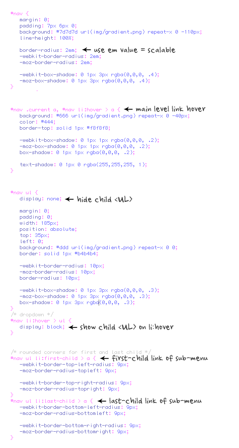
I’m not going to explain the CSS line by line. The images below explain the key points on how this dropdown is coded.

menu css

css code

A Beautiful Apple-style Slideshow Gallery With CSS & jQuery

This week, we are making an Apple-like slideshow gallery, similar to the one they use on their website to showcase their products. It will be entirely front-end based, no PHP or databases required.

Introduction

When speaking about design, there is one company that is impossible to go without. Apple values design – being a new product, a fancy catalog or their website – there is always something to admire.

This week, we are making an Apple-like slideshow gallery, similar to the one they use on their website to showcase their products. It will be entirely front-end based, no PHP or databases required.

So go ahead and download the example source code and continue with the first step.

Step 1 – XHTML

There is no need for a database nor a PHP back-end for this gallery. This means that it is really easy to incorporate into an existing site – you just have to change a few lines of html code.

Lets take a closer look at the XHTML markup:

demo.html

<div id="main">

<div id="gallery">

<div id="slides">

<div class="slide"><img src="img/sample_slides/macbook.jpg" width="920" height="400" /></div>
<div class="slide"><img src="img/sample_slides/iphone.jpg" width="920" height="400" /></div>
<div class="slide"><img src="img/sample_slides/imac.jpg" width="920" height="400" /></div>

</div>

<div id="menu">

<ul>
<li class="fbar"> </li><li class="menuItem"><a href=""><img src="img/sample_slides/thumb_macbook.png" /></a></li><li class="menuItem"><a href=""><img src="img/sample_slides/thumb_iphone.png" /></a></li><li class="menuItem"><a href=""><img src="img/sample_slides/thumb_imac.png" /></a></li>
</ul>

</div>

</div>

</div>

The idea is simple – there are two main container DIVs – the one with id=”menu” holds the thumbnails, and the other –“slides” holds the slides themselves.

To add a new slide, you’ll just have to add new elements to both containers. The slides are JPGs, and the thumbnails are transparent PNGs, but you can use any image type you want.

You can even put any kind of HTML in as well. For example you could make a certain slide into a hyperlink by just putting the image inside of an anchor tag.

That said, it is important to have the width and height attributes set up of the slide images – it is used by jQuery to determine the width of the sliding area, as you’ll see in a moment.

Also notice that the thumbnail LI elements. The first one is assigned a class name of fbar , used to only show a vertical dividing bar, and the others are assigned a menuItem class – used as the slideshow control buttons.

Now lets continue with the next step.

Step 2 – CSS

Lets see what lays hidden in our stylesheet. I’ve only included the styles that are directly used by the gallery. You can view the rest of the styles, used to show the demo, in demo.css.

demo.css

body,h1,h2,h3,p,quote,small,form,input,ul,li,ol,label{
	/* Page reset */
	margin:0px;
	padding:0px;
}

body{
	/* Setting default text color, background and a font stack */
	color:#444444;
	font-size:13px;
	background: #f2f2f2;
	font-family:Arial, Helvetica, sans-serif;
}

/* Gallery styles */

#gallery{
	/* CSS3 Box Shadow */
	-moz-box-shadow:0 0 3px #AAAAAA;
	-webkit-box-shadow:0 0 3px #AAAAAA;
	box-shadow:0 0 3px #AAAAAA;

	/* CSS3 Rounded Corners */

	-moz-border-radius-bottomleft:4px;
	-webkit-border-bottom-left-radius:4px;
	border-bottom-left-radius:4px;

	-moz-border-radius-bottomright:4px;
	-webkit-border-bottom-right-radius:4px;
	border-bottom-right-radius:4px;

	border:1px solid white;

	background:url(img/panel.jpg) repeat-x bottom center #ffffff;

	/* The width of the gallery */
	width:920px;
	overflow:hidden;
}

#slides{
	/* This is the slide area */
	height:400px;

	/* jQuery changes the width later on to the sum of the widths of all the slides. */
	width:920px;
	overflow:hidden;
}

.slide{
	float:left;
}

#menu{
	/* This is the container for the thumbnails */
	height:45px;
}

ul{
	margin:0px;
	padding:0px;
}

li{
	/* Every thumbnail is a li element */
	width:60px;
	display:inline-block;
	list-style:none;
	height:45px;
	overflow:hidden;
}

li.inact:hover{
	/* The inactive state, highlighted on mouse over */
	background:url(img/pic_bg.png) repeat;
}

li.act,li.act:hover{
	/* The active state of the thumb */
	background:url(img/active_bg.png) no-repeat;
}

li.act a{
	cursor:default;
}

.fbar{
	/* The left-most vertical bar, next to the first thumbnail */
	width:2px;
	background:url(img/divider.png) no-repeat right;
}

li a{
	display:block;
	background:url(img/divider.png) no-repeat right;
	height:35px;
	padding-top:10px;
}

a img{
	border:none;
}

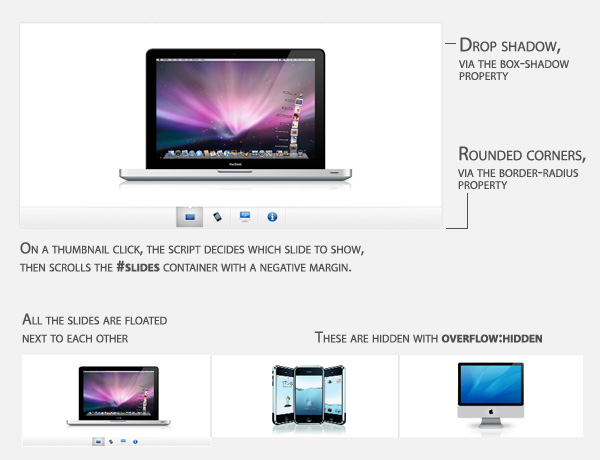
We have used a number of CSS3 specific properties in this slideshow gallery:

  • box-shadow, which makes the gallery cast a light shadow around its edges. To use it, you have to provide offsets by X and Y (0 0 here), the blurring (3px in this example) and the color of the shadow;
  • border-radius, which rounds the bottom corners of the gallery.

Unfortunately, these properties are only supported in Safari, Chrome and Firefox for now. However in the rest of the browsers you still have a completely functional gallery.

Now it is time for some jQuery magic.

Step 3 – jQuery

As I already mentioned, this gallery does not use any server-side code, so it is all up to the front end to make the slideshow tick.

script.js

$(document).ready(function(){
	/* This code is executed after the DOM has been completely loaded */

	var totWidth=0;
	var positions = new Array();

	$('#slides .slide').each(function(i){
		/* Loop through all the slides and store their accumulative widths in totWidth */
		positions[i]= totWidth;
		totWidth += $(this).width();

		/* The positions array contains each slide's commulutative offset from the left part of the container */

		if(!$(this).width())
		{
			alert("Please, fill in width & height for all your images!");
			return false;
		}
	});

	$('#slides').width(totWidth);

	/* Change the cotnainer div's width to the exact width of all the slides combined */

	$('#menu ul li a').click(function(e){

		/* On a thumbnail click */
		$('li.menuItem').removeClass('act').addClass('inact');
		$(this).parent().addClass('act');

		var pos = $(this).parent().prevAll('.menuItem').length;

		$('#slides').stop().animate({marginLeft:-positions[pos]+'px'},450);
		/* Start the sliding animation */

		e.preventDefault();
		/* Prevent the default action of the link */
	});

	$('#menu ul li.menuItem:first').addClass('act').siblings().addClass('inact');
	/* On page load, mark the first thumbnail as active */
});

The main idea behind this script is to loop through all the slides, sum up their widths and assign the sum to the slides container – the DIV with the id=”slides“. Because the slides are floated to the left and have enough room, they align next to each other.

Later, when you click a thumbnail, the script calculates which slide to show and scrolls the #slides div by assigning a negative margin via the animate method.

And with just 40 lines of code, the Apple-like slider gallery is finished!

Conclusion

In three easy steps we created a beautiful Apple-style slideshow gallery. It can be easily included into any website by just adding a few lines of code.

Fonte: A Beautiful Apple-style Slideshow Gallery With CSS & jQuery | Tutorialzine