That was a huge source for debates for sure … but the only thing that I had in mind was … is it possible to make it with only CSS (not a single picture or SVG) ?
I know it’s not a matter of life and death but when something like that gets in my head it’s too late, I can’t sleep until I have a viable answer.
After a few trials on this challenge I finally have my answer. The result is not perfect (and it’s a lot of SCSS / CSS — almost 400 lines) but it’s satisfying (based on my expectations at least).
Image (gif) from the animation
I will now describe the steps I went through to find it.
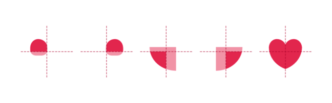
First I divided it in 3 layers : the Heart (.heart), the Ring (.ring) and the Circles (.circles), and grouped them in a wrapper (.heart-wrapper). After this, I made the drawing for each layer, then the animation of each layer and finally mixed them all together.
Drawing
Heart
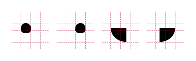
First part was the Heart.
I separated the full area in 4 rectangles :
Top / Left and Top / Right : 25% high / 50% wide
Bottom / Left and Bottom / Right : 75% high / 50% wide
And I used a pseudo element (:after) inside every rectangle and played withborder-radius property to be as close as possible to the original shape for each part.
Then I applied the color and overflow:hidden
Ring
The second part was the Ring.
This one is a simple rounded element with different border-size values andwidth / height values.
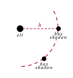
Circles
The third part was the Circles.
I built this one using a transparent rounded element in the middle and adding shadow boxes on it.
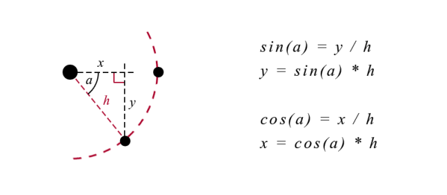
A shadow-box value for each circle, comma separated. The position x / y is computed based on the angle with sin / cos using Compass
Animation
Heart
Nothing too complex.
Increasing / decreasing the width / height of the main element (and setting the position left / top accordingly). The only thing is to make sure everything inside is relative to this element to adjust.
Ring
Adjusting the size of the border and the circle inside and the positionaccordingly as well as the color.
Circles
This one is a bit more tricky because all the border-shadow values have to be udpated all at the same time (position x / y, size, color) as it’s only one property with several comma separated values.
This function loops through all the Circles (stored in a SASS Map) and set 2 by 2 (the big and the small Circles) the box-shadow values accordingly, based on the distances, the sizes, the angle of shift between them and the progression in the color, all passed as arguments.
And make the three layers superimpose with the good timing.
A picture will be better than a long explanation :
The animation will be active / inactive just by adding / removing the class(.active) on the container (.heart-wrapper). In my example this class toggles on click.
Conclusion
I achieved my goal but as you can imagine for me it was more a question of winning this personal challenge, nothing more.
Browser support is the same as the current version (IE10+) because the most advanced requirement is CSS3 Animation (http://caniuse.com/#feat=css-animation).
I tried to keep the code as clean and structured as possible, and I used SASS variables for settings at the top to let people easily make some tests and changes. Feel free to let me know what you think and if you find something that can be improved (by setting the debug to true in the JS you’ll be able to see the animation step by step, with 1 click for each step).
Working with SVG in a RWD workflow usually involves a design phase and a development phase. The design phase is usually handled by designers who may or may not know how to code. And because of the nature of SVG as both an image format and a document format, every step taken in the graphics editor in the process of creating the SVG directly affects the resulting code and hence the work of the developer in charge of embedding, scripting or animating the SVG. In my day-to-day work, I am usually the developer whom designers hand the design assets over to, and SVG images are part of those assets.
Most of the assets I’ve been handed in my past projects needed a do-over and/or a second round of editing in the graphics editor before I could script them, because the resulting SVG code was not optimized enough for the kind of work—especially animation—that I was hired to do. The reason for that is that many of the designers I’ve worked with knew very little—if anything—about SVG code. They create vector graphics and UI assets all the time, but, for them, SVG is no more than an image format and they don’t know much about the code generated when their assets are exported as SVG documents.
There are some steps that designers can take or avoid—a set of “dos and don’ts”—that can help make the generated code cleaner. In this article, I want to share some of these. If you know any more, please do share them in the comments at the end of the article.
The tips we’re going to go over are applicable in Adobe Illustrator (Ai)—my graphics editor of choice—as well as other graphics editors. But since I personally use Ai, it is what I will be focusing on throughout this article.
We’re also going to go over the current SVG export options available in Ai and which ones to choose and why. But note that these options will change in the future, and this article will then be updated to reflect those changes.
Note that this article is based on my talk “SVG For Web Designers (and Developers)”—a talk I gave at CSSDevConf 2015 last month.
So, let’s start.
1. Create Simple Shapes Using Simple Shape Elements, Not <path>s.
There is a reason we have different basic shapes in SVG for creating, well, basic shapes. One could create practically any shape using a <path> element, right?
Simple shape elements (<line>, <circle>, <rect>, <ellipse>, <polygon> and<polyline>) are there for many reasons, and one of these reasons is that they are more readable and more maintainable and editable by hand than their <path>alternatives.
Basic shapes come with a set of attributes that allow you to control the shape features, such as position (x, y, cx, cy) and dimensions (width & height), while paths don’t come with these attributes.
For example, the following snippet shows the difference between a circle created and exported as a simple shape, versus one created and exported as a path:
If you want to animate your shape by, say, moving the position of the circle or making it bigger, you can do that by animating the position of the center via the x and y coordinates (cx & cy) and the radius of the circle (r). Whereas if you are working with a circle generated as a path, you will have to resort to CSS/SVG transformations (translation and scaling) to do that. And then suppose you want to animate that path and the animation requires you to apply further transformations to it? It can easily become a transformation mess.
Another advantage to using simple shapes is that, in the majority of cases, the code required to create a shape using simple shape elements is less than that required to create the same shape using a <path> element (see above snippet for a comparison), so using simple shapes will also result in a smaller file size, which is always better.
2. Convert Text to Outlines.. Or Don’t.
To convert text to outlines:
Select the text you want to convert.
Choose Type → Create Outlines
Pros:
Text converted to outlines will preserve the font face used, without having to use a web font to display it. This means you save a few extra HTTP requests and don’t risk displaying your text with a fallback font that generally doesn’t look good enough to substitute the beautiful font of your choice.Outlining the text and preserving the font face used is good for preserving a brand’s identity when the latter is defined by the font face used, for example: in a logo. I almost always turn logo text to outlines. Outlining is also good for preserving the font face of certain scripts when used for headlines.
Cons:
Text converted to outlines is not real text: it is a set of paths that form the outline (shape) of the text. Consequently, the text becomes unreal and inaccessible, not searchable and not selectable.In the case of a script headline or even a logo where the text is outlined, using analt text (if the logo is embedded as an image) or SVG’s accessibility elements (<title> & &>) is a good idea for providing alternative text for screen readers.I highly recommend reading all about making SVGs accessible in these two articles by Léonie Watson:
Converting text to outlines can significantly increase your SVG file size, depending on the complexity of the font face used. The image below shows the difference in the size (and readability) of an SVG with text converted to outlines (left) and text exported as SVG <text> (right).
Paths are not easily controlled and animated as <text> elements (including<tspan>s) are. The latter have a set of attributes that give you more control over your animations, while path data is limited in that sense.
3. Simplify Paths.
A path is defined by a set of points which in turn are defined by a couple of coordinates each.
The less the number of points, the less the path data (d attribute), and, consequently, the less the overall SVG file size. This is always a good step to take because a smaller file size is better for performance.
To simplify a path:
Select the path
Go to Object → Path → Simplify
Tweak the number of points. Make sure you have the Preview checked so can see how the path changes as you change the number of points. Tweak the number to get to the minimum number of points while preserving (or sacrificing) as much of the path’s visual appearance as you need.
There is a video tutorial created by Adobe to explain the process; so if you are more into videos, you can check it out here.
You can also simplify paths using the Warp Tool. I’m not a designer and I usually use Ai’s Simplify algorithm to simplify my paths, so, if you’re a seasonded designer, you probably alreay know much more about the Warp tool than I do. There is an article over at Smashing Magazine all about this tool, in case you want to check it out.
4. Avoid Merging Paths Unless You Don’t Need Control Over Individual Paths.
Many designers tend to combine or merge paths whenever possible. To merge paths:
Select the paths you want to merge.
Go to Window → Pathfinder
Click the Merge option among the list of options at the bottom of the panel (third icon from the left, shown in the screenshot below).
Combining paths may have its benefits, but avoid it when you or the developer needs to control and/or animate paths separately. Some animations are designed so that multiple elements are animated seperately, or sometimes you just want to style the paths using different fill colors. If you combine the paths, that will no longer be possible.
You need to make sure you know what the developer (or yourself, if you’ll be handling the development phase as well) needs and wants to do with the shapes you’re working on, and make the decision to merge or not to merge accordingly. This will save both of you a lot of time and friction.
5. Create Filters Using SVG Filters, Not Photoshop Effects.
If you use the filters in the Photoshop Effects section under the Effect option, Illustrator is going to export the effects you create as raster images. For example, if you create a drop shadow using the Blur Photoshop effect, the drop shadow generated will be a raster image embedded inside the SVG either inline or externally, using <image>. You definitely don’t want that when you work with SVG.
To generate your effects as SVG code, you need to use the SVG Filters available:
Go to Effect → SVG Filters
Choose and use one of the filters available in that panel.
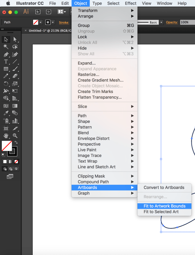
6. Fit Artboard to Drawing.
Have you ever embedded an SVG on a page, gave it a specific height and width and then found that it was being displayed at a size smaller than what you specified?
In most cases, this is caused by an amount of white space insidethe SVG viewport. The viewport is displayed at the size you are specifying in your style sheet, but the extra space inside of it—around the graphic—causes your image to “shrink”, because that white space is taking an amount of, well, space, inside the viewport.
To avoid this, you need to make sure your artboard is just big enough to fit the drawing inside of it, but not any bigger.
The artboard dimensions are the dimensions of the exported SVG viewport, and any white space in the artboard will be generated as white space inside the viewport.
To fit your artboard to your drawing:
Select the entire graphic. (I use cmd/ctrl + A.)
Go to Object → Artboards and choose the Fit to Artwork Bounds option.
7. Use Good Naming, Grouping and Layering Conventions.
I know this sounds like a no-brainer, but it needs to be emphasized for a few reasons:
The IDs and class names you use in the graphics editor are going to be translated to IDs and class names in the generated code. The more these names make sense and the clearer they label their respective elements, the less friction there will be when the developer works with the code.Now, I’m not saying you have to think up the perfect names—I’m sure we all have different ways of naming things and naming can be one of the hardest tasks, but labelling groups appropriately goes a long way. For example, if you are drawing a car, then using an ID of wheel to name the layer or group wrapping the shapes making up the wheel would be appropriate. If you are grouping all wheels in one group, you might give it an ID wheels. Simple names to tell elements and groups apart go a long way and save a lot of time, especially if the developer will be editing and manipulating the code by hand.Illustrator does not do the best job at naming things, so specifying names helps reduce the amount of junk it produces. Granted, there will be some extra editing required to get rid of the annoying underscores that Ai insists on generating, but using proper names helps make this process a bit easier.
As mentioned before, the next verison of Illustrator will show a big improvement in the way SVGs are generated, including generated IDs.
Use layers to group related elements. Layers are translated into groups in code, so name these well too. Create layers/groups to wrap related elements together, especially those that might be animated as a whole. A lot of time could be spent reordering and grouping elements by hand by the developer if this is not already done in the design phase. To save time, make sure you group appropriately. Talking to the developer in the design phase and designing how the animation will be executed together is a big time saver.
If the images you’re creating are going to be used to create an SVG sprite, the names you use can and will be used by most automation tools to generate new files. So using clear and proper names will result in cleaner file names.
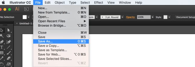
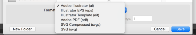
8. Choose The Best Suitable Export Options for the Web.
At the time of writing of this article, Illustrator comes with a bunch of export options that allow you to generate a generally better SVG code.
To export your SVG:
Choose File → Save As
Choose SVG from the dropdown menu
Click Save.
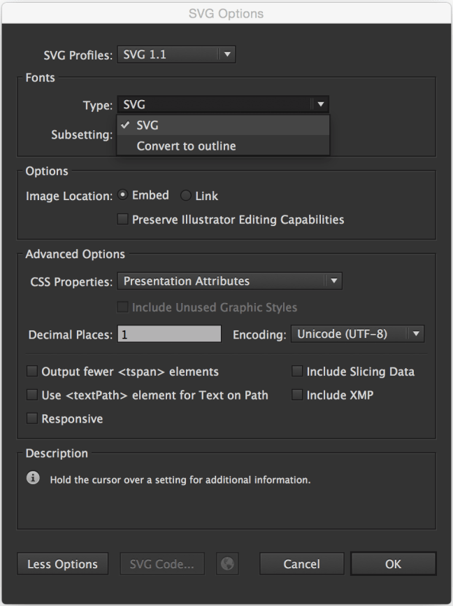
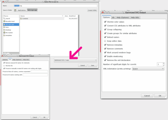
Once you click save, a dialog will show up that contains a set of options that you can customize, and that will affect the generated SVG code:
The options shown in the image above are the ones recommended for generating SVG for the web.
Of course, you can choose to Outline text if you don’t want to use a web font; Illustrator provides you with an option to do it upon export, as you can see, as well.
The Image Location option specifies whether any raster images will be embedded inline in your SVG or will be external with a link inside the SVG. This, again, depends on what you need. Inlining images inside the SVG can increase its file size dramatically. Last time a designer sent me an SVG with an image inlined in it, the file size was more than 1MB! After removing that image (which was caused by the Photoshop Effects used, that we mentioned earlier), the file size dropped to less than 100KB! So, choose wisely.
The CSS Properties option gives you the option to choose how you want the styles inside the SVG to be created: using presentation attributes, inline styles, or in a<style> tag. This is also a matter of preference and depends on how you intend to manipulate the SVG once you’ve embedded it. If you’re not the one who’s going to do that, make sure you consult with the developer to choose the option that suits their needs best.
The less the number of Decimal Places, the less the file size of the SVG. One decimal place should generally be enough, so I’d go with that.
Note that if you choose 3 or 4 decimal places, for example, and then use an optimization tool to optimize the SVG and bring that number down back to 1, the SVG might end up visually broken; so it is best to choose this option early on.
There is more to the options panel than what I have covered. Adobe’s Michaël Chaize has written an excellent article about the export panel that explains what each option does exactly. I highly recommend checking his article out:
Now, at the time of writing of this article, Illustrator will still generate unnecessary code such as editor metadata, empty groups, among others, so you will need to optimize the SVG further after you’ve exported it, be it by hand, or using a standalone SVG optimization tool.
But before we jump into the Optimization section, I want to note that you may or may not want to check an extra option as you save the SVG: the “Use Artboards” option, in the Save panel:
This option is useful for when you are working with multiple SVG images (for example: icons) and you are using an artboard for every icon.
Exporting multiple artboards will generate multiple .svg files, one for each artboard (one for each icon).
If you are working with only one artboard, this option will be disabled by default.
Choosing to export one or multiple SVG files depends on how the SVG is going to be embedded.
For example, if you are going to create an SVG sprite for an SVG icon system, there are several ways you can create and use the sprite, and each one would require a different approach: one technique requires the icons to be separate at first, and another requires them to be part of one image.
I will be writing a separate post about spriting SVGs and the artboard options, but until then, you can get an overview of the different spriting techniques in the following article I wrote for 24Ways.org:
It is usually recommended to optimize the SVG after exporting it from a graphics editor using a standalone optimization tool. The current most popular optimization tool is the NodeJS-based tool called SVGO. But it may not always be a good idea to optimize your SVG, especially if you intend to animate it.
If you intend to script and/or animate the SVG, you’re likely to set up a certain document structure—wrapper groups, ID names that you are not using/referencing inside the SVG but intend to use in your JavaScript, etc. This structure is going to change if you optimize your SVG using SVGO (or any other optimization tool).
Optimization tools usually remove any unused groupd and IDs, as well as apply many changes to the SVG to make sure it is optimized well.
I’ve once optimized an SVG after applying an animation to it using <animate>. The SVG was broken and so was the animation inside of it, because the entire structure was changed. So that is something to keep in mind before optimizing SVGs.
If you’ve manually edited and/or generated an SVG with a certain structure that you need, avoid optimizing using an optimization tool, and optimize by hand as much as possible. Some editor junk at the beginning and end of the SVG can be easily removed by hand. Other junk, such as metadata and classes generated by editors like Sketch—which has no SVG optmization options, can be harder to optimize by hand.
I generally never use Sketch to generate complex SVGs. I use Illustrator or Inkscape; the latter comes with a default export panel which gives you a lot of options to optimize your SVG before exporting it (see image below). Inkscape generates the cleanest SVG code at the time of writing of this article—that is, if you choose theOptimized SVG option, but the blurriness of the UI on a retina screen as well as its dependency on X11 on OS X make it a pain to use, so I am currently sticking with Illustrator.
If you do need/want to optimize your SVG, SVGO is the tool I would recommend.
SVGO comes with a bunch of plugins that you can fit into practically any kind of workflow. You can find more information about those tools in the following article I wrote a few months ago:
Possibly the most important tip I can give is to communicate, and to do it early in the design process.
I’m now assuming that you—the designer creating the SVG—are not the same person responsible for developing the SVG (scripting, animating, embedding, etc.).
Almost every one of the above tips requires knowledge of the development phase and what the developer intends to do with the SVG—how they intend to embed, script, style and animate it. So, unless you’re the same person making decisions for both phases, and unless you want to waste a lot of time reiterating and editing the SVGs, you need to make sure you know what the developer needs to do with the SVG and what approach(es) they will be taking. If you’re working on a project that has a tight deadline, you probably can’t afford to waste a big amount of time making changes and revisions to image assets, when you can avoid that by communicating early.
Designers and developers can be each other’s best friends. The very nature of SVG requires both design and development phases to be open to one another, and this, in turn, requires the designer(s) and developer(s) to talk, before the design process begins, and throughout the process as well.
I hope this article helps save you some time in the future. I’m not a designer so I might have missed a few clever design tips. If you know any that would help generate better SVGs, please feel free to share them in the comments below.
Hoje vamos dar uma dica simples e que consegue fazer-vos ganhar um pouco mais de espaço, que pode ir até aos 20GB.
Apesar de actualmente os discos terem uma boa capacidade de armazenamento, é verdade que quem tem hardware mais antigo tem ,normalmente, problemas relacionados com falta de espaço. A falta de espaço afecta a performance do Windows, ainda mais em alturas como as que atravessamos, com a chegada do Windows 10 e das primeiras actualizações.
O Windows faz uma gestão criteriosa deste espaço mas, por vezes, não consegue impor-se à vontade dos utilizadores mesmo quando recebem vários alertas. Hoje vamos dar uma dica simples e tentar libertar mais de 20 GB.
Esta dica deve ser aplicada não apenas por quem já recebeu um alerta de falta de espaço, mas sim por todos os que realizaram recentemente a actualização para o Windows 10 ou para a primeira grande actualização deste.
O que vai acontecer é que o próprio Windows vai eliminar ficheiros que não precisa, ganhando assim o tão desejado espaço.
Pode não parecer lógico que o Windows mantenha tanto espaço em disco ocupado com elementos temporários, mas a verdade é que estes podem acabar por ser úteis.
ALERTA
Caso apliquem esta dica vão ficar impossibilitados de reverter para a versão anterior do Windows
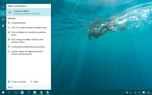
Como libertar espaço no Windows 10?
Esta dica vai apenas adicionar uma opção à limpeza de disco, que na verdade faz toda a diferença na hora de limpar o “lixo”. Na prática vão ser removidas versões anteriores do Windows e que não fazem qualquer falta.
Comecem por abrir a pesquisa e escrevam disco. Vão ver surgir a opção Limpeza do disco. Escolham essa opção e acedam à interface do Windows para limpeza compulsiva dos ficheiros desnecessários.
De imediato o Windows vai “olhar” para os seus ficheiros e identificar aqueles que podem ser eliminados, sem que isso influencie o comportamento do sistema operativo.
Esta pesquisa demorará o tempo necessário para que todo o disco seja avaliado e determinar quais os ficheiros que podem ser eliminados.
Depois dessa pesquisa a janela de limpeza do disco vai voltar a surgir, mas agora com os elementos do sistema disponíveis. Desçam na lista e procurem a opção Instalação(ões) anterior(es) do Window.
No nosso caso estavam mais de 24GB disponíveis para serem eliminados, o que é um ganho considerável de espaço. Estes valores podem variar, dependendo das instalações anteriores que existirem.
Podem aproveitar e avaliar outros itens que estejam nessa lista e que vos permitam ganhar mais espaço. Após uma avaliação criteriosa o PC do Pplware conseguiu libertar perto de 32 GB de espaço.
Esta é uma manutenção que se pode habituar a fazer periodicamente e assim garantir que todo o espaço que o Windows ocupa está limitado ao que realmente necessita, evitando ter ficheiros temporários desnecessários ou outros que estão apenas a ocupar espaço que tanta falta faz.
Uma das novidades do OnePlus 2 foi a adopção da ligação USB Tipo-C. Não tendo sido pioneira nesta questão, a OnePlus foi uma das primeiras marcas de smartphones Android a fazê-lo e criar alguns acessórios relacionados. Segundo Benson Leung, engenheiro da Google, a OnePlus pode ter construído um adaptador para USB Tipo-C que não cumpre a especificação.
Já não é a primeira vez que Benson Leung, engenheiro da Google na área de desenvolvimento do computador Pixel C, alerta para problemas relacionados com o perigo de alguns cabos USB Tipo-C existentes à venda no mercado.
Mas agora o alerta é dirigido directamente a uma das marcas mais populares actualmente, no mundo dos smartphones, a OnePlus. Segundo Leung, os adaptadores USB Tipo-C que a marca tem disponíveis para venda utilizam uma resistência que não está de acordo com a especificação do USB Tipo-C.
Benson Leung quer prevenir os utilizadores dos Nexus 5X e 6P e do Chromebook Pixel para os perigos que poderão correr ao utilizar este adaptador da marca OnePlus nestes equipamentos.
Não comprem este adaptador USB Tipo-C para os vossos Chromebook Pixel ou telefones Nexus 6P/5X. Ele utiliza uma resistência errada.
Esta é parte da mensagem deixada por Benson Leung no Google+. Mas o engenheiro alerta ainda para a necessidade de a OnePlus alertar os consumidores de que o seu acessório não cumpre a especificação.
Este adaptador da OnePlus encontra-se disponível na sua loja online por 9,99€ e a sua utilização não é assim de todo recomendada já que pode danificar os equipamentos.
A Google, até ao momento, não tem qualquer adaptador USB Tipo-C disponível para venda, nem se espera que venha a ter tão depressa, mas deixa o alerta para que os seus clientes não venham a ter problemas na utilização destes adaptadores de terceiros.
The most powerful tool a graphic designer has in creating logo design is typography. The typestyle you choose can have a strong effect on how your logo is perceived. You first need to understand the meaning of certain types of letters and how they can uniquely represent your company. This will help you decide which typography is best suited for your logo design.
Serif
A serif is a small line, flourish or embellishment trailing from the main stroke of a letter. Aside from the decorative element, serifs were created to increase the legibility of letters.
Font psychology: Traditional, Professional, Elegant, Strong, and Universal.
Sans Serif
Sans-serif fonts do not have the small projecting features called “serifs” at the end of strokes. The term comes from the French word sans (without).
Font psychology: Balanced, Modern, Clean, Simple, and Corporate.
Slab Serif
Slab Serif or Egyptian fonts resemble sans serifs in their simplicity but include boxy serifs on the end of each letter.
Font psychology: Authority, Heavy, Antiquity, Friendly, and American.
Script
Script lettering, which is similar to cursive or calligraphy, is often created with fluid strokes using a brush or nib.
Font psychology: Classic, Romantic, Welcoming, Warm, and Soft.
Blackletter
Blackletter script features elaborate thick-to-thin strokes and serifs and is seen with long swirls ascending from diagonal serifs.
Font psychology: Masculet, Hard, Historic, Dramatic, and Cold.
Sign Painter
Sign painting is similar to Script, but the look needs to appear like it was made with a paint brush or brush pen for the desired hand-painted effect.
Font psychology: Vintage, Craftsmanship, Artistic, Playful, and Affordable.
Reveal the symbolism behind the company
Your logo is a visual representation of everything your company stands for. Far beyond a simple, pretty picture, a strong logo is filled with symbolism, both obvious and hidden. To help figure the symbolism behind the brand, focus on your message by writing ten words that illustrate a business’s key benefits. These words can be feelings, adjectives, objects or time periods.
Here are my 10 words: 1. Artistic 2. Valuable 3. Bold 4. Natural 5. Warm 6. Classic 7. Simple 8. Confident 9 Handmade 10. Welcoming.
Then, as a fun exercise, I want you to draw out your favorite word and illustrate its meaning through typography, decorations, and illustrations.
For example, I drew “bold” in a tall serif font with a stroke sunburst coming towards you. In my mind, this is what I envision when I think of the word “bold” as it pertains to my brand. Thanks to this exercise, I now know that this vintage serif style will be perfect for the supporting text in my logo design.
Inspiration and visual research
At this point in my process, I like to create a mood board so I can visualize the style I have in my head. By creating my Pinterest board for Letter Shoppe, you can tell that I’m gearing towards a vintage script style. I encourage you to develop a mood board of your own that consists of at least 20 images to help mold your style for the brand.
Hint: be careful when pursuing popular trends because usually that design can become stale very quickly once that trend fades from popularity. So no matter what style you’re thinking of, make sure it remains timeless and unique.
Break time!
Now it’s time to take a 1-day breather to really get your ideas to steep. Breaks allow your brain to gather outside information so you can build a larger set of references that will be at your mental disposal when you start the sketching process.
Step 2: Experiment through sketching
Whether you’re a seasoned hand-letterer or a graphic designer who usually sticks to a digital canvas, I encourage you to start sketching your logo concepts with an old-fashioned pencil and paper. Without looking at any of your references, start to develop various thumbnails so you can explore some ideas.
This is your opportunity to experiment and really go wild with as many concepts as you can imagine. I usually rough out anywhere from 10 to 20 thumbnails for a complete look at all the possible design solutions.
Hint: A good way to get started is to build the skeleton of your letters first by simply writing out the words. Then, as you continue to experiment, make your drawings more and more refined by adding thickness and decorations.
As you get more comfortable drawing, allow yourself to break the rules and stir away from the most rigid forms of typography. Mix up upper- and lower-case letters, connect your marks, play with different sizes, and most importantly HAVE FUN!
Break time!
Alright, time for another break. Take anywhere from an hour to a day to go back to your sketches with fresh eyes.
Revisit your thumbs and choose a few of your favorites to experiment further. Enlarge each of your drawings by filling up an 8.5 x 11 piece of paper so you have room to play. Remember to start off using a light pencil. You can go darker and darker as you build out the details.
Once your outline is complete, you can ink your piece using thin and thick Sharpies or Micron pens. This will help you see the weight of your letters so you can make sure each of your letters are consistent.
Hint: Use a thin marker for the outline of your drawing first, and then color it in with a thicker marker to fill in. Whether you feel more comfortable going to the computer at this point or perfecting your hand-lettered solution is up to you. Keep in mind when you’re building a logo from scratch, the more work you do in the drawing process, the less effort it’ll take to digitalize your work.
Step 3: Digitalize your final concept
Whether you want a rough or clean look for your logo will determine your digital process. This next part is going to go over some design techniques for digitizing your logo and requires an intermediate knowledge of Photoshop and Illustrator.
Cleaning up in Photoshop
1. Scan your image at 600 DPI—and please don’t just use your iPhone
2. Open up your scanned image of your sketch in Photoshop
3. Go to Image > Adjustments > Levels and pull in your whites and blacks so you can really see your lettering
Hit Command-R to pull up your rulers. Pull down some guides for your sketch to ensure all your letters rest on the same axis. You’ll want to place your guides on the base, descender, body, ascender and t line
Hint: Letters like C, S, O, capital Q and G rest slightly above and below your guides. This allows your letters to appear to be resting on the same plain.
5. Feel free to use your Lasso Tool to Select > Right Click > Cut out your letters to fix any alignment issues.
6. Now it’s time for a serious clean up. Zoom in close to add or remove anything else that may help to perfect your drawing.
Break time!
Hit Save. Now, step away from your drawing to take a break. Try not to go from screen to screen so you can give your eyes a proper rest.
7. After about an hour, go back to Photoshop and turn your drawing upside down. See any more imperfections? Maybe only some of your letters are straight while others are tilted, or your S’s and O’s look more oblong than round. Looking at your work from this perspective really helps in finalizing the details.
8. Turn your art board right-side up, hit Save, and you’re ready to vector!
Using Live Trace to vectorize your work
If you want a more natural look to your lettering, I recommend using Live Trace to vectorize your work. This will give your artwork a more organic, rough feel that looks more hand-drawn with tiny imperfections.
1. Open up Illustrator and place your PSD into your art board.
2. Select your piece and go to Object > Live Trace > Tracing Options. Once your dialog box shows up, hit Preview and play with your settings until you get your desired result. I usually start off with the Black and White Logo preset and go from there.
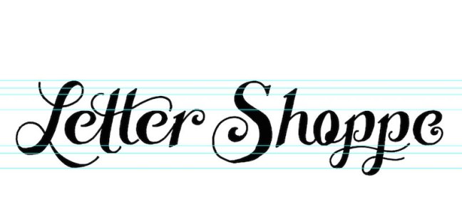
Here’s a look at my settings for my Letter Shoppe logo. The reason we placed a .psd file rather than a static .JPG is that now you can review your traced logo and still make changes. Maybe you realize that your lines aren’t connecting, or you have additional scuff marks that need to be edited. Simply go to you .psd file, make the changes, and hit Save. Your changes will automatically update in your live traced art.
3. If everything is looking good, go to Object > Expand to flatten your image.
4. Feel free to edit your anchor points accordingly until your logo is exactly how you want it. I usually use the smooth tool under the Pencil Palette to smooth out any rough edges. Check out the amazing before and after below.
Creating a perfect vector logo
Thanks to an awesome article by AGCS, I have a completely new approach to clean vectors using 0 and 90-degree bezier handles. I’ll use my letter S as an example using this new method.
1. Open up Illustrator and Place a PSD of your sketch into Illustrator.
2. Select your image and lower the opacity of your sketch. Hit Command-2 to lock your layer.
3. Create a new layer Command-L and place your nodes strategically along the curves of your letter’s outermost point. Check out my diagram below illustrating where each of my anchor points lie.
4. Remember to hold Shift when dragging out your handles to snap them horizontally and vertically.
This will no doubt take some practice to perfect, but keeping your bezier handles straight will allow you to use fewer nodes and have an all around cleaner result. Yes, there will be times when perfect handles won’t work, and that’s fine. It’s more important that your vectors look good over anything else. Now, let’s check out that sexy S.
Adding textures to your lettering
For some added roughness, you can add subtle jagged lines on the outside of your letters so it appears to be more hand-lettered. The more subtle the lines, the bigger you’ll have to scale your artwork before adding the effect. Go to Effects > Distort & Transform > Roughen.
Feel free to play with the settings in order to get your desired result, and be sure to checkAbsolute.
Once it’s complete, go to Object > Expand Appearance to lock in the image.
Now for the icing on the cake: texture! I like to use this vector texture pack from Seanwes, but feel free to create your own textures. Some people like to apply their textures directly into Photoshop and then live trace, but I’ll allow you to select your preference.
Adding just the right color
I always save color for last, but I usually have a general color palette in mind while I’m brainstorming and sketching.
A good way to choose a color palette is to base your selection on those words we came up with in the beginning. For example, some of my main words are “artistic” and “handmade,” so my plan was always to keep my logo design one color in either black or white. I’ve also chosen my supporting colors by placing my lettering on all-natural matte blacks, pearl whites, wood browns, and paper creams to help bring a clean artisan look to my hand-lettering portfolio.
Hint: Do not exceed 3 colors unless it’s absolutely necessary! A 5-color logo could be gorgeous, but once it comes time to produce it, things can get pretty pricey to print.
Test for readability
A great logo looks great no matter what size it is. It needs to have an interesting visual hook, accompanied by well-kerned typography. Make sure that your logo reads in seconds and is memorable. I usually test my logo at a business card size (3.5 x 2) to ensure its readability.
Get some outside feedback
Especially when you first start creating your logo design by hand, it’s important to get feedback from colleagues and other designers. This is where places like Instagram andDribbble come in handy, not to mention just showing a friend who isn’t a designer.
It’s important to get the perspective of other people because they may see a flaw or improvement that you can’t. Sometimes it can be hard to recognize improvements or faults with a design when you’ve been focusing on the design too long.
Com o Windows 10 a Microsoft passou a disponibilizar no seu sistema uma app de Mapas. A base de dados da app é a mesma da versão web e mobile do HERE Maps e logo por aí está tudo dito.
Há no entanto uma funcionalidade “escondida” que pode dar jeito quando não temos conectividade. Hoje ensinamos como podem obter os mapas para acesso offline.
Obter os mapas no Windows 10 para acesso offline é algo bastante simples e rápido. Para isso basta que abra a app Mapas e depois carregue no ícone lateral inferior. Aí dentro devem carregar na opção transferir ou actualizar mapas.
Depois basta carregar em Transferir mapas
Escolham o Continente
E por fim devem indicar qual o país que pretendem. No caso de Portugal os mapas ocupam 218 MB. Há mapas para todos os países.
E está feito! Depois de descarregados os conteúdos, o utilizador pode usar na mesma a aplicação de mapas de uma forma actualizada mesmo não tendo acesso à Internet.
Infelizmente no mundo da tecnologia/comunicações não existem “milagres”! Quando se fala em acesso à Internet tudo depende da velocidade contratada ao operador e como sabemos essa largura de banda é normalmente partilhada por outros utilizadores.
No entanto é sempre possível fazer algumas afinações no sistema de modo a garantir a velocidade mais rápida possível. Para quem usa Linux, aqui ficam algumas dicas.
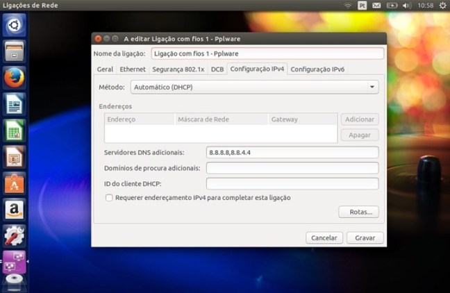
Alteração do DNS
Um dos serviços mais importantes em qualquer rede é o DNS (Domain Name System)). Este serviço é responsável pela tradução de nomes, em endereços de IP e vice-versa e funciona à base de pedidos e respostas, isto é, uma máquina faz um pedido para saber o IP associado a um determinado nome e o serviço envia-lhe essa informação.
Quanto mais rápido for essa resposta mais rápida será a ligação da nossa máquina ao servidor (ex. servidor web) que pretendemos aceder. Um dos serviços de DNS mundiais mais rápidos actualmente é o da Google com os endereços 8.8.8.8 e 8.8.4.4 (isto para IPv4) e 2001:4860:4860::8888 (para IPv6).
Alteração do MTU
MTU é a abreviatura para Maximum Transmission Unit. O MTU é basicamente o parâmetro que determina o tamanho máximo dos pacotes (por exemplo, se vão enviar um filme de 800 MB pela rede, esse conteúdo tem de ter “partido” em pedaços mais pequenos (fragmentação) para que seja recebido pelo destinatário).
Se o valor do MTU é pequeno isso traduz-se num maior número de pacotes criados o que significa a ocupação do canal de transmissão por mais tempo. Mas afinal qual o melhor MTU?
Podemos fazer testes e verificar qual a melhor valor para nossa ligação. Para isso podem recorrer à popular ferramenta ping e começar com um MTU de 1472 (o standard para Ethernet é 1500 bytes) e depois incrementar /decrementar 10 até encontrarem qual o melhor valor.
Depois de encontrarem o melhor valor basta ir ao ficheiro /etc/network/interfaces e acrescentar a linha “mtu 1472” (indicando qual o vosso melhor valor encontrado.
Browser
Ao nível do browser é também possível fazer algumas afinações. Tanto o Firefox com Chrome/Chromium permitem activar um tipo de “fast caching” que pode aumentar a velocidade dos nossos acessos regulares. Para activar tal funcionalidade (no chrome) basta escrever o endreço
O Fever é o novo topo de gama da marca francesa, que continua a apostar na relação qualidade/preço.
As características parecem impressionantes para o preço anunciado: processador de outro núcleos a 1,3 GHz, 3 GB de memória RAM, 16 GB de armazenamento, ecrã Full HD de 5,2 polegadas, 4G, Dual SIM e sistema operativo Android 5.1. O Wiko Fever, o novo topo de gama da marca francesa, vai chegar ao mercado nas próximas semanas por um preço recomendado de 249 euros.
De acordo com o comunicado da Wiko, o Fever mede 148×73,8×8,3 mm e pesa 143 gramas.
A Wiko, que garante ocupar a segunda posição no mercado livre em Portugal, apresentou ainda duas outras novidades, o Pulp (€179) e o Pulp Fab (€199). Estes dois smartphones 3G também recorrem a um processador de oito núcleos, mas apresentam menos memória RAM (2 GB). A grande diferença entre estes dois terminais está no ecrã: o Pulp Fab tem um ecrã de 5,5”, enquanto o Pulp tem um ecrã de 5”. Ambos são HD.
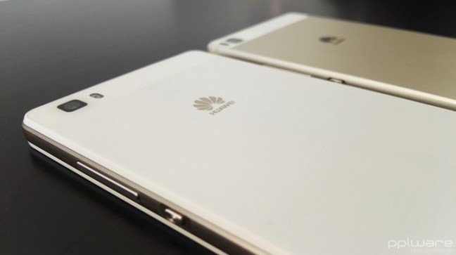
O Huawei P8 lite foi lançado este ano a lado do Huawei P8, uma versão ligeiramente inferior ao P8 em termos de especificações, mas muito mais acessível e com um desempenho que faz jus às suas características de smartphone de gama média.
Conheça em pormenor o Huawei P8 lite.
Aspectos positivos
Câmaras fotográficas
Qualidade do ecrã
Desempenho
Construção
Aspectos negativos
Falhas pontuais de rede móvel
1 – Características Gerais
Apesar de já ter sido lançado em Maio, o Huawei P8 lite é ainda hoje alvo de muitas questões por parte dos nossos leitores. Na verdade, ele é ainda uma excelente opção de compra mesmo com os vários equipamentos que já foram lançados posteriormente.
O Huawei P8 lite tem um ecrã de 5 polegadas, o design é simples e elegante, com linhas que o aproximam do Huawei P8. Vem equipado com um processador HiSilicon Kirin 620, Octa-core 1.2 GHz Cortex-A53 e tem um GPU Mali-450MP4.
Está disponível com 2 GB de RAM e 16 de armazenamento interno, expansível através de micro SD, abdicando da utilização de um cartão SIM, já que tem opção de utilizar dois cartões SIM (nano e micro SIM).
A câmara principal é de 13 megapíxeis (MP) e conta com o auxílio de um flash LED, e a câmara secundária é de 5 MP.
A caixa onde vem o Huawei P8 lite, além do smartphone, traz o manual de instruções rápidas, o acessório para abrir a ranhura dos cartões, um cabo USB/microUSB, o carregador e ainda uns auriculares.
2 – Design
Da Huawei já é comum uma elegância presente nos seus smartphones pelo que o Huawei P8 lite não é excepção. Construído em plástico, bastante leve, com uma moldura a imitar metal (tal como a Samsung fazia nos seus modelos mais antigos) e uma traseira em branco escovado. Pesa 131 g e tem 7,7 mm de espessura.
Na frente tem o ecrã de 5 polegadas, a cima, o LED de notificações, os sensores de luminosidade e proximidade, o altifalante e a câmara de 5 MP. A baixo não existe qualquer botão capacitivo, apenas a inscrição da marca.
Nas laterais, do lado esquerdo não existe qualquer botão, porta ou ranhura de cartões, em cima estão o jack de áudio de 3,5 mm e o microfone. Do lado direito encontra-se o botão de volume, o botão de power, a ranhura para cartão nano-SIM/microSD e a ranhura para o outro cartão micro SIM. Na lateral de baixo, está a grelha de áudio, onde do lado esquerdo se encontra o microfone e do lado direito o altifalante e a meio a porta micro USB.
Na traseira em cima encontra-se a câmara de 13 MP e o flash LED. A capa traseira não é removível e não inclui nada mais além do logótipo da Huawei.
3 – Interface, aplicações e funcionalidades
O Huawei P8 lite vem com a versão 5.0 do Android Lollipop personalizada através da interface própria da Huawei, a Emotion 3.1 UI. Esta interface não tem diferenças relativamente ao que o Huawei P8 apresenta, apenas tem menos algumas funcionalidades, o que é normal tendo em conta a diferença de hardware entre ambos.
Aqui não existe um menu com todas as apps instaladas no smartphone. Existem sim, as aplicações distribuídas por vários ecrãs, todos eles personalizáveis, mais ou menos ao estilo do iOS, mas com a vantagem de se poderem utilizar todos os widgets, que acabam por trazer uma melhoria em termos de produtividade e informação disponível ao utilizador.
A barra de notificações, basicamente contém todas as informações comuns de um Android, as notificações são mostradas por ordem cronológica, com informação da hora a que foram recebidas. Algumas destas notificações são interactivas e permitem acesso a algumas acções rápidas.
Em termo de aplicações, o utilizador pode contar com as várias aplicações Google, um Gestor de Telefoneque permite, entre outras opções, optimizar o desempenho do smartphone, activar Filtros de assédio que bloqueia chamadas e mensagens de números pré-definidos pelo utilizador, números de origem duvidosa ou desconhecido, e ainda o bloqueio de aplicações que passam a poder ser acedidas apenas através de um código PIN.
Vem ainda com um bloco de notas, um gestor de temas comum nos smartphones da Huawei, um gestor de Ficheiros, Gravador de voz e ainda uma série de Ferramentas úteis, como calculadora, Rádio FM, Espelho, Lupa, Gestor de Cartões SIM e Lanterna, entre outros.
Em termos de desempenho, o Huawei P8 lite comportou-se de forma exemplar tendo em conta a gama onde se insere. Muito fluido, sem bloqueios ou desfasamentos entre troca de aplicações. Há, no entanto, que referir que o Huawei P8 perde sinal de rede esporadicamente, não é algo que tenha afectado muito a comunicação, contudo, em 2 ou 3 situações, durante a análise, foi necessário desligar a chamada em curso e voltar a retomar devido à perda de rede.
Através do Benchmarck Antutu, o P8 lite conseguiu uma pontuação de 31111, um valor muito próximo do conseguido em smartphones como o InnJoo One 3G HD, o Xiaomi Mi 4i, ou até mesmo do UMI Iron.
Resta referir que a qualidade do ecrã, tendo em conta o tamanho e a resolução, é muito boa, tem uma definição e um contraste que fazem dele um aspecto positivo a destacar, principalmente, na gama de preços onde se insere. Já o som é um pouco ruidoso com o volume no máximo.
4 – Câmaras
O P8 lite vem equipado com uma câmara principal de 13 MP e uma secundária de 5 MP. A câmara principal conta ainda com o auxílio de um flash LED e faz gravação de vídeo a 1080p.
A câmara principal vale a pena ser comparada com a do Huawei P8 já que partilham características comuns. Apesar do P8 lite apresentar menos opções de captura que o P8, a verdade é que os resultados finais de uma foto são igualmente satisfatórios, não sendo o desempenho em fotografia ou vídeo que pesem na decisão de compra entre um ou outro modelo.
Relativamente à câmara frontal os resultados são bons, mas nada de espectacular. O modo de Beleza a partir do nível 3 começa a deformar a cara das pessoas, mas isso é algo transversal entre os smartphones da Huawei.
Estes são alguns exemplos de imagens fotografadas com o Huawei P8 lite:
5 – Veredicto
O Huawei P8 lite revelou-se ao longo da análise um smartphone bastante competente tendo em conta as suas características. De notar que ao preço a que se encontra actualmente, o Huawei P8 lite apresenta-se como uma das melhores opções já que pode ser adquirido a menos de 200 euros.
Um problema que tem sido apontado por alguns utilizadores, mas que na minha experiência se revelou ao nível dos demais smartphones já aqui analisados, prende-se com a autonomia. Na verdade, não considero que seja um problema, com uma utilização comum, alguns minutos de chamadas, notificações e sincronização do e-mail activas, visualização de vídeos no YouTube durante 30~40 minutos diários e outras tarefas, nunca cheguei ao fim de um dia sem bateria, tendo mesmo conseguido utilizar durante 2 dias inteiros. Além do mais, o Huawei P8 lite tem várias opções e perfis de poupança de energia que o utilizador pode adaptar às suas necessidades.
Huawei P8 ou Huawei P8 lite, qual a melhor opção?
Durante os últimos meses o Huawei P8 foi um dos smartphones que utilizei com mais frequência. A interface da Huawei é algo que me agrada por ser simples, intuitiva e até minimalista e o Huawei P8 é um smartphone que sempre se apresentou fluido e com uma autonomia suficiente para a minha utilização diária. A minha expectativa inicial era de vir a notar diferenças significativas em termos de desempenho ao começar a utilizar o Huawei P8 lite, mas não foi o que aconteceu. Apesar de ser ligeiramente mais lento a diferença não justifica os quase 200 euros a mais do P8.
Este e outros smartphones estão disponíveis na loja onlineGearBest, com envio a partir da União Europeia, sem quaisquer taxas adicionais. O Huawei P8 lite em análise foi cedido pela GearBest a quem deixamos um agradecimento.